NetSuite vs. SAP: using competitive advertising to reposition your company

NewtSuite SAP Fired
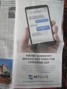
NetSuite “Fire SAP” ad in Wall Street Journal; click the picture to see it larger

We’ve talked in the past (and you can read in my book) about strategies for competitive advertising—promotions in which you talk about a competitor as much or more as yourself. It’s a good strategy for smaller companies because, by positioning themselves against the bigger competitor, they can gain instant credibility. It’s probably not so smart for the bigger guy, who would be better off pretending the little guy doesn’t even exist.

There’s a third reason to do competitive advertising: to position yourself in a new way, for a new audience, even if you are a big and established company. That’s what is happening with the NetSuite campaign currently running. Both NetSuite and SAP handle the back office “plumbing” of Enterprise Resource Planning (ERP) and other large-scale data management. The difference is that SAP is an established and somewhat stodgy company, while NetSuite is Software-as-a-Service. They operate in the cloud.

Notice, however, that cloud is never mentioned in this ad. NetSuite is a company that does the same thing as SAP but is more agile. Maybe the idea is to position them with IT executives who are suspicious of abstracting their key functions and think that important data should never leave the premises. This ad gives NetSuite an opening to talk to them before that objection comes up. They use the reader’s built-in perceptions of SAP, bad and good, as a springboard they can use to say “we do that too” and then differentiate themselves.

I do wonder about the creative execution that seems a little casual and slangy when a stodgy, white-paper approach would have been the obvious way to go. I doubt this target does a lot of text messaging. On the other hand, this is the kind of sophomoric humor that appeals to engineers.

I’ll be keeping my eye on this campaign to see how successful it is (which you can generally judge by how long it keeps running) and what this first foray leads to next. Stay tuned.

Obamacare with a New York accent

As a small business owner, I turn out to be one of those people who doesn’t get to keep the health insurance I like. We got the letter from our provider yesterday, advising us to go right to the New York State site thus avoiding the healthcare.gov train wreck. Unfortunately, mystateofhealth.ny.gov isn’t much better. I tried to register about 30 times each time getting the message that my session had expired as soon as I hit the “submit” button. It didn’t help that I had to get over a check of my preferred username to be sure no one else had it, and answer a particularly hard to read Captcha. Why in the world would they think bots would be trying to set up health accounts?

My wife had better luck today and got a good way through the application before the website went down. There were two drop-down menus at different points, one to identify our current health carrier and the other to identify our auto insurance provider (not sure why they need this info). And here’s the thing: the menu listings were in random order, vs. alphabetical. There were easily 100 health carriers and even more auto insurers so you just have to scroll back and forth till you find the one you’re looking for, and I bet there are lots of mistaken choices. My wife was able to find our health insurer. But when it got to auto insurance she scrolled and scrolled, back and forth, and finally realized our carrier (USAA) wasn’t on the list. So she put down “none” because that was the best choice available. Doesn’t exactly help the state exchange with the actuarial part.

Where do they get the people who code these sites? Isn’t there any kind of darwinism in government that rewards people who strive harder to do a good job? I know a lot of you will say “what a stupid question” but I really do try to have faith that people entrusted to help other people will take that responsibility seriously. So this is discouraging, and I hope we don’t get sick before we get insurance.

Not OK, Chrome

I am not sure how Google Chrome became the default browser on my Macbook Pro, but it’s gone now. Just way too many instances of “the Shockwave plug-in has crashed”, the fact that it won’t run the current version of Flash, and the frequent escapades of the “Chrome Renderer” and his evil twin, the “Chrome Worker” that slow my system to a crawl.

So I went through the peculiar (though obviously self-serving, to Apple) practice of changing the browser through Safari, Mac’s own browser which can’t be the default because of just too many incompatibility problems. Now I’m back to plain old Firefox.

How did I ever get into this pickle? I think I was lured by a casual invitation to try Chrome on the Google search page, and initially it seemed noticeably faster than Firefox (which has its own problems with plug-ins that are constantly getting out of date; but unlike Chrome, Firefox simply disables them rather than allowing them to crash the app). I also liked my fresh results with Bing, the browser which was oddly-enough (because it’s not Google) pre-loaded. Once a daily productivity app becomes a habit, it’s hard to change. But now they’re both gone. And I’m feeling a sigh of relief.

How to be a good tech writer

The other day a marketing colleague asked me to write him an email which he’d pass along to his CEO, about why I should be hired to write technical copy. Feel free to use these selling points in your own self-marketing, assuming of course they apply.

The first thing I believe about tech writing is that you need to understand the product—-not necessarily on a programmatic level, but the problem it solves, and why it does this better than other options. I’m not a scientist but I love to learn how things work.

Secondly, I believe that technology buyers are people with the same personal motivations as those buying consumer products. They want to be secure, avoid conflict and achieve recognition and in an indirect way technical products help them do this. They get promoted because they’ve contributed to the bottom line. They get to go home on time instead of staying to placate angry users.

Finally, I always ask to interview the sales team so I can understand the objections that are typically raised and the hot buttons that get prospects excited about the product. I go to CES most every year (and attended Comdex before that) and spend most of my time hanging back near kiosks to watch sales engineers do technical presentations.

I believe these steps are missing in a lot of the copy I read for technical companies which reads like a laundry list of specs. I spent most of my career working in the Bay Area, and my work was typically lead generating direct response that was tested against other messages and I usually won.

To my fellow copywriters, I’ll add that I won consistently not so much because I was a dramatically better writer, but because I was diligent in my preparation. As Yogi Berra may have said, half of success is showing up.

Tech gifts for the techie dad

Father’s Day is a great time to give dad techie gadgets he wouldn’t necessarily buy for himself. Here are some ideas.

1. Last minute gift: an Apple App Store or Android gift card. Who doesn’t need more apps for their mobile device? You can buy prepaid Apple gift cards at most any Target and many supermarkets; if they don’t have the App Store card an iTunes card would work just as well. For Android, Amazon Gift Card – E-mail – Amazon Appstore will work just as well and you can order it for immediate delivery via email. (Unfortunately, Amazon does not seem to have a gift card with a picture of the Android robot on it.)

2. Home Depot gift: a cordless lithium drill/driver set. Every dad has an old cordless drill in a drawer, but the new-generation lithium battery technology is a dramatic step forward. They’re lighter, more powerful and the battery lasts far longer. I have one by Bosch but whatever is on sale will do; take a look and see if you can find a combo set with flashlight, radio and other add-ons that run off the same batteries. This is definitely something dad would never buy for himself but, take it from me, would like to have.

3. Grilling dad gift: temperature monitor for the Weber. The point where dad gets serious about barbecue is when he starts to think about temperature control. Fortunately, there are sturdy aftermarket thermometers like this one which he add in to his existing kettle cooker in a few minutes by drilling a hole, then securing the thermometer with a nut and a washer. If you want to go high tech, my friend Steve would send you to the Thermoworks site where they have all manner of remote doneness sensors, instant read laser thermometers and such.

I am fortunate enough to have all the above (well, except for the Thermowerks tchotchkes) and am hoping for Why Knot?: How to Tie More Than Sixty Ingenious, Useful, Beautiful, Lifesaving, and Secure Knots! by Philippe Petit, a high wire artist to whom well tied knots are obviously important. And when you think about it, back in the day, knots were the original high technology.

How (and why) to change your WordPress permalink structure

Sorry for geeking out here, but I just discovered the solution to a longstanding problem and I haven’t seen a complete discussion anywhere else. So here goes…

The problem has to do with WordPress permalinks. A blog post’s permalink is the URL that search engines and directories use to find it on a WordPress blog like the one you’re reading. If a permalink changes for an existing post, the post disappears and searchers get a 404 error which not only is frustrating, but will cost you big time in the search rankings.

So why in the world would you want to change your permalinks in light of this risk? Because most of us made a mistake in the way we set up our permalinks to begin with. There’s a “Permalinks” tab in “Settings” on the WordPress dashboard and radio buttons to choose your structure and the default (as I recall) is to give each post a unique number like:

http://www.yoursite.com/blog/?p=123

But instead I thought it was useful to reference the date (at the beginning of Otisregrets, I was using it primarily as a communications tool in my copywriting class so it was important to have everything in chronological order) so I chose this option:

http://www.yoursite.com/2013/05/sample-post/

There are two things wrong with that structure. First, it means that every time a search result lists my post it will include the date. And I think most people give more credence to recent posts since an older one may have obsolete information. Second, you may want to republish older posts (like the ones from the early days of a blog, when you had far less readership). You can’t simply cut and paste to create a duplicate post; the search spiders hate this. But if you change the publication date in the WordPress dashboard to create a new post, then all your indexing disappears.

What I wanted to do is change the permalink structure to

http://www.yoursite.com/sample-post/

which means I can change the publication date (but NOT the title) and the search engines and indexes will still find it, yet it will be on the top page of my blog. And if you look at the urls of my posts now, that’s what I did. Here’s how.

1. Download your .htaccess file, which is in the top level directory of your WordPress blog. (Mine is in www.otismaxwell.com/blog for example.) This is the file which directs spiders and other indexing operations (including your own) as to where to find things on your site. You might not see the file immediately because many ftp applications hide “dot” files by default. I used Filezilla which has a setting under “Server” for “Force showing hidden files”; you want to check this setting and then .htaccess appears.

2. Make the .htaccess file visible on your local machine. This is necessary because neither Mac OS X nor Windows shows these files by default. In Mac it’s a simple matter of opening the Terminal and adding this line:

defaults write com.apple.Finder AppleShowAllFiles YES

After you do this, close terminal and restart Finder and voila, all your hidden files are now visible.

3. make a copy of the .htaccess file you downloaded and move it to a safe place on your local computer in case something terrible happens.

4. Open the .htaccess file in a text editor (I used TextEdit) and insert a line under # BEGIN WordPress to specify a 301 redirect. DO NOT MAKE A MISTAKE HERE OR YOUR POSTS WILL DISAPPEAR. Web programmer and SEO expert Joost de Valk has kindly provided a script which will create the correct code for you; read the article then click “generate redirects” and follow the prompts to create your own like of 301 code.

The revised code will look something like this:

# BEGIN WordPress
RedirectMatch 301 ^/([0-9]{4})/([0-9]{2})/(.*)$ http://www.yoursite.com/$3
<IfModule mod_rewrite.c>
RewriteEngine On
RewriteBase /
RewriteRule ^index\.php$ - [L]
RewriteCond %{REQUEST_FILENAME} !-f
RewriteCond %{REQUEST_FILENAME} !-d
RewriteRule . /index.php [L]
</IfModule>

# END WordPress

5. Upload the edited .htaccess file to your WordPress directory, replacing the old file, then IMMEDIATELY go to the Permalinks tab on the WordPress dashboard and change the format to:

http://www.yoursite.com/sample-post/

6. Test it by searching for a couple of your posts in Google or other search engine. The result should resolve to the new title of the post. You did it!

7. It’s a good idea to re-hide hidden files on your local machine so you don’t delete or alter one of these vital files by accident. To do this on Mac, just go into Terminal and enter the same instruction as previously but this time end it with “NO” instead of “YES”:

defaults write com.apple.Finder AppleShowAllFiles NO

UPDATE: Years later I find myself setting up a wordpress.com blog and find this option isn’t available; for this free platform you are stuck with the http://www.yoursite.com/2013/05/sample-post/ format with the date in the middle of the permalink. This is true even if you pay for one of the available upgrades, to Premium or Business.

Instagram, iPhone and the photo-based social network

A couple I know bought a fancy camera before the birth of their first baby. It’s sitting in a drawer somewhere. Turns out that their trusty iPhone does everything they need: they can shoot a pretty good photo, touch it up with Instagram, and shoot it out to their friends immediately.

Instagram is interesting. Dave Kerpen wrote an article about it over on LinkedIn called “And the Future of Social Media Is” and the answer is… not Tumblr, just acquired by Yahoo, but Instagram. His 10 year old daughter and her friends used it to exhaustion on a recent weekend trip, adding insta-apps to expand the conversation as they went. As opposed to Pinterest, which sends lots of traffic to my food blog but seems mainly a scrapbooking application, Instagram really works as a fully functional social network–and it’s a lot easier to shoot and share a picture than to write an update.

One of those apps, Instafollow, allows users to automatically follow or unfollow up to 160 users per hour, up to an ultimate count of 20,000 users, simply by following followers of a user. That’s a lot more power than Twitter and a lot easier to execute. No wonder my own kid, who’s fairly responsible on Facebook, got me in so much trouble on Instagram that I had to delete my account. Snap a picture, slap some text on it, and you’re good to go.

I just put the account back up and already I’ve got new followers and a writing opportunity thanks to Instagram. My username is otismaxwell if you care to meet me over there.

CES 2013: start the party without me

Alas, a schedule conflict will keep me from attending CES this week in Las Vegas. My annual prediction* is that this will be the year of the app-liance: a hardware mashup, possibly centered around a tablet but maybe something completely different, that puts together several apps in order to perform a hopefully useful service such as protecting your home, monitoring your diet or organizing your virtual library.

If I were there I’d arrive in time for ShowStoppers and give these good and awful marketers a probably unappreciated critique. I’d head for the Panasonic booth first thing  next morning to see how they’re pushing the edge of the eco-envelope this year. I’d save time for Eureka Avenue and see what the startups are up to. (Hopefully they’ll fare better than Twykin last year.) And of course, I’d take in a buffet or two.

Have fun, be careful, and never draw to an inside straight. Hopefully I’ll see you in 2014.

* See last year’s eerily prophetic prediction here, in the paragraph about LG.

Hello, again, Lincoln. And now goodbye.

LincolnAd2
Click on the image to see larger size then click again to read

As a technologically savvy consumer who’s not excited by the current crop of luxury cars, I should be the perfect target for the reimaged Lincoln. Yet the full page ad in Saturday’s Wall Street Journal had me scratching my head. (I haven’t been able to find the full text anywhere online so I’ll shoot it at hopefully high enough resolution that you can read it for yourself.)

As a copywriter, I love long copy ads that succeed and hate long copy ads that make skeptics say “long copy doesn’t work”. This ad, unfortunately, is in the latter camp. Let’s examine why:

1. Lincoln assumes a coziness which is not likely to exist between ad and reader. Sadly, today’s consumer is not enamored with our silken prose and is more likely to turn the page than to read the copy. Witness the headline which, out of all the infinite possibilities, says “Hello. Again.” And a first paragraph that says, “It takes a special type of ego to presume the world needs another luxury car. (In fact, it’s a bit like the kind that interrupts your otherwise meaningful pursuit of current events with a full-page ode to our intentions.)” Lincoln, we could care less about your ego.

2. The ad has a tin ear. Here’s an aspirational statement in the second paragraph: “True trailblazers follow their inner light. You’ve got to be pretty confident to create what has never been done before. It’s true in history, invention, art, you name it. Even automotive design.” Pretty high-minded and soul-stirring.

But here’s their proof point in the very next paragraph: “If the traditional gearshift consumes too much space between the front seats, you break the rules. You break new ground. You place a redesigned push-button shifter next to the steering wheel.” Not only is that a terrible letdown from the aspirational high, it’s not even new. I had such a shifter in my 1963 Rambler.

3. Lincoln steps on his own coat tails in attempting to be all things to all consumers. The brand wants to be “what has never been done” as noted above. But they also want to build on their heritage, as the ad progresses. Past Lincolns are presented as “different… truth be told, not everyone liked them” and the “selfless” (sic) ego of Edsel Ford is brought forward as the kind of pure design fire that burned brightly. (When people think “Edsel” they think of the car, of course, with all its quirks, not the man.)

If you are brand new, then you’ve broken away from any history you have. Instead they’ve chosen to bring up the history, then belittle it or suggest that Lincoln has been misunderstood. I don’t think you can have it both ways. And there is also the television advertising to deal with, presenting the Lincoln as the “car of presidents” (as in presidential limo) which makes it seem like a mainstream choice and not an eccentric outlier. More discontinuity.

Finally, at the end of the ad, we’re told what lies in store for us: “elevating our owner service to be on par with the world’s most exclusive concierges… we’ll treat you as a ‘client,’ not as a customer… simply, our goal is to be everything for a certain few.” Here I know what is happening because I did some work for Lexus in the early 90s, when they were eating Infiniti’s lunch. The two new luxury brands were launched at the same time. Infiniti then, like Lincoln today, came forth with dreamy high-minded metaphors and poetic-sounding prose. Lexus simply said, we’re going to pamper you like you’ve never been pampered before.

So Lincoln is going to be both Infiniti and Lexus in the same body. We’re dreamers and unabashed egoists, but when push comes to serve we’ll open the door for you and give you a free carwash with your oil change. Actually, according to Yahoo! News, the promotional plans include a “date night” in which consumers get a free dinner for two when they take a test drive. Now that might get my attention. As long is it’s not Olive Garden or TGIF Friday.

Nerds are people, too!

Here’s a preview of the KISS panel we’re presenting at the Direct Marketing Association’s annual conference in Las Vegas. Come see us next Wednesday, October 17 at 9 am to get the full story!

When you’re selling complex products and services, that often have a high price tag, it’s easy to overcomplicate your marketing message. A copywriter might think, it’s hard to know which of the technical specs is most important so I better include all of them. Or, this buyer will need a lot of information in order to justify the cost. The problem is that ultimately you’re still selling to people. And we can only absorb so much information, especially when we may not have asked for that information in the first place.

The solution is to keep it simple—tell your complicated story in basic human terms that boil down to easily understood story lines and personal benefits. Because even if we’re the chief technology office of a large company, we’re also a human being and we will evaluate rationally but ultimately make an emotional decision.

For example, here are the “Six Universal Buying Motives” as described by Roy Chitwood at Max Sacks International. A powerful appeal may speak to more than one of these emotions. And if you are appealing to none of them you’re going to have a lot harder time making the sale.

1. Desire for gain (usually financial)
2. Fear of loss (again, usually financial)
3. Comfort and convenience
4. Security and protection
5. Pride of ownership
6. Satisfaction of emotion

Now, let’s look at how these might translate into a technology workplace environment:

1. Desire for gain (usually financial)
=career advancement, better performance reviews.
2. Fear of loss (again, usually financial)
=job security, avoidance of unpleasant surprises.
3. Comfort and convenience
=less late hours, fewer angry users/bosses.
4. Security and protection
=systems work as they are supposed to do.
5. Pride of ownership
=taking credit for a new and better solution.
6. Satisfaction of emotion
=elegant systems that make the enterprise work better

The moral: people are still people, even when they’re on the job and deciding which technical products to buy. At the end of the day they want to be praised for their good work, have a comfortable lifestyle because they’ve been promoted, and go home at a reasonable hour instead of having to solve headaches. And you can tell them how your product helps them do this.

There’s lots more KISS (keep it simple) creative on tap from Dawn Wolf, Philip Reynolds and me. Come see us at 9 am on Wednesday, October 17 at the DMA in Las Vegas!