My favorite iPhone apps (updated)

Nearly four years ago, I wrote a post after a reader asked me to list my favorite iPhone apps. Since I’m about to make a (maybe temporary, maybe permanent) switch to Android and the HTC One (M8), seems a good idea to revisit it before I go. Surprising how I feel the same about most of these today, with a few exceptions and updates.

Here’s the list, with today’s comments in italics.

1.  ZipCar. How cool that I can reserve my car, unlock it, and find it in a lot by making its horn beep…. all from the iPhone. Smartphone as remote controller. Now I have Uber, Lyft and Sidecar for my transportation pleasure plus a PowerUp preorder so I can command my own drone.

2. Zillow. How much is that house actually worth? Ha! As long as I trust Zillow’s occasionally goofy algorithm, I can get the embarrassing answer while I’m standing right in front of it. (Zillow noticed this post and asked me to add the link. Good social marketing at work.)

3. Pandora, as long as you appreciate its limitations. “Guy Clark Radio” turns up new thoughtful songwriters. “Robert Earl Keen Radio” is set to deliver songs about going to Mexico and getting drunk… not the right algorithm.

4. Yelp. Just plain essential if you ever go anywhere and get hungry.

5. NPR news. To this I’ll add aggregators like Stitcher and the Public Radio app.

6. Amazon. The other day I went to Walmart to buy a Smokey Joe mini charcoal grill, found they no longer carry it, ordered from Amazon while I was standing in the aisle. I also like that I can take a picture of something and they will try to find it for me (not always successfully).

7. Tiger Woods Golf. I know, I know. But I have learned a lot of golf by stroking my screen with the tip of my finger. I have weaned myself of this, thank you. Too bad there’s Words with Friends.

8. My bank’s mobile deposit feature. A problem that my bank is not in town. A solution that I can take a picture by aligning the check with the screen and deposit that way.

9. Email. This is actually the killer app for me. I don’t read much email in detail, but I do know when somebody is trying to get in touch so I don’t have to interrupt what I am doing and find a wireless connection for my laptop. This is still true for me.

10. Caterday on YouTube. I said most used apps, not most used by me. For 8 year olds, a few Caterday episodes make a long car ride pass quickly. Then the battery runs out of juice, and that is even better. Obsolete, but the now 12 year old finds plenty of things on youTube to run down the battery.

And now the rant: why is it that location based apps (including several of the above) must find your location before they will load any of the program information such as your search box? It makes for a frustrating experience, often means that by the time you get to use the app you have passed whatever you were interesting in, and it just doesn’t seem necessary. WTF? Mostly obsolete. Location based services are one of the biggest benefits of using a smartphone today.

I’ll update again in a few months, with a report from the other (Android) side.
Thanks, AAdvantage, now goodbye!

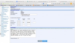
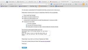
AAdvantage unsubscribe screen
AAdvantage finally asks me for my email prefs… as I’m about to unsubscribe.

I just unsubscribed from both my AAdvantage email accounts, mine and my teenager’s. I was getting several emails a week and it was pointless to read them since AA does not serve my local airport. But, they’re about to as a result of the USAir merger so I’ve made a point of making an occasional qualifying purchase to keep our combined 50,000+ miles intact.

Or, so I thought. I actually read one of these emails this morning, and discovered the miles in both accounts had zeroed out. (AAdvantage does not bother with real-time reporting, so it showed 24,372 miles in my kid’s account while a couple lines below showing an expiration date a few days ago.) D’oh!

Why in the world, if American wants me as a customer, would they not send me a special announcement that the miles were about to expire and some information on how to preserve them?

AAdvantage Customer Service screen
Thanks, AAdvantage, now goodbye.

And why in the world would they continue to flood my inbox with emails when I hardly ever open any of them? A best practice followed by many marketers today is to warn customers they’ll stop receiving emails unless they take some action. But AAdvantage is the original mileage reward program and their policies have likely been around as long as people have been receiving emails. Which is probably also why I get so many emails from them; I can’t remember them ever asking me if I would like to specify preferences, until I unsubscribed today.

So, AAdvantage has done its job, which is to pry loose some miles fair and square. But American Airlines has lost a couple of potential customers who fly frequently and could have been on its ALB routes very soon. I fail to see how that’s a good thing.

P.S. Don’t know if they are still doing this as I am no longer an active member, but United’s Mileage Plus had a promotion they would send to people with expiring miles, asking if they wanted to convert the miles to various subscription offers. I’m sure they earned some nice revenue from this partnership at the same time they kept members up to date on their accounts. Another example why AAdvantage’s assumption of primogeniture–I’m right because I was here first–is actually obsolete and clueless.

Google Engage, did you have a seed list?

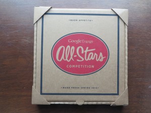
Google Pizza Box
Google Engage Pizza Box mailing; note protective corners

I often get promotions from Google Engage, the division charged with boosting AdWords sales to agencies. They spare no expense to make sure their message gets across. They’re one of the last big users of dimensional mailers, and they take extra care to be sure the package arrives in pristine condition. This mock pizza box, for example, had corners protectors spot-glued to protect it and was further protected by shrink wrap (which I’ve removed).

PizzaBoxInside
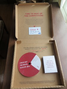
Inside the pizza box, as the marketers intended you to see it. Click the picture for a closer view of the wording on the gift card.

Inside, we have a promo that uses the built-in stage management of the pizza box effectively. This is a competition of some sort, and there’s an involvement device (the wheel), a box with rules, and a $40 gift card to pay for pizza since you’re going to be spending a lot of late nights in the office planning your AdWords campaign. The message on the gift card says “Late Night Pizza. Sound Familiar?” Very clever.

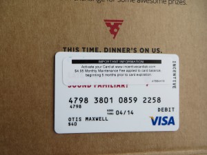
However, the first picture doesn’t show the package as first saw it when I opened the box; the second one does. There’s an ugly security notice across the gift card that hides the copy message, promotes the issuer of the card, and announces a $4.95 a month service fee if it’s not used quickly.

Google Pizza Gift Card with sticker
Gift card, as I actually received it, with security sticker covering the message.

I can’t believe this was what Google intended, and I’m sure at least one of of the project managers threw him/herself off the San Mateo Bridge on seeing this. (Why they chose an obviously cut-rate card company, after spending so lavishly on the other components, is a separate matter.)

The cure for this is to first, assume nothing. Don’t just order the cards, ask the issuer exactly how they’re going to look when they arrive. Second, do a check in the mail production house… this blooper could have been caught at that point, though I’m not sure what could have done since this is a time-value promotion. And third, address several pieces to seed names (without telling the mail house) so you can see it in the mail as your recipient does.

This promo arrived several months ago, and I can’t remember if a “please excuse the egg on our face” follow up was sent. I don’t think so, since it would have arrived Fedex like the original package and I would have noticed it and put it aside for later review as I did with this package. Too bad. It would have been fun to write that letter.

P.S. In case you can’t read it on the security sticker, the card issuer is incentivecardlab dot com. As of now, they’re not on my short list for suppliers.

New Crest tube is designed by idiots

Crest Tube
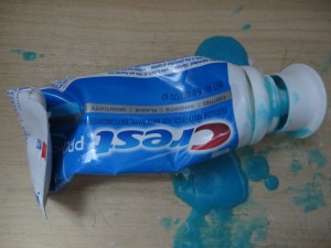
Crest tube can’t hold the toothpaste… brilliant
Do you have a mess like this in your toothbrush drawer? You will, if you’re a loyal customer of Proctor & Gamble and their flagship Crest brand.

Seems like the old tube with the small opening and the screw top wasn’t good enough for them, so they went to this great big cap that is supposed to pop on, but it doesn’t. And they also changed the formula of the paste so it’s more liquidy and oozes out all over the drawer.

Anybody know why they did this? Hard to believe it’s less expensive than the traditional tube. I think it’s a case of a/changing two things at once, which as marketers we know is folly and b/somebody with too much time on their hands.

I’m too cheap to throw it out, but as soon as it’s done I’m going to switch brands to somebody who still uses the old fashioned tube.

Why your writing could use an AutoCrit

I am working on a book, and before sending it out I wanted to eliminate as much sloppy language as I could. I’ve been experimenting with a tool called AutoCrit which I recommend to anyone who writes long form copy–and best of all you can try it for free.

The sample free report (which is limited to 500 words, but you can chop up your copy and make three submissions per day) will identify overused words and tell you how many to eliminate, and also identify cliches and redundancies. I was particularly happy at how often it flagged “it”, a trouble word that slows down readers because they have to take the time to figure out what “it” refers to if it’s not obvious.

The paid versions, which start at $47 for a year’s subscription (you can currently get 10% off with the promotion code fb2013), also identify repeated words and homonyms. Sometimes we repeat words intentionally, but sometimes it’s accidental, and the result is that the narrative loses texture and the reader might actually notice the repetition when the flow of your narrative should always be seamless with all grammatical tricks behind the scenes.

Homonyms are words that sound like other words–eg “in” which sounds like “inn”–and they’re mostly innocuous. But this feature will also catch words which can have more than one meaning, and those are deadly–“lie” being an example; the skimming reader might not know whether it refers to something in a prone position or someone who’s not telling the truth. (Something it doesn’t catch, but you should be vigilant against, is words that look similar to other words so they can be mistaken by the reader–“through” and “though” being an example pair.)

Seeing your text in the context of the report also helps you look at it with fresh eyes, and catch typos or awkwardness you might otherwise miss because you’re too close to it. I took perhaps 10% of the suggestions AutoCrit had for me, but that 10% has definitely improved my manuscript. Check it out.

It’s almost 2014, and mail order retailers still haven’t figured out gift order options

If you give a gift, you want to be acknowledged, right? At the very least the recipient should know the package came from you and has a bit of thought behind it. Yet some of the largest mail order retailers are doing a very poor job of dealing with this issue at holiday 2013, long after they should have figured it out.

I’m not that experienced at web giving—I order a lot online, but it’s either for my personal consumption or to be packaged and presented in person. The idea of trusting a mass merchant to honor my earnest attempts to find and deliver the right gift has always made me queasy. And with good reason, it turns out.

I wanted to send somebody two pairs of flannel boxer shorts found on L.L. Bean… a somewhat whimsical yet practical gift. To gift these I would have to spend another $6 per pair of shorts (which on their own cost $16 per pair) and deliver them in two separate gift boxes. I don’t expect to have a live human running around and picking my order in 2013, but I do think it’s reasonable to expect the retailer to anticipate items that might be grouped, like this order, and offer combined packaging. Failing that, give me a substantial discount on gift boxing when I order multiple items sent to the same recipient.

That order abandoned, I went to Eddie Bauer where I found a well-priced duffel bag for the same recipient. Into my shopping bag, appropriate information entered, all the way to checkout, and I realize I’ve never been asked if this is a gift even though it’s to a second ship-to address. I try the chat function and it’s unavailable so I ask for instructions for handling a gift to be sent by email. Several hours later, the only email I’ve received is a notification that I better hurry and complete the order because my item might sell out. I never did find out how to specify a gift message or buy gift wrapping at Eddie Bauer, assuming these services exist.

Amazon, as usual, sets the bar on this. Gift options always available unless it’s clearly specified they are not (as on large items, like snowblowers), and the charges for gift wrap are reasonable. Folks complain about how Amazon is stifling competition but if Bean and Bauer refuse to perform at the same level I don’t think the complaint is justified.

The final element of the gift giving process is, of course, the delivery. Amazon will include a personalized gift greeting, as will my old friend Liberty Orchards which still offers the option of a handwritten gift card at no extra charge. Packages which have the giver’s name printed on the mailing label, and that’s it, are an embarrassment and betrayal of the well-meaning giver’s good intentions. Maybe next year I’ll self-order a bunch of gifts and see what kind of greeting I get. I don’t expect to be overly impressed.

Behavioral Economics at DMA2013

Dan Ariely is a professor of psychology and behavioral economics at Duke University, and also a consultant to the Wilde Agency. Yesterday he delivered an entertaining and eye-opening keynote called “Who Put the Monkey in the Driver’s Seat?” in which he documented irrational and yet predictable human behavior for the benefit of the direct marketers at DMA2013.

First example: statistics for organ donor signups in European nations. Organ donation doesn’t hit all the altruism hot buttons because it happens after you’re dead, and the recipient will never know who provided the life-saving transplant. So it’s not surprising that donations are close to zero in some countries, such as Germany. Yet in demographically similar nations, such as Austria, donations are close to 100%. The difference? In the high-donor nations people have to opt out at their DMV if they don’t want to donate and people will do almost anything to avoid doing something.

ArielyInsurance
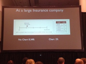
This buckslip produced a 588% lift.
Moving on to direct marketing: a large insurance company wanted to improve response for its affinity accidental death offer. So a chart was added on a buckslip, showing people that although they are eligible for $3 million in coverage at present they are only at $800K. It’s obvious at a glance that the reader is missing out. Given a reference point, response increased from 0.34% to 2%.

Another example is a response form for The Economist. Given the choice of an online-only subscription for $59, print-only for $125, or online plus print for $125, 84% opted for the last option. Who wouldn’t—it’s like getting online for free! But in fact it’s a significant upsell for anyone who was considering an online-only subscription. And when the print-only option was removed the numbers reversed: 68% went for online-only, vs only 32% for the online plus print combo.

ArielyBigData
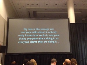
Ariely poked fun at the direct marketer’s infatuation with Big Data.
As a creative practitioner, I eat this up. It’s one thing to sell your prospects through a positive reception of your carefully presented benefits, but much better if you can cement the sale by making them feel like they’ve gotten a great deal or they aren’t missing out. As to that organ donor stat, most of us have found that negative option offers (in which you have to opt out to keep something from happening) lead to poor pay-up, conversions and renewals. But if the consumer is dead, I guess that isn’t a problem. Fascinating stuff.

It’s all about positioning, isn’t it?

Today’s Wall Street Journal had a nice anecdote from a gathering of retired American Airline employees. A flight attendant remembered a flight where there were 125 Kosher meals on board and only 50 people said they’d ordered Kosher meals. With a normal meal service, they’d run out of options and everybody in the back of the plane would get a Kosher meal whether they ordered it or not.

Solution: the crew announced that American was testing a special menu and the first 50 people to press their call buttons would get to try it. The meals sold out quickly. The Kosher labels were stripped of and what might have been a “I didn’t ask for that” complaint turned into an anticipated treat. All because of the right positioning.

I’m old enough to remember the days of meal service on airplanes, how about you? I also remember the frequent flyer’s trick of always ordering a special meal (Kosher was good, as was the fruit plate, but I always went for the seafood plate if available) on the premise that if it was custom-prepared it would be better (not always true).

Do you have a favorite recollection from the “golden age of flying”? Let’s get together at DMA 2013 next week in Chicago and compare notes. I’m leading a panel on Wednesday the 16th at 10 am with Dawn Wolfe of Autodesk and Philip Reynolds of Palio+Ignite. It’s all about positioning, what else? Come see us!

“I work for ME”—Neil Young

This year Farm Aid was held in my little town of Saratoga Springs, NY, and I got to spend a beautiful day in the audience. It was a lot of fun. Lots of farmer advocacy, lots of great music. As darkness fell a bunch of cigarette puffing bozos surrounded me and I slipped out and watched the excellent webcast from the comfort of home.

That was when I got to see Neil Young do something that every freelancer would love to do—tell some jerkoff to go f*ck himself. Neil was meandering between songs, talking about a musician he knew who committed suicide, and an audience member became impatient and called out, “Come on, let’s go!”

Neil Young at this point stops in his tracks and says, “Come on, let’s go? Did I hear ‘come on, let’s go?’ Buddy, I work for ME!” After a long awkward moment the music resumes.

This is what it’s all about, isn’t it? As freelancers we give up the certainty of a paycheck, benefits and predictable hours for the chance to be our own boss. At least we get to call our shots, though. And possibly you have had the pleasure of telling an impossible client it is time to part ways. It’s a mixed blessing: on the one hand, you may be eating kibble for a few weeks. But on the other, you exercised an option to maintain your integrity that would not be available if you worked for someone else.

Neil Young’s 2013 Farm Aid performance is archived on YouTube. It’s great stuff… just the man and his harmonica, guitar and piano completely filling the stage. “Come on, let’s go” is toward the end, just before he plays “Changes” by Phil Ochs who did indeed commit suicide. Listen, appreciate, and give a virtual high five to another freelancer who is not going to compromise on principles.

Serotta Bicycles and the “quality of time”

BenSerotta
Ben Serotta explains the “quality of time”

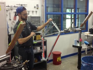
Last month I got a tour of Serotta Bicycles, a world-renowned high-end facility located in my little town of Saratoga Springs, New York. These bikes cost from $4800 to over $28,000—and that’s just the frame. But the painstaking details make it seem worthwhile—from a machining process that can take a stock titanium tube and give it 3 different diameters and three different thicknesses, so it has light weight along with the perfect balance of strength and flex at every point along its length. The total process from beginning to end takes about 40 hours to produce a finished frame; the shop turns out an average of 3 per day.

All the other visitors were current owners who’d come to see the mother lode, and there were esoteric questions about discontinued models and “why don’t you use steel anymore?” (Google that one with Serotta in the search box.) Finally I had to ask the question, why does it take 40 hours instead of 39 or 41? How do you know when it’s done?

Founder and President Ben Serotta said it’s about the “quality of time”. He wouldn’t amplify on that and when I asked a local bike evangelist and Serotta enthusiast to explain it to me, he was silent. So there’s a bit of mysticism afoot here and I will make a couple of educated guesses.

SerottaAlighing
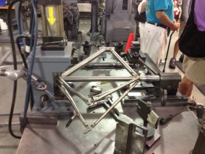
Frames are aligned after every assembly stage, making this the most important machine in the shop

First, quality of time means diminishing returns. As nearly perfect as these bikes are, the finish will never be completely immaculate. (Even though in the final polishing step they use 2500 grit sandpaper, which feels as smooth as a baby’s bottom.) There’s got to be a point when an hour produces so much less benefit than the hour preceding it that you’re spending your own money or raising the price for no good reason, so you stop. Second, bicyclists spend a lot of time in the saddle. If incredibly subtle details can make for a more productive or efficient or competitive ride and so improve their quality of time, they’re worth doing.

Both these hypotheses have application in copywriting. As a creative practitioner, I charge several times what a junior copywriter would charge and there are people who charge several times more than me. Here the time you are paying for is experience—the knowledge and instinct based on past work that a particular message and way of presenting that message will work better than all others. It’s probably not necessary to hire a senior copywriter to write a coupon for your dry cleaning establishment; someone who can follow basic common sense marketing rules (and mayn can’t) will be fine. But if you’re planning to mail millions of people or launch an elaborate website, then the cost of the creative becomes a relatively minor one and it pays to pay more for the best.

SerottaFinish
Final step: polishing with 2500 grit sandpaper

The other way to look at “quality of time” is in the experience of the user—the prospect or retail customer who is the recipient of your message. The more time you spend understanding that person’s preferences and motivations—whether through research or hunches—the better their experience is going to be when they receive your message and the more likely they will respond positively.

I may never be able to afford a Serotta bike but it’s something to aspire to—especially because the way to making the money to buy one lies in maximizing my own quality of time.