Is this the John Caples of 2014?

Neetzan Zimmerman
Neetzan Zimmerman

Almost a century ago, John Caples wrote one of the most famous direct response ads of all time: “They laughed when I sat down at the piano. But when I started to play…” Caples combined a homespun way with words and a scientific approach to analyzing the interests of his audience, as documented in his classic Tested Advertising MethodS.

If John Caples were to re-animate, be zombified, or simply time-shift to the present day, what would he be writing now? Maybe something like the work of Neetzan Zimmerman, who was recently profiled in the Wall Street Journal. Zimmerman doesn’t write space ads, long-form direct mail or emails. He’s an editor at the website Gawker, where he’s charged finding story threads that are so irresistible, people not only read them but pass them along, in huge viral numbers, to their friends.

Zimmerman was responsible for “Mom Fined $140 Every Day Until She Circumcises Her Child” and “Black Man Arrested Dozens of Times for ‘Trespassing’ While At Work” among countless other gems. His posts generate an astonishing 30 million page views a month, more than all other Gawker contributors combined. When they linger on his posts, web visitors see the ads that accompany them; that’s the Gawker revenue model.

According to WSJ, Zimmerman’s ability to draw traffic allows Gawker to subsidize other deeper and longer pieces. He’s the equivalent of a retail loss-leader, but with words. Like Caples, he combines a scientific curiosity with the ability to connect with his audience on the topics they care about—“cute, outrageous, heartwarming, hilarious, anger-inducing” being some typical threads.

Zimmerman starts each day by analyzing the metrics (Twitter and Facebook mentions) for popular stories, then deciding which ones to pass along. “Within 15 seconds, I know whether an item is going to work,” he told WSJ. “It’s a biological algorithm… I’ve put myself into the system—I’ve sort of become the system—so that when I see something I’m instantly thinking of how well it it’s going to do.” He adds that he can no longer tell the difference between stories he finds interesting and stories that will be popular. “If it’s not worth posting then I’m not interested.”

Lee Euler, a savvy newsletter publisher who was my client at one time, describes this as “the common touch”. It’s not enough to write well, to know your subject and audience, to deliver up benefit statements that get readers reaching for their wallets. To be a truly great and consistently control-busting copywriter you need to be able to connect with people on a visceral level, where they trust you and want nothing more than to hang on your every word. It’s a rare gift, and this guy seems to have it.
How to get more page views for your copywriting blog

Would you like to increase the traffic on your marketing blog or copywriting web site through organic search results? Here is an accidental success story that may help.

I have another blog, Burnt My Fingers, which is specifically about food and cooking. It’s a fun, niche project and I have never worked too hard to pump up the metrics. But in the last 3 months my page views have increased by well over 100%. How come?

I wrote a post called “Why I’m not buying a Sansaire sous vide device” which was an offshoot of some earlier articles on this specialty cooking method. Well, turns out there is a lot of interest in this gadget and the buzz is only increasing as the holidays roll around. Do a web search for “Sansaire” as many shoppers might and there’s my post, close to the top of your search results. It looks like a negative review (it actually isn’t) so is just the sort of thing a shopper might want to read as part of their research.

The good news is that search links to this specific post account for only about 25% of my new page views. The rest are from the activity of users once they get to the site: they browse around to linked articles, then my recipes, which is exactly what you hope they would do if the article they came for is relevant to your core content vs. link bait.

The key to this accidental success story was finding a topic a certain audience wants to read about, vs something I wanted to write about. Think about the interests of your audience—then think about how you might mine that with catchy content that draws them to your site.

Is that a telephone in your marketing program, or are you just glad to see me?

My early client Roy Chitwood of Max Sacks International told a funny story involving a rookie sales guy who loved to get busy signals on the phone because he could tally them as completed calls… “that’s one more out of the way”. But according to a recent story in the Wall Street Journal, many of today’s younger salespeople no longer know what a telephone is (let alone a busy signal).

They’ll email when a previous generation would have called, even to someone in the next cubicle. This probably explains the profusion of chatty lead generation emails I get that are written to look as if they’re from a casual acquaintance, often “confirming” something (usually a webinar) that I supposedly had expressed interest in. Easy to send, even easier to get rid of with the delete button.

Direct Marketing Partners, a California-based outfit I’ve done some business with, has a different idea. They still use the telephone the old-fashioned way for marketing, and with spectacular results. It helps that their clients are typically selling expensive, complex products or services which justify a high cost per lead.

The first thing DMP does is a canvassing operation to get the telephone contact information for people on the business lists they rent or compile, and to confirm the recipient is the right person for the pitch. If not, they’ll find out who is the true buying authority and add that name, address and phone number to the list.

Then, a direct mail pack goes out which is intentionally “high impact” with features or a theme that is easy to recall. As an example, one recent promo I worked on with DMP (and Beasley Direct Marketing, their frequent collaborator) included a poster of the Curiosity Mars landing, rolled up in a clear plastic tube.

DMP follows up a couple of weeks later with people who did not respond to the direct mail offer. They open the call by asking, “do you remember that tube you got with the poster inside?” and a high percentage of prospects do indeed remember. Then they deliver the same pitch that was in the mailer, which usually concludes with the offer of a highly attractive premium in return for setting a sales appointment.

The results of these campaigns can be spectacular—often the total number of leads generated is 3 to 5 times the initial number from the direct mailing. It helps that the DMP phone reps are intelligent and well spoken, and receive training in the product and the interests of their audience, so the call becomes a two-way conversation instead of an irritating canned pitch that might as well be recorded.

I also thinks it helps the DMP effort that so few of their competitors are using the telephone. (I’m not including robo-calls which are a worse plague than Lyme disease.) It’s become a novelty to get a call from a smart, involved person who is selling something you actually want to buy. Maybe more marketers should pick up that phone.

Obamacare with a New York accent

As a small business owner, I turn out to be one of those people who doesn’t get to keep the health insurance I like. We got the letter from our provider yesterday, advising us to go right to the New York State site thus avoiding the healthcare.gov train wreck. Unfortunately, mystateofhealth.ny.gov isn’t much better. I tried to register about 30 times each time getting the message that my session had expired as soon as I hit the “submit” button. It didn’t help that I had to get over a check of my preferred username to be sure no one else had it, and answer a particularly hard to read Captcha. Why in the world would they think bots would be trying to set up health accounts?

My wife had better luck today and got a good way through the application before the website went down. There were two drop-down menus at different points, one to identify our current health carrier and the other to identify our auto insurance provider (not sure why they need this info). And here’s the thing: the menu listings were in random order, vs. alphabetical. There were easily 100 health carriers and even more auto insurers so you just have to scroll back and forth till you find the one you’re looking for, and I bet there are lots of mistaken choices. My wife was able to find our health insurer. But when it got to auto insurance she scrolled and scrolled, back and forth, and finally realized our carrier (USAA) wasn’t on the list. So she put down “none” because that was the best choice available. Doesn’t exactly help the state exchange with the actuarial part.

Where do they get the people who code these sites? Isn’t there any kind of darwinism in government that rewards people who strive harder to do a good job? I know a lot of you will say “what a stupid question” but I really do try to have faith that people entrusted to help other people will take that responsibility seriously. So this is discouraging, and I hope we don’t get sick before we get insurance.

The Retailization of Heath Care at DMA2013

This was the best session I attended at the Direct Marketing Association’s just-concluded annual conference, featuring a CMO from a large insurer and a finance exec with huge experience in retail at Google, with excellent moderation from another healthcare exec. A few takeaways:

Tremendous change in the healthcare industry is underway, and it’s not just because of Obamacare. Used to be insurers could underwrite and consumers had no choice because they got insurance through employers. Now insurers have to accept everybody and consumers can shop around. Over the next 10 years a trillion dollars will shift in the industry as consumers shop around.

Google perspective: Google is where people come when they have concerns about their health. Worried about a diagnosis or a pain, they google it. They have a serious reason for being there and are making a critical decision about their health. 50% of queries now related to healthcare reform. Many queries from mobile devices and about Medicare… so it’s absolutely not true that “people 65+ don’t use the Internet”.

How healthcare is marketed: focus moving to retail. Consumers want self service. Price transparency is not necessarily a bad thing; retailers have known this for 10 years. (Retailers lead the way because their margins are razor thin so they have to be agile.) Insurers are worried about protecting their brand with standard Gold, Silver, Bronze levels. But customers not just interested in lower price, they will pay more for value if you demonstrate it. This is how Nike, Coach, Tiffany maintain a premium price.

The customer experience: companies need to add a Chief Customer Officer who reports directly to the C suite. Insurers are used to saying no to their customers; we’re in a new era where they need to learn to say yes. Don’t let your org chart show: if the customer goes through a phone tree and they have to answer the same health or personal questions they just answered to a new person, that’s your org chart showing. Customer has to be at the center of your business model, just as they are in retail.

Where should you spend your next dollar as a healthcare marketer? Traditional model was very straightforward: send people a mailer or an agent, they sign up. Now they may get input from a number of places. Most marketers don’t cover the fact that you’re watching an ad then go to Google and search; they don’t have a search strategy combined with their TV buy. Mobile devices a big black hole because there is no equivalent to a cookie to find out how they researched their decision on their phone or tablet, then moved to their computer or the other way round. Gamification may become part of the marketing process: reward people for learning about the health.

What’s the impact of the startup problems at healthcare.gov and the state exchanges? People assume that the Internet “just works” so this has been a profoundly negative experience. We know from retail that when people experience this kind of “choke point” they don’t return. But ACA is a marathon, not a sprint. The question is how well the government will respond from here.

Behavioral Economics at DMA2013

Dan Ariely is a professor of psychology and behavioral economics at Duke University, and also a consultant to the Wilde Agency. Yesterday he delivered an entertaining and eye-opening keynote called “Who Put the Monkey in the Driver’s Seat?” in which he documented irrational and yet predictable human behavior for the benefit of the direct marketers at DMA2013.

First example: statistics for organ donor signups in European nations. Organ donation doesn’t hit all the altruism hot buttons because it happens after you’re dead, and the recipient will never know who provided the life-saving transplant. So it’s not surprising that donations are close to zero in some countries, such as Germany. Yet in demographically similar nations, such as Austria, donations are close to 100%. The difference? In the high-donor nations people have to opt out at their DMV if they don’t want to donate and people will do almost anything to avoid doing something.

ArielyInsurance
This buckslip produced a 588% lift.
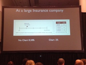
Moving on to direct marketing: a large insurance company wanted to improve response for its affinity accidental death offer. So a chart was added on a buckslip, showing people that although they are eligible for $3 million in coverage at present they are only at $800K. It’s obvious at a glance that the reader is missing out. Given a reference point, response increased from 0.34% to 2%.

Another example is a response form for The Economist. Given the choice of an online-only subscription for $59, print-only for $125, or online plus print for $125, 84% opted for the last option. Who wouldn’t—it’s like getting online for free! But in fact it’s a significant upsell for anyone who was considering an online-only subscription. And when the print-only option was removed the numbers reversed: 68% went for online-only, vs only 32% for the online plus print combo.

ArielyBigData
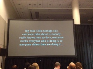
Ariely poked fun at the direct marketer’s infatuation with Big Data.
As a creative practitioner, I eat this up. It’s one thing to sell your prospects through a positive reception of your carefully presented benefits, but much better if you can cement the sale by making them feel like they’ve gotten a great deal or they aren’t missing out. As to that organ donor stat, most of us have found that negative option offers (in which you have to opt out to keep something from happening) lead to poor pay-up, conversions and renewals. But if the consumer is dead, I guess that isn’t a problem. Fascinating stuff.

Onsite at #DMA2013

I just arrived in Chicago for the Direct Marketing Association’s annual conference and have already seen a couple of great sessions and met some folks that made the whole trip worthwhile. (Also happened to walk down Michigan Avenue as the marathon was being run and got to see both the men and women winners.) If you’re here please email me via the contact form or tweet to @otisregrets and hopefully we’ll find a time to meet up.

I’m leading a panel at 10 am Wednesday with Dawn Wolfe of Autodesk and Philip Reynolds of Palio+Ignite. The topic is “KISS: Keys to Copy and Content that Generate Results” and we’ll talk about how to apply powerful and simple communications techniques to selling complex products. Attend and you will see and learn:
* A refi direct mail offer that was so successful, it drew a cease-and-desist order
* An insider’s view of ED (erectile dysfunction) advertising
* how to sell software through “gamification”
* and much more!

This is the last breakout session of the conference and the exhibit hall will have shut the day previous, so there’s absolutely no reason not to join us. See you one Wednesday October 16.

It’s all about positioning, isn’t it?

Today’s Wall Street Journal had a nice anecdote from a gathering of retired American Airline employees. A flight attendant remembered a flight where there were 125 Kosher meals on board and only 50 people said they’d ordered Kosher meals. With a normal meal service, they’d run out of options and everybody in the back of the plane would get a Kosher meal whether they ordered it or not.

Solution: the crew announced that American was testing a special menu and the first 50 people to press their call buttons would get to try it. The meals sold out quickly. The Kosher labels were stripped of and what might have been a “I didn’t ask for that” complaint turned into an anticipated treat. All because of the right positioning.

I’m old enough to remember the days of meal service on airplanes, how about you? I also remember the frequent flyer’s trick of always ordering a special meal (Kosher was good, as was the fruit plate, but I always went for the seafood plate if available) on the premise that if it was custom-prepared it would be better (not always true).

Do you have a favorite recollection from the “golden age of flying”? Let’s get together at DMA 2013 next week in Chicago and compare notes. I’m leading a panel on Wednesday the 16th at 10 am with Dawn Wolfe of Autodesk and Philip Reynolds of Palio+Ignite. It’s all about positioning, what else? Come see us!

“I work for ME”—Neil Young

This year Farm Aid was held in my little town of Saratoga Springs, NY, and I got to spend a beautiful day in the audience. It was a lot of fun. Lots of farmer advocacy, lots of great music. As darkness fell a bunch of cigarette puffing bozos surrounded me and I slipped out and watched the excellent webcast from the comfort of home.

That was when I got to see Neil Young do something that every freelancer would love to do—tell some jerkoff to go f*ck himself. Neil was meandering between songs, talking about a musician he knew who committed suicide, and an audience member became impatient and called out, “Come on, let’s go!”

Neil Young at this point stops in his tracks and says, “Come on, let’s go? Did I hear ‘come on, let’s go?’ Buddy, I work for ME!” After a long awkward moment the music resumes.

This is what it’s all about, isn’t it? As freelancers we give up the certainty of a paycheck, benefits and predictable hours for the chance to be our own boss. At least we get to call our shots, though. And possibly you have had the pleasure of telling an impossible client it is time to part ways. It’s a mixed blessing: on the one hand, you may be eating kibble for a few weeks. But on the other, you exercised an option to maintain your integrity that would not be available if you worked for someone else.

Neil Young’s 2013 Farm Aid performance is archived on YouTube. It’s great stuff… just the man and his harmonica, guitar and piano completely filling the stage. “Come on, let’s go” is toward the end, just before he plays “Changes” by Phil Ochs who did indeed commit suicide. Listen, appreciate, and give a virtual high five to another freelancer who is not going to compromise on principles.

Twitter Bios: the 160 character sales pitch

Here is a great project for your copywriting class or inhouse brainstorming session: give everybody five minutes to write the best possible Twitter bio, which has to be 160 characters or less, including spaces.

Your Twitter bio is what shows up in another user’s inbox when you follow them and they make a split second decision about whether to follow you in return. The New York Times had a nice sidebar piece in which they join Slate and the Washington Post in anointing Hillary Clinton’s bio a superb example of the craft:

Wife, mom, lawyer, women & kids advocate, FLOAR, FLOTUS, US Senator, SecState, author, dog owner, hair icon, pantsuit aficionado, glass ceiling cracker, TBD …

It states her qualifications, though not in a pompous way. It veers off into some relevant light touches (Hilary’s lack of hair savvy and her predilection for pantsuits are well known non-presidential attributes) which are amusing without being frivolous.

A bio like that promises that the tweets also will be interesting, and that you may meet other cool folk by following her. It’s much more effective than a straightforward statement of qualifications, or an unabashedly promotional bio like the one Lady Gaga is currently running: BUY MY NEW SINGLE ‘APPLAUSE’ AND PRE-ORDER MY ALBUM ‘ARTPOP’ HERE NOW!

Before writing this post I checked my own neglected bio for @otisregrets and found it pretty terrible:

Results-focused ad copywriter; blogger about writing, marketing, customer service, technology and more.

I gave myself the five minutes and came up with:
I write direct response ads, web pages, emails, direct mail & whatnot. Gold Echo & Caples Silver Cup winner. Guilty pleasure: streaming bluegrass videos at work.

Some work qualifications hopefully written in a  casual way… but I don’t like the personal aside because it might imply to some that I bill for time when I’m actually not working. (I don’t.) So I tweaked it to:

I write results-oriented ads, web pages, emails, direct mail & whatnot. Gold Echo & Caples Silver Cup winner. Read my blog for marketing tips & off-topic rants.

The blog’s a good call to action since that is indeed where I want the reader to go next, and the throwaway about “off topic rants” will hopefully garner curiosity. I’m sure I can do better but I only had 5 minutes. Let me know how you do on your bio.