Attention copywriters: nobody likes a downer….

Just finished watching “Young Adult” with Charlize Theron. The good news: great performance, solid directing. The bad news: it was free on Amazon Prime, barely 12 months after release. And therein hangs a story….

This movie is a downer. A ghost writer of “young adult” fiction gets a birth announcement for the baby of her old boyfriend. On a whim she decides to return to her small hometown and win back the old beau and in the process gets tangled up with a former classmate who was or was not gay but in any case was maimed by jocks who thought he was gay and now is as physically crippled as she is mentally. Are you laughing yet?

I wanted to see this movie when it first came out based on some trailers showing Theron trying to hide her dog checking into a motel and other deadpan moves. So did 8 or 9 other people but it didn’t work. The plot is incredibly depressing and you do not leave the film with an uplifted morale. So nobody wanted to see it except a very few who told their friends to stay away.

Moral for us copywriters is, nobody’s going to read something that makes them feel bad. Okay to turn on the spigots of negativity, but be sure to transition to that golden shower of redemption before you’re done… AND you need to let them know at the outset that said redemption is in sight. Make sense?

Too much of a good thing from Values.com?

HenryFordValuesBillboard
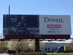
Values.com billboard in Latham, NY

I pass this billboard frequently on a busy highway in upstate New York. It has multiple inspirational headlines stacked like cordwood: Driven/ Innovation/ Pass It On/ Values.com. To the left, a photo of Henry Ford (we know it’s him because there is a caption that says Henry Ford), driving (not being driven in) an early horseless carriage. The net effect is too much of a good thing, and I see it all the time, so I finally had to write about it.

Part of the problem is that the placement is a stone’s throw from Troy, NY, birthplace of the Arrow shirt, the cast iron stove, Uncle Sam and The Night Before Christmas among innovations. It sticks in our craw that they chose a non-local for their innovator. But the bigger issue is the multiple inspirational sayings when just one or two would do. It’s like too much candy on Halloween.

I headed over to Values.com to learn more about exactly what inspires them to inspire. It’s an interesting website. You can’t join them or give them money or get money from them; they’re doing this because “We believe that people are basically good and often benefit from a simple reminder.” Fair enough, and a good reason they deserve a little gentle nudging to make sure those reminders are effective.

There’s a section on the website called “Billboards” and on it you can create your own values billboard and look at it online, or look at billboards others have created. Each has one photo, one headline and one value and works a lot better than Values.com’s “Driven” effort. Give it a try. (But be sure your inspiration is not something naughty like “beer” or you’ll get a server error.)

By the way, what the website does not say is that Values.com is apparently funded by evangelical Christian Phillip Anschutz, who according to Wikipedia has also funded a think tank that criticizes evolution and a ballot initiative designed to overturn local and state laws that prohibit discrimination against individuals on the basis of sexual orientation. If I were Mr. Anschutz, I would identify myself and make my case on the website rather than leaving it to the curious visitor to go googling and draw their own conclusions.

Headline hijinks revisited with Bose, Wall Street Journal and Coke Zero

Bozz
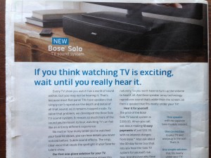
Bose speaker ad
We’re back as promised to that corridor of horrors where tyro copywriters go to die. But this time we’ll focus on the context in which your headline/outer teaser is read and include a couple of positive examples.

First, some badvertising from Bose on the back of a Sunday newspaper insert… about as broad a demographic as you can find. “If you think watching TV is exciting, wait until you really hear it.” There are two things wrong here. First, the copywriter assumes universal agreement that “watching TV is exciting”. If it’s not a head-nodder then the reader is lost. But do we all agree that “watching TV is exciting”? Not likely. Second, there’s an intellectual contortion required to stay with the writer’s train of thought. When you switch from one action mode to another (watching… to listening) that’s some heavy lifting for the reader to do in their mind’s eye. Not likely they will stay around for the body copy, and neither shall we.

wsjwelcomeback
Wall Street Journal “welcome back”
Now look at this envelope from the Wall Street Journal: “Welcome Back”. Apparently I renewed after a lapse but don’t remember doing so; naturally, I’m going to open the envelope to see what I agreed to. And when I get inside it turns out this is their standard “professional courtesy discount” offer; they WANT to say welcome back and maybe I will feel a little guilty about getting an offer that maybe I’m not entitled to so you can guess I’ll jump on that. The two simple words “Welcome Back” do a brilliant job of framing the conversation and getting me involved.

CokeZeroDontRead
Coke Zero “don’t read” banner
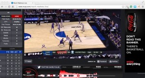
Same thing with this Coke Zero banner that ran during the NCAA championship game: “Don’t read this banner. There’s basketball on.” Well, of course I’m going to read it because I can’t not do so. But in this chest-bumping environment I will give you huge points for the apparent cool factor. Yet it actually ties perfectly into their tag line, “enjoy everything”.

The copywriters on the WSJ and Coke Zero projects thought about the environment in which the prospect is viewing the ad, and meet them on their own turf. The Bose copywriter asked readers to switch from what they’re doing to what the writer wants them to think about. Which is better and more effective?

No thank you to Citi “Thank You Points”

I used a Citi “Thank You” card as my main purchasing vehicle for maybe 10 years. Its attraction was that it credited travel points for miles on any airline (at the time, unheard of) and I amassed some 300,000 points and paid the $75 annual fee each of those ten years. Then, about a year ago, I happened to have a question about my account and the telephone rep told me that virtually all my points were expiring in 90 days. I could purchase travel for a future date but if I didn’t buy something before the deadline they were gone.

So, my wife and kid went to visit friends in Germany in high season at a ridiculous price and we used more points on a family vacation. There were still tens of thousands of points left over so I transferred them to a new, no-fee Thank You card and cancelled the paid card. A few months later that card’s points are about to expire so I have been scheming to get some value out of them. It’s an expensive time to book travel so I’m looking to buy gift cards for places where I spend money. Meanwhile, from Citi’s perspective, I’ve transitioned from a presumably profitable customer paying a high annual fee to a fee-free and soon to be ex-customer.

While I’ve been spending way too much time negotiating with the Thank You folks, I have wondered whether there are any useful marketing lessons to be gleaned. Certainly the strangest policy is to let points expire without notifying the customer. It’s not like you get an AAdvantage statement where you can see that you need to book travel before a certain date to keep your old points; the whole procedure is invisible unless you log onto their website. Why in the world don’t they send me notices that warn, “your points are about to expire, here are some great offers from our partners”?

And about that website. You can check your points from your Citi card login which takes you to a rather promotional and unhelpful website, but there is a shadow thankyou.com website that you will never see unless you establish a separate log-in with a username and password that have different rules from your Citi card login. Yet this secret handshake is required for certain privileges, such as redeeming for Amazon purchases which they offered me recently (that’s how I found out about the separate website). And I don’t consider myself a web troglodyte. What happens with people who barely know how to log on, or still do their business by phone?

Thus, when I got an invitation to take a survey and say how happy I was with Thank You Points, you can bet I swooped down on it like a hawk on a chicken. A few days later I got an email from a certain [redacted], inviting me to call her and explain why I would not recommend Thank You to a friend. Apparently she had tried repeatedly to reach me by phone, which is peculiar because my cell is listed in my Citi contact information and there is no record of calls from unidentified callers. I called her back and left a message, also emailed her, and she did not return my call or respond to the email. But I was more than ready to share my opinion, so I am doing it here. [UPDATE: she finally did call me. See the comment for an update, plus why it took so long.]

What can marketers learn from all this? First, the points expiration seems ridiculous, but any expiration must be treated as an opportunity to contact your customer. Not doing that is just crazy. It’s lost revenue and lost good will.

Second, byzantine websites that require the user to decode your intentions are not okay. (If you want to book travel, the main reason I got the card, that link is buried in the bottom menu of the page of “rewards” below bubbly cross-promotions.) If you aren’t willing to meet your customer’s needs with clean and logical navigation, they will go find somebody who will.

Third, don’t play games by telling me you’ve tried to contact me when you haven’t and then not responding to my calls and emails. That’s middle school stuff.

To be fair, I haven’t reported some nice transactions with Citi folks on the phone trying to solve these problems but neither have I described every problem I’ve had with this program; there’s lots more. Also, full disclosure, I bought Citi stock when it was in the toilet and have made enough to pay for the points I lost. But not for the aggravation.
Headline Horrors (outer envelope teasers that don’t)

Fresh Air camp appeal
What buses? Where are we going?

It’s been far too long since we’ve visited the Badvertising Hall of Shame… that corridor of horrors where unfortunate marketers teach us by example what NOT to do. Let’s begin with this outer envelope teaser from Fresh Air Fund.

This is a seasonal appeal I used to struggle with when doing work for Salvation Army… the “send an inner city kid to camp” fund. It seemed less urgent than putting food on the table or rescuing a child from the streets, and it was complicated because you’d have to create a word picture of why this was important before the reader got away. No missteps are permissible.

So look what Fresh Air Fund has chosen as its teaser: The buses are leaving soon… please hurry! What buses? Am I supposed to be on one? Why on earth does this not say instead, “The bus is about to leave for camp without me… please help!” (Singular better than plural because it’s more specific, and let’s mention the reason for the appeal for chrissake.) Also, while camps are universally recognized as a good thing buses are not. Seems like a terrible choice for the opening salvo in this appeal. Next.

Personal and Confidential OE
Do you believe this?

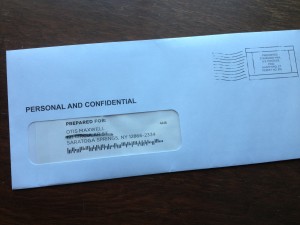
From… I don’t know who because I never opened it… I have a blind outer with nothing but PERSONAL AND CONFIDENTIAL printed above my name. Maybe I notice the “standard postage” indicia that spoils the illusion, but maybe I don’t; they’ve done a good job of designing something that looks like a real meter imprint.

But, look what’s above my name: PREPARED FOR: Okay, that’s too much and it’s also discordant with PERSONAL AND CONFIDENTIAL which suggests a very individualized letter, maybe a collection notice, whereas PREPARED FOR suggests a mechanized process like maybe a refund. Either would have been good on its own, together they cancel each other out. The blind outer has lost its intrigue so out it goes.

Pella 72 hour sale
When did the 72 hour sale begin anyway?

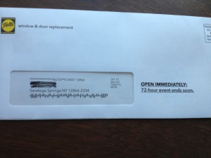
Finally we have this from Pella: OPEN IMMEDIATELY: 72-hour event ends soon. Well, is it 72 hours or isn’t it? If it is, it ends in 72 hours, not “soon”. The contradiction completely bursts the bubble of urgency and anticipation. Also, since this is clearly a piece of advertising mail, there needs to be more reader context, eg “Hurry! You’ve only got 72 hours to save” or “Open for your private invitation to our 72 hour preferred customer sale”.

That’s enough for today. Three examples in which the client or product manager is wondering why their mailing was not more successful, when in each case the fault lies with the copywriter who is probably making mischief on another campaign right now. I’ll have a couple more good ones in my next post.

The wrong (and right) way to use infographics in your marketing

Infographics seem to be the newest arrow in the art director’s quiver. Why say it with words when you can throw in a clever graphic? I’m fine with this as long as it enhances the communication, but recently I’ve seen some examples in which the visuals actually got in the way.

Rovi infographic
Rovi infographic

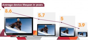
Here’s a simple infographic from Rovi (they’re my client, but I wasn’t involved in this) which demonstrates several best practices. The stat is about the effective life of different categories of device and it turns out the bigger the screen, the longer it tends to stay around. So the designer created a graph in which time is expressed by the size of the screen and is reinforced by the more precise timeline at the top. It’s memorable and instantly understandable. It pulls one fact out of a longer article which is particularly appropriate for visual expression.

Less good are infographics in which a legend is required to understand what the visual is communicating—in other words, there are design objects that symbolize something and then off to the side there’s a caption that says what they mean. This is a necessary feature with complex charts but an infographic is not supposed to be complex. If you need a legend to make your point, start over.

Google+ infographic
Google+ infographic

Still less good are infographics in which numbers are just translated into graphics with color and clever type treatments. This seems to be the most common type of faux infographic. Our friends at eConsultancy shared this classic from Google+ in “How Not to Make an Infographic: Four Examples to Avoid”. (Sorry it’s tiny; click through to the jpg then click on the magnifying glass to blow it up.) There’s nothing in these numbers that could not have been said just as effectively with simple words. The graphics don’t add anything; they’re arbitrary and don’t add the visual revelation we saw in the Rovi example.

Finally, at the bottom of the barrel, we find infographics that are actually incomprehensible. This is the kind of work I’ve seen from a couple of would-be infographics designers who pull out words or numbers that look important, then turn them into graphics and assume they will support the text. But it doesn’t work like that. An infographic has to work on its own as an element of the message.

None of this is news, of course. Edward Tufte’s The Visual Display of Quantitative Information, first published in 1983, has great examples of infographics dating back to the time of Napoleon. I wish some of today’s would-be infographers would read it.

The new American is arriving

I love the new commercial announcing the US Airways/American Air merger. It’s stirring, and poignant, and on-message. Who would have thought that a corporate merger could make your heart swell with pride? They did it with an emotional tug at the appeal of new beginnings… an empty airport becomes filled with promise and we remember that flying used to be romantic and exciting. Here’s the script, as narrated by John Hamm:

It’s time to make a change.
It’s time to become better versions of ourselves.
To be greater than you expected.
And more than you had hoped for.
So starting now, we begin a new chapter.
One written in passion, and skill, ambition, and sweat.
One where two companies take the best of themselves to create something better.
And when all is said and done, we will not only have become a bigger airline
But also something so much greater.
So let’s introduce ourselves to the world…
Not again, but for the very first time.
The new American is arriving.

What’s even better is that the spot was completed on February 12 (per the slate at the beginning), the day before the merger was announced, so it would seem to have been produced in record time. How did they do it? Perhaps it was in the can in anticipation of the event (which had been publicly discussed for several weeks), but I like to think they (McCann Worldwide) quickly threw it together using footage from the recent “Change is in the Air” campaign which debuted last month.

That campaign, by the way, fails for me in the same way this new spot succeeds. All the people stopping what they’re doing to look into the skies seems manipulative and unlikely, and also brings unfortunate echoes of 9/11, especially the peek at the tail of the plane disappearing over the top of the building. The evolution from that campaign to this one is to be applauded. I also like the fact I’ll finally be able to use my AAdvantage miles, since US Airways but not American flies to my local airport. Well done.

Priceline cancellation process… smart, or sneakily stupid?

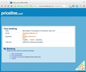
Priceline Change reservation Page
Can you find the cancellation link on this page?

[This post is preserved for historical reasons only. See UPDATE below.]

I booked a hotel through Priceline’s Booking.com subsidiary where you don’t have to pay up front but do have to give them a credit card with advance notice required if you cancel. Then I did need to cancel and found it surprisingly difficult.

The email confirmation made no mention of a cancellation procedure. I went back to the confirmation page on Priceline and there was nothing there about cancellation either. I poked around with searches for “cancel” on the Priceline website without success. I emailed the hotel at the address in my confirmation email and got no response. Finally, I called the hotel and they had no record of the reservation. They said since it was made through booking.com I’d have to go back through them.

So I did go on the booking.com website and entered the reservation number and PIN I’d been given and it took me to the page shown here. Notice there’s no cancellation option, just the choice to “change” my booking. I chose that and was then able to cancel without further difficulty.

I’m wondering if Priceline has run the numbers on the effects of this process, which is definitely more sneaky than what I’ve encountered on hotel sites and also on other aggregators like Expedia. On the one hand, there are probably people who, faced with the difficulty to cancel, just say screw it, I’ll stay there after all. But how often does that happen? Don’t you generally have a good specific reason when you cancel a reservation?

And the net effect on me is that, similar to CarRentals.com with its deceptive pricing policy, I’m much less likely to use booking.com in the future. How is that a good thing for them?

UPDATE as of June 2015. I used booking.com for a recent stay, and had to cancel. Happy to say that the cancellation procedure is completely transparent. There’s now a prominent link on your confirmation email that says “manage your booking” and when you click to that page there’s a prominent (red) “Cancel” button. Very pleased with this change in policy, which I assume was made by Priceline not out of the goodness of their heart but because it makes sound business sense to be up front with your customers.

Legal advice for freelance copywriters

I had, then lost, a new client this month. The breaking point was a work for hire agreement that specified I could not work for any company “in the same business” as this client for two years after working for them. My problem was that the document did not specify what business the client was in! So I added a phrase to do this, and they rejected the edit because they wanted to reserve the right to go into other, new businesses in the future. We thus went our separate ways.

This is not the first time I’ve lost work by declining to sign a legal document I felt was unreasonable. Once a small agency (whose client base was banking, not the CIA) wanted me to sign a commitment never to show any work I had done for them or even say I had done it. Since a freelancer needs to prove experience to get work, this didn’t seem a good idea. It’s not the same thing as signing an NDA (non-disclosure agreement) which I’ve done many times and simply holds the contractor responsible for keeping confidential any trade secrets revealed during the project.

What do you do to protect your legal rights while still getting new business? Do you show everything you are asked to sign to a lawyer? Do you have a lawyer draft your own estimates and contracts? I don’t. For one thing, the cost of the lawyer would cause me to raise my rates to a level the market wouldn’t bear. For another, if there ever were a legal complaint the cost of defending it would most likely put you out of business anyway, so the best defense is to act ethically in all your dealings and hope it never happens. This is the “reasonable person” (nee “reasonable man”) concept in which you honor any commitment, in writing or not, in a way that meets the expectations of your profession and the business community.

When I’m asked to propose an agreement to a client (as I’ve done a number of times in retainer relationships) I write a letter, in plain English, and put a place for both of us to sign at the end. I describe what it is I’m delivering, how it will be judged as satisfactory and complete, what are the payment and delivery terms, and how either party can get out of the contract. I deliberately keep it simple. Again, if they want to outwit me with a legal shenanigan they can do that easily enough but I’m hoping a satisfactory working relationship is more important.

Do you have professional liability insurance that would defend you if a client claimed a business failure was your fault? I don’t… see above, if you ever get a claim it’s probably going to put you out of business insurance or not. If you do purchase this insurance be sure the business you are in is clearly defined. You probably want it to be “advertising consultant” not simply “freelance writer” and you want to get a clear commitment from the insurer as to what is covered.

One type of insurance I do have is a “studio” rider on my homeowner’s policy (I work in a separate building on the same lot where our house is located) that covers the cost of business equipment, some business interruption costs, and personal liability as it relates to people who come on the property. Once a delivery man was surprised by my German Shepherd (long since deceased, by the way) and jumped off the second floor balcony; the insurance paid for his medical bills and time lost from work.

That’s what I do to protect myself legally. I’m sure it could be better, but I feel like it handles the worst scenarios. I’m gratified that most of my contracts, even for some fairly large clients, are still made with a handshake rather than a legal document. How about you?

Do Initial Caps Improve Response?

I was half-dozing through a Google Adwords tutorial the other day when something woke me up: the instructor’s advice that you can improve results by putting all the words in your ad, but especially your keywords, In Initial Caps Like This.

David Ogilvy must be spinning in his grave as if on a rotisserie. He railed against ALL CAPS in Ogilvy on Advertising because they deconstruct a word and turn it into a bunch of separate letters which the reader must look at one by one in order to make sense of it. Readers don’t do this. If there is any impediment to readability, they move on.

I have always assumed that Capitalizing The First Letter Of Each Word presents a similar problem, and I thought Ogilvy wrote about it, although I can’t find the source right now. But it’s the same issue of comprehension. Inappropriate use of initial caps means the reader sees individual words, not phrases, so it’s that much more trouble to seamlessly absorb the message. What’s more, overuse of initial caps gives your advertising a kind of stilted, affected, 19th century look. It’s certainly not what you want if you are selling a product or service which is closely attuned to the needs of 21st century consumers or businesses.

For these reasons I’ve always advised my clients against unnecessary initial caps, and often changed their copy if I get my hands on it. That’s why the Google “tip” is so demoralizing. Have people stopped reading copy completely, so they no longer have the mental acuity to focus on more than a single word or at most a keyword phrase?

Please, tell me it ain’t so. If you have testing experience with standard capitalization (what Microsoft Word calls “Sentence case”) vs initial caps, I’d love to hear the results. If initial caps are indeed the wave of the future, I’ll accept that. But I Won’t Like It.