I am working on a business-to-business lead generation campaign in which I was given a bucket of information “assets” to sprinkle as offers throughout the series of contacts. Included are several infographics. I find myself reluctant to use them and I wonder if I’m alone in this.
It’s one thing to visit a web page and find a graphic that tells a story with images and type design, more effectively than words could do alone. That’s what an infographic is supposed to do. (I have previously complained about infographics that don’t get over this easy hurdle, and seem to be just a way to keep designers employed.) But how do you get people sufficiently interested that they’ll click through or give their contact information to see the infographic?
A search for “infographic” in my email archive doesn’t come up with a lot of examples. Here’s CEA Smartbrief:
What’s the ROI of Brand Advocacy at Retail?
We were curious about the value of turning retail employees into brand advocates. So we conducted an independent academic study that crunched two years of data on 63,500 sales associates in over 330 locations — and discovered that brands with customer-centric brand training sell up to 69% more. Download the infographic.
And here’s an ad for Citrix, on the Infoworld: Mobilize newsletter:
Infographic: Mobile Workspaces Enable New Ways to Work
The number of workers who telecommute is expected to increase 63% in the next 5 years, but the technology to support this is lacking in most organizations. Mobile workspaces that follow people anywhere, across their devices, secure enterprise information and afford the ultimate in productivity. SEE THE INFOGRAPHIC.
And here’s Russell Kern’s ROInsider:
Download our easy-to-read infographic on Big Data to learn what it means to connect with today’s consumer.
I like the first example because it sets up the graphic as support for one surprising fact. I’m interested in Kern’s reassurance that his is easy to read, implying that’s a hurdle with infographics. And Citrix treats the word “infographic” as equivalent to “white paper” or “special report”; there’s no additional advantage or baggage.
But what I’d like to know is whether the promise of an infographic performs as well as or better than these other, tried and true, information delivery vehicles. As a business prospect, I’m a bit embarrassed by the idea of clicking on a promised infographic because of the implication I can’t handle words so I’ve got to get my information in pictoral form—like a comic book!
Another issue with infographics is how they are to be accessed. Do you really expect me to cheerfully and willingly download a picture as I would a white paper, which I accept must be absorbed offline? And what am I going to do with it when I get it? By definition, infographics are supposed to be quick reading. Now I’ve read it, and I’m done, and I have this unwanted download (possibly with a virus attached) to dispose of.
Then there’s the practical aspect of reading the infographic: most are huge, and require extensive scrolling on the screen. That goes against everything I know about lead generation offers: if you make it difficult for people to get at your promotional information, they’re much more likely to abandon it than to struggle through.
I saw a study some years ago (from eMarketer, I think) of the comparative effectiveness of various lead gen offers (white papers, sales kits etc with interactive calculators being the best performing). I’d love to see infographics evaluated in this mix. My hunch is that prospects will view an infographic on a web page if you describe it in a compelling way, but they’re not going to download it. So that’s how I’m going to handle it in my project, and I’m going to couple it with another offer. They can go to a page and see our interesting visual, then give us a bit of contact information if they want to delve further with a related written document.
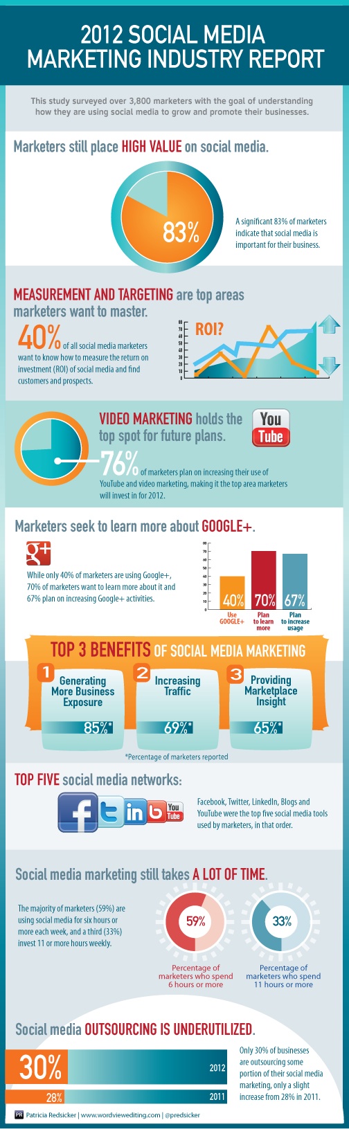
In writing this post I searched “infographic” on Marketing Sherpa, which is all about direct marketing case histories, and found just one which is the example above. This is on the blog of a company that sells travel insurance, and it appears they promoted it through quite a few channels, so I don’t know that it’s helpful in answering my question about the effectiveness of infographics for lead gen. (The article does mention that it was tested in emails against a “just plain insurance” message and achieved a 96% lift, but that is what I would expect with any offer vs no offer.) If anybody has any hard stats of whether infographics work, please share!