Product wrapup from CES 2011

A product I didn’t expect to like, but impressed me, is the $449 neo-I from Optoma. it’s an iPod dock that has a sweet sound system and a picoprojector that projects a reasonable size image (say 3×5 feet) on a wall). They demo’ed it in a mocked up college dorm (beer bong not included) which looks like a great user case.

The product most likely to go nowhere: the Atrix suite from Motorola. In a year where everybody is selling a unified device in a do-it-all tablet, Motorola wants you to buy a component set that includes a phone that hooks into a dock that turns into a PC with a wireless keyboard that turns into a content input device for your HD TV. They call this a “PC in a phone” but it’s really an internet device with a few specialized apps; the demonstrated benefit was being able to show your vacation videos wherever you go. Nobody is going to want to buy and organize all these pieces of equipment. And to make it worse, their wireless partner is AT&T, master of dropped signals and a no-show at CES.

Under the radar technology that was getting the most attention: Hand gesture input for televisions. Like the Xbox Kinect, the Asus TV with PrimeSense has a microcam pointed at the viewer that reads your hand gestures so you can, for example, change channels by waving your arm up and down. A lot more elegant than yet another remote, even if it has a motion sensor like the Wii.

User interface design at CES 2011

Chopped arugula at ShowStoppers

There’s always a nice buffet at the ShowStoppers press event at CES. This year it included a beautiful arugula salad with orange slices. Trouble was, the long strands of arugula fell off the tiny plates they gave us. So by the end of the evening the kitchen was chopping the arugula into pieces that didn’t fall off the plates. User interface problem, solved.

It is not so easy for a consumer electronics company to change direction with its user interface, and I think that a lot of worthy products never get a foothold in the market because of poor or simply unfamiliar choices about the way the consumer interacts with them. This is allegedly the “Year of the Tablet” at CES, and indeed it is with hundreds of models on display. Tablets don’t have keyboards, so you have to design a way for consumers to manipulate the on-screen icons that is intuitive.

BlackBerry PlayBook
BlackBerry PlayBook

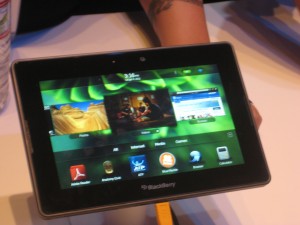
Most copied the iPad model with a grid of apps icons that you can select by touch. BlackBerry’s new PlayBook did something different and I liked it. There is a horizontal band of icons actual running applications [thanks to Peter Hansen, below, for this correction] across the middle and a dock of smaller favorite icons at the bottom. It’s a cleaner interface with much less on the screen. You can flick the band to left or right to expose more icons. When you want to activate an icon enlarge an application’s window you tap it and it fills the screen, but you can get back to a desktop by “rolling in” the edge from any of the four inner edges of the bezel. After a minute I was using it with ease. I wish RIM success with this device, although I’m a little nervous that they have not announced a battery life.

Apps menu on LG TV
Apps menu on Samsung TV

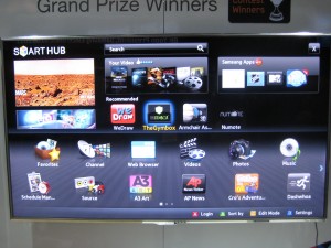
Less successful are the TV Apps I saw from Samsung and LG; I’m sure they are available from other brands as well. High-end “smart” TVs have a menu screen that looks like an overgrown iPad with big icons for sports programming, partner channels, and their own version of apps, mostly games and kid activities. The whole idea seems like a non-starter to me. How many people fiddle around with their TV menu instead of going right to the menu of the TiVo or set top box they’re familiar with? And tabbing among the icons with a handheld remote was awkward and reminded me how much more intuitive a touchscreen is.

A giant electronics company can absorb a mistake, but the same may not be true of  Anti Sleep Pilot, a device that mounts on your dashboard and monitors the driver’s performance and alerts you if it’s time to take a break. This is a very serious subject and a worthy thing to do but I wondered how they went about deciding how exactly to alert you and nobody at the booth could inform me.

The demo video shows a melancholy Dane who looks like he’s quite willing to cooperate but I wondered how it would be sold to Americans who are distracted to begin with. Here’s where the user interface makes a real difference. I’m told the warning sign, after you fail a certain number of tests, is a “chime”. Did they test that vs a buzzer or siren? I hope so. This is a product that truly will live or die by its interface. I watched it at ShowStoppers while munching my arugula.

GadgetTrak scribes best press release of CES 2011

GadgetTrak is a service that, if your smartphone or laptop is stolen, will snap a picture of the perp using the webcam and identify their location within a few yards, then forward the information so you can turn it over to law enforcement.

They could have told me about this with a standard press release that begins, say, “GadetTrak expands innovative protection service at CES 2011” but instead they sent this one which starts “Don’t Come to Vegas without Bringing Protection”. Smart and relevant double entendre. Then, they deliver the product pitch in a personal context a blogger can appreciate:  a reporter had his backpack stolen, and all the products he was going to review were lost forever… something that would not have happened if they were registered with GadgetTrak.

And finally, an offer: journalists can get a free month of GadgetTrack protection during the show, so they can try the product for themselves. This is followed at the end of the press release by contact information, web address for the presskit and so on…. all material that I know is going to be in there so no reason to lead with it.

Contrast this with a journeyman effort such as this which came from Westinghouse, but might have been sent by any of 500 TV brands here: “Westinghouse Debuts New LED And LCD HDTV Lineups At CES 2011: Super-Thin, Energy-Efficient Westinghouse Lineup Flagshipped By 60” LED And LCD Models.”

See the problem? With competition like this, GadgetTrak wins the “flack of the year” award with a first-round pin. And they demonstrate why you always need to sell your reader on the benefit of paying attention to your message… whether it’s a press release, a direct mail letter or a job application.

What’s cooking at CES 2011?

On the plane heading to CES in Las Vegas, I decided to think about innovations I’d LIKE to see prior to reading my sheaf of press releases to find out what I actually am GOING to see. This year I’m not looking for any dramatic product category breakthroughs. Instead I’m on the prowl for stuff that makes our life easier, especially when it comes to food and eating related tasks.

The iGrill Bluetooth thermometer mentioned yesterday is a good place to start. It’s pretty intuitive how it works without knowing much more than the name. You can be sitting in front of the game indoors and still monitor the temperature of your meat (or perhaps the internal temperature of the grilling chamber) and when it’s done, get up and waddle out into the sunlight to collect your perfectly smoked brisket.

At $99, the iGrill seems a bit pricey for a one-trick pony. It would be nice if, after reading the temperature, it can do something for you… like turn off the heat (if it’s a gas grill) or dump a fresh supply of wood or charcoal on the fire. And hey, how about a really smart convection oven that can show you temperature and airflow in your oven in a heat map diagram on your iPad and you can move your finger around to adjust things? Or, a device that releases an even supply of steam inside the oven to produce a perfect loaf of crusty bread? That doesn’t need to be electronic, probably, just a fancy teapot with tricky vents and valves. I’m digressing a bit…

Lots of devices are integrated systems these days…. think of your dishwasher, or clothes washer, and the multiple functions that happen at the touch of a button. These things are controlled electronically, so theoretically it does not seem to me complicated or expensive to add a software interface that lets you monitor and modify what’s going on. Then add the Bluetooth connection and software on the computing device, and you’re in business, right?

Every year there are a number of platform areas at CES…. a number of vendors following a common standard such as X-10 or Zigbee. The booths often seem kind of sad and underfunded and it’s hard to see them starting a revolution. Meanwhile some of the big vendors, often Panasonic, will develop a technology on their own and if it takes off then others adopt it. Such is the inefficient platform development system in conumser electronics.

I’d also like to see a solution that lets you retrofit a remote control, software based interface to legacy gadgets… like Slingbox, but for my bread machine. I have been fiddling with one of these devices and it shows promise. So, what if I want to set it from the road to turn on and have a hot fresh loaf waiting  when I come home? Slingbox’s secret is that it uses infrared technology,… a communications channel between the home entertainment system and a remote that is already there. The only interface to the bread machine is your finger. But, you’re saying, I could do all the programming and have some kind of delayed device to give power to the machine. That might work on some models but not mine; you have to unplug then plug it back in to input cycle instructions.

I am eager to see if some smarter soul has figured out some of these things for me…..

Blogger preview: CES 2011

Tomorrow I head west for this year’s Consumer Electronics Show in Las Vegas. The word is that LAS is packed, hard to get a taxi or a hotel room just like in the glory days. I’ll be attending press events on Thursday and Friday night, visiting a couple of clients, and trolling the floor for new and noteworthy things to write about.

In last year’s preview post (inexplicably titled “On my way to CES 2009”) I talked a little about my philosophy of working this show. I also predicted that 3D TV would be a non-starter… you read it here, and many other places, first. This year is supposedly “the year of the tablet” which also happened in 2003; I am more interested in things you can do with the tablet, such as iGrill, the world’s first bluetooth cooking thermometer you can monitor from your iPad.

My task on the plane is to scan some 300 press release emails and see if there is anything promising enough to follow up. Tip to flacks: like most people who will be writing about the show, I’ve been filtering my CES emails into a special folder. So if you don’t say “CES” in the subject line, you’re not visible to us.

Wearing my consumer hat, I am going to find what the ^% is happening with the content side of streaming video. Was excited to get an HD Roku for Christmas. Not so excited to discover that Netflix has just 20,000 streaming titles available, NOT including anything by the Coens, or Dumb and Dumber, or the Southland series from TNT. I’ve read that the studios seriously underestimated the appeal of streaming and delivered their content to Netflix at a bargain price, but if they’re going to just pull it back then we don’t have a seamless entertainment experience, do we?

Stay tuned…

MP3 of my DMA social media talk now available

A number of folks have asked me to share the talk I did for the DMA in San Francisco in October, “How Twitter Killed Direct Marketing Copywriting (Just Kidding)”. I now have an MP3 of the audio which I will be happy to email you… just use the “contact” links on this site to get in touch.

I can also give you access to a private site where you can watch my Powerpoint slides with audio (which is same as the MP3) but it won’t add a whole lot because the DMA techs did not capture any of the videos. It’s a lot simpler to just listen to the MP3. Let me know if you want a copy (it’s a 13 MB file).

Are Groupon copywriters really worth $6 billion?

Groupon, which was featured in an earlier post and also in my social media presentation at the DMA in San Francisco, has recently spurned a $6 billion takeover offer from Google. Pretty cheeky…. considering that there’s nothing proprietary or patent-able about its business of delivering a daily coupon to your inbox with a big discount on a local business.

Indeed, Groupon is one of four coupon outfits I now hear from on a regular basis. BlackboardEats is doing something similar for San Francisco (except they don’t collect the money up front which is good for me but a poor profit model for them), Open Table has gotten into the act with discounts as well as reservations, and LocalSavings is giving Groupon a real run for its money here in the upstate NY area.

But Groupon’s emails are the ones I always open, and why? It’s the copywriting! Today, for example, in an offering for a Portuguese restaurant, the copywriter noticed it had small plates and delivered the following riff: “Small plates provide diners with a rare chance to act like a giant and yell “fee-fi-fo-fum!” at the waitstaff. Enjoy a make-believe growth spurt with today’s Groupon: for $20, you get $40 worth of Portuguese cuisine at Atasca in Cambridge.”

That’s the kind of extemporizing that used to get us yelled at by our bosses when we were cub copywriters… but as always it’s followed by solid research-based benefits including a description of menu items, a reference to its listing on a best-of directory, and a verbal capsule of the ambience:  “The in-house atmosphere is warm and romantic, bedecked with Portuguese art and fresh flowers, ideal for a smooch-inducing date or a platonic rendezvous with a band of surly Casanovas.” You can’t make this stuff up, at least you can’t day in and day out. I spoke to one restaurateur who was a happy Groupon client and he said yes, someone from Groupon did indeed call and interview him at length.

I have one worry for Groupon though, and that is its inability to attract quality advertisers in the hinterlands. In San Francisco and Boston, the specials are from recognizable establishments where I’d want to eat anyway. But in Dallas and Albany (all part of my quixotic geographical rotation) we tend to get tanning salons, car washes and second-tier pizza joints, the same folks who show up in Val-Pak.

If Groupon is going to grow beyond $6 billion they’re going to have to find a way to sell creative marketing to the late adopters. If Groupon should happen to implode, at least there will be a lot of good copywriters available for hire in the Chicago area (where Groupon is based).

Allstate creates Mayhem with negative ad campaign

Copywriters love to write negative ads… they’re so much more fun than bland positive messages. But early in our careers we have it drummed into us that negative doesn’t sell. The reason is that the ad itself has no credibility. Rather than absorb an unrequested negative message, the reader simply turns the page.

I had to prove this for myself with a negative direct mail package to test against my control for Long Term Life Insurance at Met Life. Your chances of needing long term care are hundreds of times greater than the possibility of a home fire. Yet everybody carries fire insurance. Similarly, you have maybe a 1 in 10 chance of getting in an auto accident but the odds of needing long term care are 1 in 2. Getting worried yet?

The package bombed. Nobody wanted to read it. And I have stayed on the sunny side ever since…. with the exception of a few forays for my financial services client.  But now comes the Mayhem campaign for Allstate… which seems to be working, based on the way the campaign has expanded and the fact they are now running a “clips” spot for the holidays.

Mayhem points out all the bad things that can happen when you don’t have insurance or enough insurance…. with humorous depictions by the entertaining actor (who plays one of the dead family members on Rescue Me) Paul Dean Winters. My favorite is “Large Expresso” in which the bigwig executive, upset about losing millions in the market, spills a large expresso on himself and slams on the brakes… causing you to run into him from behind, your fault.

So we have two shibboleths broken at once, negative advertising and humorous advertising. Thank you Allstate (and thank you agency Leo Burnett).

UPDATE: Allstate’s PR folks contacted me to correct the spelling of the star’s name and to point out that Mayhem now has his own Facebook page. You can find it lower right on this Allstate site.

Terra Madre Day celebrated by Saratoga Slow Food

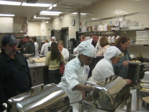
Yesterday was the local observance of Slow Food’s Terra Madre (Mother Earth) Day, sponsored and beautifully organized and presented in the kitchens and dining room of Schenectady County Community College chef and Saratoga chapter president Rocco Verrigni. I sat in on a mega panel discussion followed by a mega tasting of fare prepared by rising chefs; there were also student presentations and a screening of the short film “Green Beef”.

Chefs and farmers in the kitchen on Terra Madre day

The panel discussion featured local farmers (from Saratoga Springs down to the area below the Mohawk River), chefs and restaurateurs discussing their “successes, issues and stories”. Successes for me included clues of how these folks are taking small steps to become commercially viable. Tod Murphy of Vermont’s Farmer’s Diner has the goal of serving local and naturally raised meals at prices farmers can actually afford; he does this by negotiating with farmers a scale larger than boutique/retail/farmers market enterprises and by staying away from steaks. Michael Kilpatrick, a local farmer, described his success in bringing year-round vegetable growing to Saratoga; he is just 23 and I am happy he will be around far longer than me.

Slow Food snail cookies baked by SCCC students

Michael was one of several to describe an “issue”: it’s difficult to follow the national standards for “Certified Organic” so as a result none of them does it. Kilpatrick Family Farm can’t be organic because they use a sheeting product called Biotelo for their winter mulching and though biodegradable, it’s not organic-approved. Noah Sheetz, executive chef of the governor’s mansion in Albany, described another problem, which is the practicality of coordinating multiple purveyors for poultry, produce, dairy etc. plus having a backup when somebody’s delivery truck breaks down. Sysco, by offering one-stop shopping for quality products, has made it too easy for many kitchens; what’s needed is a Sysco for natural producers.

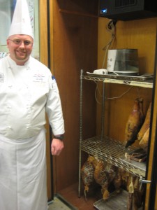
Chef Christopher Tanner and his meat curing closet

The food presentations ranged from a perfect half moon of roasted acorn squash to a groaning board of charcuterie prepared by the SCCC students in Garde Manger II, which has done nothing but make sausage all semester long. Chef Christopher Tanner showed off his curing closet for prosciutto and Westphalian ham, made by stripping the shelves from a wine cabinet and adding an off-the-shelf humidifier. Local students pay just $3533 for learning all this and virtually all of them are offered jobs in the industry at the end of their two-year program.

During the breaks there was plenty of time to talk with local farmers and make new friends along with lists of places to go and dine and find new food near Saratoga. The only bad news is that the season has ended for many of these folks (which is why they could take the day off) so I’ll have to wait for spring for many of my forays.

Editing advice for copywriters

I am working on my first “long form” direct mail promo in quite a while. This one occupies an 8 ½ x 25 piece of paper, folding down to six 8 ½ x 11 sides. It’s a definite schlep writing this thing.

I have always used the “Michelangelo David” approach to such projects, creating a block of marble by putting everything that comes to mind into a Word document then gradually whacking away until a finished form emerges. Each day I attack the project anew and at the end I have a draft that is hopefully closer than the day before.

Yesterday was what might be thought of as my torso-carving day; I’m getting down to the point where I am not close to finished, but the final form is beginning to take shape. I worked very hard for maybe 8 hours.

Today I picked up the 11 page single spaced manuscript to review it. It was terrible. Significantly worse than the work I’d just criticized my kid for preparing for Mrs. Brooks’ third grade class. My heart sank.

But I read on, and it got better… as I should have expected. I had had a poor start the day before. My poor decision today was to review that bad introductory copy first. I should have started at a point further in the manuscript when I had a firmer footing, then doubled back to that beginning-of-the-day messiness when I kept hitting my thumb instead of the head of the chisel.

Don’t review your copy start-to-finish. Do anything but. If you are lucky enough to have a schedule that permits multiple rewrites, start your review in a different place each time. That’s my editing advice for copywriters.