CES, Comdex and me (plus a few survival strategies)

CES 1979
On the floor at CES, 1979

I first attended the Consumer Electronics Show around 1980, when it really was what its name says. I was a young account executive working on the Federated Group, an “entertainment superstore” that was sort of like what Best Buy is today. Being low on the totem pole I was placed in the Showboat Hotel, a marginal facility located downtown. (Then as now, hotel prices skyrocketed during conventions; unlike now, you didn’t have the internet to comparison shop and find available rooms.)
3d pen at CES
Demonstrating a 3D pen at ShowStoppers, my favorite CES press event

The audience was mom-and-pop retailers who took a yearly junket to Vegas where they met with suppliers and made decisions about what to stock in the coming year. Betamax and quadraphonic were big. Even though I was not invited to the back-room discussions, I found myself fascinated by the opportunity to watch the watchers. I’d attend demos, and look at the faces of attendees as the features were explained. When their eyes lit up I would take note of hot buttons that might be used in my marketing.
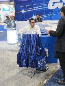
Fesco Bags
Collecting bags is a big deal at CES. Extra points if they are from obscure Chinese companies or are sturdy and actually useful.

By the 1990s I’d moved up through the ranks and then out, with my own freelance copywriting practice. My clients were primarily technology based and I started attending Comdex (the name stands for Computer Dealers Expo, which it was not; the focus was on much larger operations and installations) on a yearly basis as well as the much smaller Interop show in May. We now had the internet but not Travelocity or Kayak. My lodging philosophy was to rent a car and drive around till I found a room at a reasonable price. I stayed at some pretty scary places. I’d park that car on a north-south street (no longer in existence) parallel to the LVCC and walk about 10 minutes to the convention hall. Parties were plentiful (the best ones were from Oracle, IBM and other large companies for their clients, which usually included my clients) and I rarely paid for food or drink. Comdex was dealt a crippling blow by the events of September 11, 2001 and limped on for a couple more years before closing for good in 2003. I believe I attended the 2002 show and it was a shadow of its former self with many sections of the LVCC hidden behind fabric drapes.

Meanwhile, CES was picking up where Comdex left off and many of the largest vendors moved there. It became a place for big electronics hardware companies to show their wares and, as before, I could watch the audiences and see what I should be saying in my copy about these products. It also took on something of the third-world bazaar personality of Comdex in its wildest years, with massage chairs among the technology exhibits and adult entertainers in the lobby at the Sands (not by accident because AdultX was held at the same time, a schedule which has sadly gotten out of sync in recent years).

Massage chairs at CES
Massage chairs are an irresistible attraction for the foot weary CES visitor.

I’m not attending CES every year these days, since it has gone increasingly back to its consumer roots and most of my clients are b-to-b. So in lieu of my usual posts-from-the-floor, this year I’m sharing a few of my personal practices:

• These days, I always stay at the Econolodge on Convention Center Drive which is around $100 if you reserve well in advance. The only reason to do this is that it’s a 5 minute walk to the LVCC.
• Rent a car. They’re not that expensive compared to other jacked-up prices because most people take shuttles or wait in the endless cab lines. You’ll only use it to go from the airport to your hotel and for evening forays around the desert.
• Go on Yelp and explore local ethnic restaurants. Vegas has a vast array of Thai, Japanese, Vietnamese and Korean places that are insulated from the tourist traffic and prices.
• Go to In-N-Out on Tropicana at least once, unless you live in California and get to go all the time.
• Don’t go to parties. They’re not what they used to be. Don’t go to buffets. They’re no longer a bargain and the food’s not that good. And of course, don’t gamble.

Here are a few more dos and don’ts from someone who is on the ground this year as a vendor.

The USPS is getting better

USPS tracking
Tracking for my two-day Priority Mail package that took a week to arrive

Remember my fiasco with the Post Office last holiday season? This year they’re a lot better. They’ve updated their tracking tool, so you know what’s actually happening in their system rather than simply that it is “in transit”.

Using this tool I was able to determine that just 1 of my 7 packages arrived in two days as printed on the “2-Day Priority Mail” box. (To be fair, the clerk at my post office said it’s “two to three days”.) One just arrived today, after a week on the road. We’re getting there.

The age of the scary brand manager is upon us

Freelance creatives are familiar with the sales/marketing conflict at their client organizations: sales needs to generate business, while marketing needs to generate the maximum number of leads at the lowest possible cost. When good leads can be produced cost effectively, everybody wins. It’s an example of creative tension that produces a positive result.

But now there’s a new force to be reckoned with at many client companies: the brand guardian, who might be a product manager, an in-house creative director or some kind of special off-to-the-side position on the org chart reporting directly to the marketing VP. Unlike the sales and marketing folks, the brand manager is often not required to show measurable results. And their interference can do serious damage to your best work.

Companies have long been aware of the importance of a consistent identity, but social media has caused them to be ultra-vigilant. If you go off-brand in a way that’s tacky or politically incorrect or just counter to what your customers expect, you risk being excoriated like Gap with its new logo and Starbucks with its #RaceTogether campaign. The brand manager would appear to be a sort of flack jacket, taking a daily activist role to keep this embarrassment from happening.

The bad stuff occurs when setting and enforcing brand standards becomes a subjective process. These standards grew out of style guides and copywriting rule books, which were specific enough that they were easy to follow. You knew what colors you could and could not use, and you knew not to sound like J.C. Penney when you were writing for Neiman-Marcus.

But now, weighed down by “voice of the customer” screeds and “personas” for the various pilgrims you meet along the “buyer’s journey”, brand enforcement has gotten much broader and at the same time more arbitrary at many companies. (NOT all and certainly none of my clients—see below!) The only way you know for sure is when your hand is slapped for going off-message. And because they want to avoid this experience, many marketing managers are over cautious and will preemptively kibosh good creative because they think brand won’t like it.

Historically, good lead generation has had little to do with brand. If you want to start a conversation at a party, you don’t begin with your elevator pitch but with a statement you think will be of interest to the other person. If you’re DirectTV, a satellite provider with a huge brand investment, you trick people into opening your envelope by making it look like a personal invitation. Now that AT&T has acquired them, the difference is an AT&T logo on the back of the envelope. Brand can wait. Right now they just want to get leads.

Don’t take this the wrong way. Brand is good. I love brands. One of my favorite clients is an agency that specializes in helping companies define their brands. The damage is done when brand is apparently in conflict with good creative—something that should never happen because brand should not be “this is who we are” but “this is what we can do for you” or “this is how you feel when you use our brand”.

Brand is still about benefits, about you and not about me. But many brand managers don’t trust this. They’ll dial back powerful selling statements in favor of stilted, stuffy language that is somehow “brand-y”. This hurts your chance to win for your client by generating more customers and revenue through powerful copy. Same thing happens with graphics if you are shoehorned into a template that looks great but doesn’t follow principles of good eyeflow and doesn’t allow enough content to deliver a compelling message.

So what can you do? If possible, get an audience with the brand manager as part of your assignment. Ask them to explain why the standards are the way they are. Then, when you present the work, play back those explanations in the same way you quote from the creative brief. This gives the brand manager some skin in the game and may even win them over.

But that’s an ideal situation. At some companies the brand manager may refuse to even talk to you. They may argue there’s no need because the brand standards are already laid out. It’s obvious they’re being defensive—but the very reason you need to talk about standards is to be sure you interpret them correctly.

A brand needs to listen to its customers. It needs to evolve. Marketing is a key part of that conversation. As my sales training client Roy Chitwood says, “nothing happens till somebody sells something”. When a brand manager shuts you out of that conversation, everybody loses.

This post was inspired by conversations at my “Devilish Details” Ignite Session at the 2015 DMA conference, where over 100 creatives shared examples of good ideas gone bad. It has no bearing on any of my own clients, past, present or future.

American Red Cross blood donation marketing could use a shot in the arm

A family member died from a blood disease, so I’m sensitive to the importance of blood donations. I had not given in far too long when I stopped into an American Red Cross trailer a few weeks ago and donated a pint plus platelets.

The techs warn you at the time there’s no guarantee your blood will be acceptable, but I got a follow-up call a couple weeks later for another donation. I happened to be in a public place and the connection seemed to be poor. I asked them to call me back. Later, I reflected on the fact my blood must have passed muster or they would not have called me. Why didn’t they just tell me the good news?

Tonight, another call. Again the connection was poor, which I’ll now say is due to some budget choices on the equipment used by the telephone staff. There’s a drive this Thursday at Saratoga Catholic, would I prefer 11, 12 or 1 pm?

Wait a minute, I said. I understood there was something special about my blood from the previous call and I’d like more detail before committing. The rep read through a script about how important blood donation is. But what about my blood, what’s special about that? Well, you’re A Positive which is 34% of people but only 3% give blood. Further you’re able to give to A Negative donors as well.

I had to stop her there because I’m not available on that date but asked her to call again. I really do want to give blood and intend to, but this process is self defeating. Let’s see how it could be made better

1. On the first follow-up call, congratulate the donor on the fact their blood was found acceptable and is helping save lives right now. Why in the world would they not do this?

2. On the second call, don’t lead with generic blood donor motivators. Tell me what my blood type is and why that’s important, rather than have me ask for it.

3. Finally, don’t twist my arm. Calling me out of the blue and trying to set up an appointment right way is way too intrusive. How about a softer direct mail sell? And how about a secondary ask of a donation, which might help pay for the program?

DMA 2015 &then was a home run

&then2015, also known as #andthen2015 or simply the DMA Annual Conference, is in the books. The Boston event concluded with an emotional keynote from John Legend that wrapped up about 4:15 this past Tuesday, October 6. I would venture to guess that the event succeeded beyond anybody’s wildest hopes and dreams.

A huge format change had staff scrambling up to the last minute to get relevant information online. As a presenter, I was a bit worried about who might show up or if nobody would. But they came, and they were engaged, by a curriculum that somehow weeded out the self-serving promotional sessions of prior years as well as cutting a full day off the program by removing the Hall of Fame Luncheon, report from the DMA President and other excuses to take your client offsite for lunch.

I’ve rarely seen a mature organization give itself such a radical makeover and objectively the possibility of a failed event was pretty high. But these guys pulled it off and it really was the best of maybe 20 DMA conferences that I’ve attended. Special thanks and congratulations to my immediate contacts, Jeremy Ladson and Keith Baker of the programming committee. See you next year, I hope.

First review of $50 Amazon Fire tablet

Mine arrived today and I wanted to review it on the Amazon website but they said the product has not yet been officially released and can’t be reviewed so I’ll share experiences here. It’s a 2 or maybe 3 star product. Good performance and graphics, but due to interface problems it’s going back if I can’t fix it.

This is basically a delivery mechanism for Amazon products and services. If that’s all it’s good for they should give it away free, not charge $50. It’s very difficult to log in to anything other than Amazon’s own app store. (I tried to access the NYTimes app for which I had a subscription; they wanted me to get it through their Kindle store.) The second problem is that when you try inputting your user info after finally reaching a log in page, it autocorrects to nonsense. Can’t find a way to turn this off.

Not a fan.

Get a free copy of my book at DMA2015 &then

Update: DMA &then website has now been updated with full schedule information. Go to http://dma15.org/schedule/ to read all about it. BE SURE TO USE THIS LINK; the “build your schedule” menu on the home page of dma2015.org still produces the old placeholder content.

Here’s the session I am leading on Monday, October 4, from 4:45-5:30 at the DMA’s revamped &then conference in Boston:

Devilish Details: Looking for an Advantage in Your Copy and Design
An interactive sequel to one of last year’s most popular sessions, “The Devil’s in the Detail”. Share clever tweaks and clumsy misfires that made a big difference in creative execution and bottom line results—good or bad. Veteran copywriter Otis Maxwell will kick things off with examples of a few gems and gaffes, then you join the fun. Fabulous prizes for the best ideas!

This is an “Ignition” session which is designed for attendees to interact in a town-hall environment. I’ll share some examples of copy and design decisions that had a negative impact on campaigns, then make suggestions for how to improve them. After a few examples I’ll open things up to the floor and ask folks to share their own experiences which can be a/creative home runs and pratfalls they’ve experienced in their own work and what they’ve learned from them, or b/third party examples similar to my own.

While copies last, everybody who makes a meaningful contribution gets a free copy of my copywriting book, Copywriting that Gets Results!

Note: As of September 27, there is still placeholder copy on the DMA15.org website. This is the session in the slot called “Concentrating on the Detail: Copy & Color Choice”. That’s the placeholder title; what I’ve described above is the real deal.

Why too many good ideas can sink your direct marketing campaign

Front of Save the Children OE
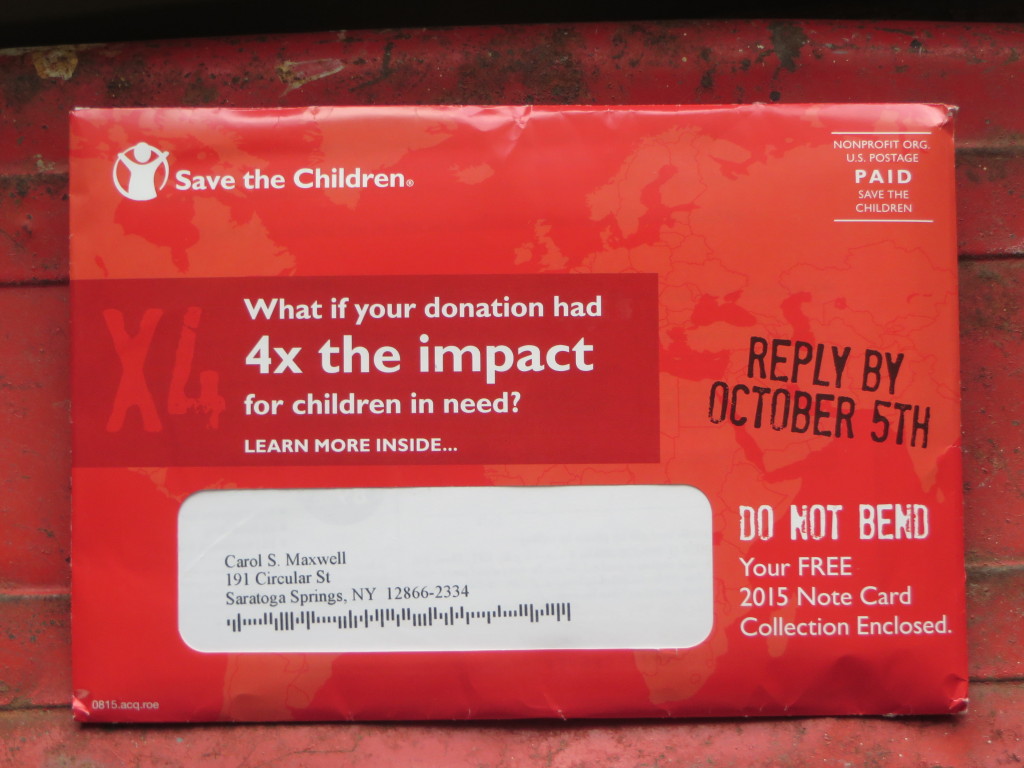
Save the Children outer envelope has lots of good ideas

It’s great that you are brimming over with good ideas. Unfortunately, your prospect is not nearly as enchanted with your creativity as you are. They’ll sit still for one powerful marketing statement, perhaps supported by a call to action subhead, then it’s off to the deleted messages folder or the recycling bin. When you put out too many good ideas, you run the risk of getting none of them across.

This Save the Children appeal is an example of too many good ideas. On the front of the outer envelope is this headline: “What if your donation had 4x the impact for children in need?” That’s a very legitimate teaser and it’s supported by the subhead “learn more inside…” Unfortunately, the reply-by date is a complete non sequitur. Does the 4x benefit cease on that date? Then there’s the free notecard statement which I’m aware is a popular fundraising technique in today’s society, but it appeals to greed which is a different motivator than wanting your gift to do the most good so it’s misplaced here.

Save the Children OE back
Still more good ideas on the back of the same envelope (click the photo to enlarge and read the quotes)

On the back there are MORE good ideas. Here’s a quote from Bill Gates that would support a package all by itself. When asked to recommend a top philanthropic cause on the Today show, he replied, “you can go to Save the Children—they help mothers have safe births… It’s amazing. You can be sure that [this organization] will put your money to good use.” A minor quibble, not everybody knows who Bill Gates is so I’d set the stage by saying he was the world’s richest man until he started giving away his money. Then we’d have a very nice setup for a direct mail pack or maybe a long form print ad.

Unfortunately, the Bill Gates quote is diminished by a quote from the Save The Children’s own president, in the same size type. Since she has maybe a tenth the credibility of a legendary philanthropist in this context, that should be the weight of the two quotes—or, better yet, leave it off. And we’re not done; the envelope needs to tell us that Save the Children has earned its 14th consecutive 4-star rating from Charity Navigator. For what? Hopefully it’s for using my money efficiently instead of spending it on administration and marketing. But tell me; don’t just show me the Charity Navigator logo.

Save the Children is a fabulous organization that really does great work; I was quite familiar with some wonderful packages written by my mentor Robbin Gehrke at Russ Reid. But this isn’t a winning effort. It falls victim to too many good ideas.

Coming to DMA &then in Boston? We’ll be talking about this and other examples of marketing milestones and miscues in my interactive Ignition session, Devilish Details: Looking for an Advantage in Your Copy and Design. It’s at 4:45 pm on Monday, October 4. See you there!

Copywriters, don’t spill your candy in the lobby

Bowtie Cinema urinal sign
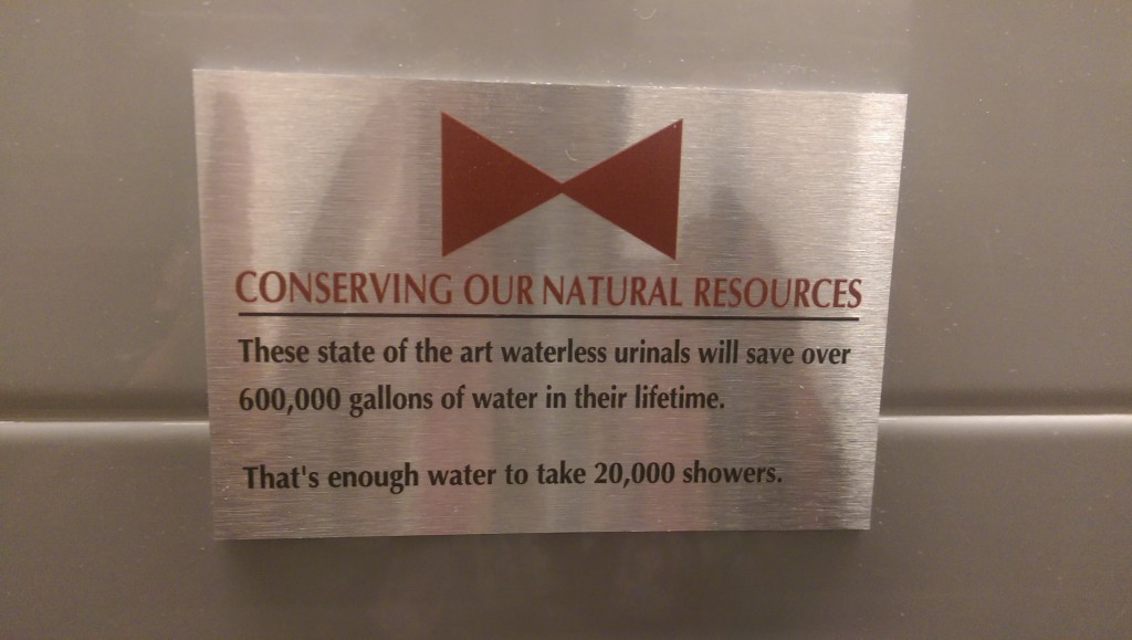
Sign over the urinal at Bowtie Cinema, New York

Gore movie maven and direct mail copy guru Herschell Gordon Lewis had a great admonition in one of his books: “Don’t spill your candy in the lobby.”* It means that you should not give away the premise of your selling message too soon but instead should take the time to build up some interest and curiosity. I have a good example in a OE teaser for Investor’s Daily which I show in my direct mail class:

40% are millionaires
35% have portfolios over $500,000
60% are in management
37% own two or more homes
What are they all reading?

Now, think what would happen if they left off that final line. You’d be fascinated by these impressive stats and would be thinking “who are these financial overachievers” and would tear open the envelope to find out. But IBD (which does not identify itself on the OE; the return address is an anonymous street address) has to refine the discussion and let us know they are selling a publication. If I’m not a reader, out it goes. The marketer spilled its candy in the lobby and arrives at the loge seating alone and empty handed.

I was reminded of this advice when visiting an actual movie theater the other day, where I spied the pictured plaque above the self-composting urinal. The initial message is praiseworthy: These state of the art waterless urinals will save over 600,000 gallons of water in their lifetime. Which is great, and they should stop there. But then comes the spillage: That’s enough water to take 20,000 showers.

It takes 30 gallons of water to take a shower? I had no idea… shame on me for taking so many showers. A positive message has been turned into a negative, unless this is exactly what the management of the theater intended. And maybe it is. But think what would have been the effect if the final line had been left off. You’d be left with a positive impression of the theater’s conservation practices, and that would be that.

* Actually, I don’t know if he said it or not but he’s said a lot of other clever things so I’ll give him credit for it.

Making the most of your Xiaomi Yi camera

I have been having fun with my Xiaomi (pronounced show-me) Yi, a GoPro knockoff I bought online for a little under $70. You can order on Amazon at prices that fluctuate, but always under $100, and there’s no reason not to get one of these and have fun with it and maybe even discover a practical use.


The two things I’ve been doing mostly are time lapse photography (see sample) and as an action cam that allows me to take it with me on forays to sandwich shops, farmers markets and potentially the Saratoga Race Course to document experiences for my food blog. You need some kind of mount for this purpose since your hands will be busy with your smartphone (iPhone or Android) which is how the camera is controlled. (At this price it does not have its own monitor screen.) So far I’ve acquired a head harness, chest harness and underwater mount (which blocks the microphone, so it’s not useful for above the surface work.) You’ll also need a mounting screw (it has the standard 1/4 inch receptacle in the bottom) and perhaps other hardware to attach to these setups. All of these are available at low cost on Amazon from Chinese companies that will take a couple weeks to ship to you. Also, you’ll need a micro SD card to capture your images and a USB external power supply if you want it for power intensive work such as time lapse photography.

I was initially self conscious about wearing the camera but folks don’t seem to care or maybe don’t realize it’s a real camera. I’ve used it on a selfie stick stuck out of my briefcase and on the chest mount, worn under a shirt with just the lens peeking out. Haven’t found the chutzpah to wear the head harness yet.

It’s oddly hard to find good info online about the extensive capabilities of the Xiaomi Yi camera. The manual is in Chinese and brief. The app is very good and frequently updated, but it’s not always clear what all the options are and how to use them. Here are a few random tips which I recorded simply because I didn’t see them anywhere else:

  1. How to know if you’re shooting video or still without looking at your smartphone? When you select video by pressing the front button, an additional light comes on, on both the top and bottom of the camera.
  2.  Wireless connectivity problems? Before you start the app but after turning on wireless on the camera, go to your settings and choose its network. You may have to enter a password which is 1234567890.
  3. There’s a function to transfer files from the camera to the phone (so you can watch them when the camera is not connected) but it takes forever. A much better tactic is to use the built-in micro USB jack to access the files from your computer and transfer that way.
  4. What’s the meaning of the colors on the front ring of the camera? It flashes when starting up then turns to a bright solid color. Blue fully charged, purple partway, red low battery. When hooked up via USB it is purple then red if you eject the card.
  5. The HDMI jack is for use with a monitor that broadcasts what the Yi sees, like for a security camera. Apparently it can’t be used to play recorded video/photos.
  6. Use the time lapse function under video, NOT under photo to make a time lapse movie. If you choose time lapse photos you will get a large number of individual stills which I guess are useful as a security camera. For time lapse you’ll definitely need external power (a brick that plugs into the micro USB port, which the Yi uses for charging) because time lapse is a huge memory hog.
  7. It was doubtless a cost compromise to use a removable cover for the area that houses the HDMI and micro USB jacks and the memory card and you are probably going to lose it. Don’t worry too much. None of these items is extremely fragile (no more so than the camera overall) so you’re unlikely to do serious damage if you’re taking good care of the camera overall. But at this price maybe you should just buy a second camera, just in case.