What we can learn from voters’ expectations versus their intentions

Ask me who I’m going to vote for in the Presidential election and you’ll get one data point, which might be a lie. Ask me who I think is going to win and you’ll get a far more reliable predictor. First, because I’m no longer on the spot for answering about my own vote. Second, because my answer will encompass my conversation with friends about how they’re voting, plus what I’ve heard and read and seen in the media and on people’s bumpers and in their yards. In essence, I’m speaking as a social network of one.

The above isn’t a hypothesis. The New York Times cites an academic paper by David Rothschild and Justin Wolfers that compares the predictive power of voters’ intentions (how they will vote) and their expectations (who they think will win). In the majority of presidential elections since 1952, expectations were the winner. According to Wolfers, a professor of economics at the Gerald R. Ford School of Public Policy at the University of Michigan, that’s because the expectations question taps into additional knowledge beyond the personal voting question, and of course “more information produces better results.”

In fact, the authors estimate that each expectation answer is equivalent to ten “how will you vote” answers, thus solving a problem that I didn’t realize existed: people today are much less responsive to polls. A few years ago, 40% of people polled would respond. Today it’s down to 10%, according to Andrew Kohut, the president of the Pew Research Center. Think about the number of polling calls you’ve likely received during this election and you can guess why that is. We’re oversaturated with polls.

As a marketer, I’ve often used polls as an involvement device. You can gather valuable useful audience information and then offer the finished poll to participants as an incentive to answer. As copywriters, we would never ask personal questions that make readers uncomfortable; rather we’ll be looking for ways to make them interested and eager to respond. We’ll automatically go for the “expectation” vs “intention” question, in other words.

You can also use polls to get people thinking about the benefits of your product by asking questions that show it in the best possible light. For example, one of my favorite controls is a package I wrote for Intuit for a new tax preparation product that wasn’t quite ready for prime time. I asked people what they’d like to see in a tax prep product, with multiple-choice answers that touched on existing and planned product features. The involvement made them invested in the product’s development and they were more likely to buy it as a result; this package remained the control during the entire lifecycle of the product.

But back to presidential polling, you’re probably wondering who is picked to win next Tuesday according to the “expectation” method. Read the Times article for that answer. Then come back at midnight on November 6 to see if they were right.

UPDATE: They were right.
Nerds are people, too!

Here’s a preview of the KISS panel we’re presenting at the Direct Marketing Association’s annual conference in Las Vegas. Come see us next Wednesday, October 17 at 9 am to get the full story!

When you’re selling complex products and services, that often have a high price tag, it’s easy to overcomplicate your marketing message. A copywriter might think, it’s hard to know which of the technical specs is most important so I better include all of them. Or, this buyer will need a lot of information in order to justify the cost. The problem is that ultimately you’re still selling to people. And we can only absorb so much information, especially when we may not have asked for that information in the first place.

The solution is to keep it simple—tell your complicated story in basic human terms that boil down to easily understood story lines and personal benefits. Because even if we’re the chief technology office of a large company, we’re also a human being and we will evaluate rationally but ultimately make an emotional decision.

For example, here are the “Six Universal Buying Motives” as described by Roy Chitwood at Max Sacks International. A powerful appeal may speak to more than one of these emotions. And if you are appealing to none of them you’re going to have a lot harder time making the sale.

1. Desire for gain (usually financial)
2. Fear of loss (again, usually financial)
3. Comfort and convenience
4. Security and protection
5. Pride of ownership
6. Satisfaction of emotion

Now, let’s look at how these might translate into a technology workplace environment:

1. Desire for gain (usually financial)
=career advancement, better performance reviews.
2. Fear of loss (again, usually financial)
=job security, avoidance of unpleasant surprises.
3. Comfort and convenience
=less late hours, fewer angry users/bosses.
4. Security and protection
=systems work as they are supposed to do.
5. Pride of ownership
=taking credit for a new and better solution.
6. Satisfaction of emotion
=elegant systems that make the enterprise work better

The moral: people are still people, even when they’re on the job and deciding which technical products to buy. At the end of the day they want to be praised for their good work, have a comfortable lifestyle because they’ve been promoted, and go home at a reasonable hour instead of having to solve headaches. And you can tell them how your product helps them do this.

There’s lots more KISS (keep it simple) creative on tap from Dawn Wolf, Philip Reynolds and me. Come see us at 9 am on Wednesday, October 17 at the DMA in Las Vegas!

For all you long-copy haters out there…

Screen grab from Stansberry's 77 minute online ad
Screen grab from Stansberry’s 77 minute online ad

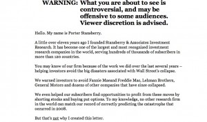
Direct marketing watchdog Denny Hatch had his knickers in a twist about the online ad shown here. And with good reason. It’s simply a long copy direct mail letter turned into a PowerPoint video and it runs 77 minutes (I am taking that part on faith since I lasted about 4 minutes) with no pause button and no call to action until the very end. The sell is for an investment newsletter which allegedly has 241,700 active subscribers, which I presume are the same as the 241,700 people currently viewing Otisregrets.

Stansberry's "don't leave" interrupter screen
Stansberry’s “don’t leave” interrupter screen

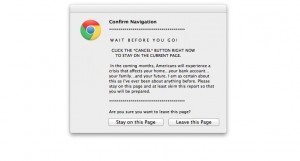
Hatch waited all the way to the end; I didn’t and clicked the close button, bringing up the frantic “WAIT!” alert usually reserved for adult content sites. I clicked the “stay on page” button … and was rewarded with the opportunity to read the same copy, but in its original mega-letter format. (And badly reproduced, too. Hope that Stansberry picks up a few subscribers so he can afford a new imaging drum for his scanner.) Even so there is no call to action until the very, very end of the letter where we find a single “subscribe” button.

Stansberry's letter
Stansberry’s letter

Of course this is NOT evidence that long copy is a bad idea. Rather, it’s a great way to experience good direct marketing by its absence. When asked how long a man’s legs should be, Lincoln allegedly replied “long enough to reach the ground.” It’s the same with sales letters. They can be one page, or 32 pages (my personal record), or hundreds of pages like the Stansberry effort… just as long as the copy is permeated with calls to action so the reader can stop reading and give you the order as soon as they are convinced.

Hatch’s article had a great quote from old school copywriter Claude Hopkins, which talks about “print” but applies equally well to electronic media:

“People are hurried. The average person worth cultivating has too much to read. They skip three-fourths of the reading matter, which they pay to get. They are not going to read your business talk unless you make it worth their while and let the headline show it.

People will not be bored in print. They may listen politely at a dinner table to boasts and personalities, life history etc. But in print they choose their own companions, their own subjects. They want to be amused or benefited. They want economy, beauty, labor savings, good things to eat and wear.”

Getting back to the format of Stansberry’s online ad, Hatch closes (as will I) with this zinger from “Visual Display of Quantitative Information” author Edward Tufte: “Power corrupts. PowerPoint corrupts absolutely.”


People were easier to amuse in the old days…

I was back in San Francisco this week and paid a visit to the Musee Mechanique. This is a warehouse full of old arcade games that are restored and maintained by a private owner in return for your plunking in many quarters for a chance to experience a thrill from yesteryear that probably cost a penny back in the day.

There are early video games, tests of strength, and machines that tell your fortune along with your weight. But the really charming exhibits are boxed dioramas which come to life to show a man trying to calm a crying baby (whose jaw is repaired with what looks like silly putty), the horrors of an opium den, or the flatulence that results from eating too many beans on the prairie in the example below.

O for the good old days, in which consumers could be amused by simple thrills like this and marketers could get them to read long copy ads like John Caples’ “They laughed when I sat down to play the piano” or the Charles Atlas ads. Today they demand amped-up computer graphics, and they wouldn’t have the patience to watch to watch the full two minutes of “The Inquest”, a large exhibit in which buffalo shuffle their heads while investigating the body of an Indian warrior who has frozen to death in the snow. Today’s consumers also lack the generous acceptance of our wiles that made advertising a welcome, entertaining part of daily life.

Our job is a lot harder, which makes it more interesting I guess. Happy Labor Day.

Applebee’s out-ironics The Onion with its new campaigns

Have you seen this? According to a media commentator, Applebee’s has a new campaign in which they are urging hipsters to dine at their restaurants “ironically” which makes sense since they are never going to get them there through conventional advertising. Take a look:

Funny thing is, Applebee’s actually is running a social media campaign that is far more bizarre as this, called “Girls’ Night Out. Life is better shared.” A Betty White character harangues ladies for spending too much time online, then tells them the solution is to get down to Applebee’s for some facetime. Take a look:

There’s also a tumblr page that anchors the campaign and has links to Pinterest and Twitter pages (no Facebook, maybe because it’s a regional campaign). All the elements of a well thought out and expensive social media campaign.

Speaking of social media, Applebee’s is also marketing a life size inflatable dummy you can leave at your desk while you sneak out for lunch. This one is on Facebook, where you can take the Desk Lunch Diagnosis Quiz (I am the “Break Room Hero… people are tired of cleaning up the microwave after you”).

Does this stuff work? The “goddess” video above has over 50,000 hits but how many of those are potential customers? There are only 400 plus followers on the Twitter page and the selection of inflatable dolls on Amazon was originally 7 but is now down to just 2. The bottom line is that Applebee’s is still Applebee’s (check the hashtag #applebee and you’ll get a far more realistic snapshot of Middle America’s view of the chain) and there’s only so much you can do to get hipsters to change their behavior… unless they do it ironically, perhaps.

The Writer’s Diet

Pompous, stilted and jargon-esque prose may be popular in corporate marcom departments and annual reports, but it turns readers off and causes copywriters to lose their jobs because we’re putting people to sleep. That’s why we need to stay ever-vigilant against that dark inner voice that keeps whispering, if we aren’t saying anything or don’t know what we are talking about, we better sound smart.

Along with the beloved we-we calculator that tells us if our copy is too me-centric, we have a useful new tool in the Writer’s Diet from Kiwi pedagogist Helen Sword. Cut-and-paste an entry from 100 to 1000 words and her program will score you from “Fit and Trim” to “Heart Attack Waiting to Happen” for readability based on your choice of various parts of speech.

A snippet of my direct marketing copy was labeled “fit and trim” with a recommendation to tone up some abstract nouns. (I was writing about an abstract concept.) My intro to a fiction piece was labeled “needs toning” based on a “flabby” score for my verbs in which a passive observer is commenting on what he sees around him. Busted. This sucker seems to work pretty well.

I had originally encountered Dr. Sword through her article “Zombie Nouns” in the opinion pages of the New York Times. These are “nominated” words in which a verb or adverb is transformed into a noun: participation, perception, observation, nominalization. A few of these are fine, but when they are overused they suck the life out of the text as in this example from a social sciences book:

The partial participation of newcomers is by no means “disconnected” from the practice of interest. Furthermore, it is also a dynamic concept. In this sense, peripherality, when it is enabled, suggests an opening, a way of gaining access to sources for understanding through growing involvement. The ambiguity inherent in peripheral participation must then be connected to issues of legitimacy, of the social organization of and control over resources, if it is to gain its full analytical potential.

For those of us who work with technology companies, this is new yet oddly familiar—companies in this space (another word to hate BTW) tend to turn verbs into nouns (verbalization?) that have the ring of authenticity without really meaning anything; cf. “impact” (how will this initiative impact our bottom line?).

In both cases, the construction of active, well-structured sentences using simple yet evocative words will awaken our readers and, hopefully, keep the zombies at bay.

Should you ever turn down business as a copywriter?

When I started freelancing, a couple decades ago, a wise old art director counseled me: never turn down work. Even if you’re super busy, stay up all night to get it done or offload it to a fellow creative and hopefully mark up their work. After all, you never know which new client might become your bread and butter or, conversely, if your current bread-and-butter client might go belly up tomorrow.

And I do try to stay hungry. But recently I’ve been turning down a bit of work. Part of this is a hunch we are headed for good times. Freelance creative are the canaries in the coal mine, first to get laid off in a recession but also first to know when companies think they better get cracking to stay competitive. And that’s what seems to be happening right now. Buy U.S. equities, dear reader. Buy Facebook like I did last week. (Though not at the IPO price obviously.)

And, another part of my reasoning is quality of life. I’m trying to get some traction on a fiction project, which uses the same brain cells as my copywriting. At the end of the day, when I’m trying to get the attention of David Ogilvy at that great water cooler in the sky, do I want to admit I didn’t get my novel finished because I decided to take on yet another few hundred $$ project? Not to mention my kid’s in the Little League playoffs and we are looking pretty good over here.

Both my turn down projects this week had to do with budget contractions. When times are good, prices start rising all over the place (the $3.47 deck pieces I wanted at Home Depot rose to $5.94 in the space of a month, for example), and it’s natural to get aggressively defensive.

One client wanted to redefine a project to pay less for work we’ve already agreed to. There’s a line item for A, and a line item for B, but the assumption is you’ll get both and I do research and prep with that in mind before I ever type a word. Now this client wants to only pay for the “A” portion which makes it a loser for me since the prep work is the same, so I’m outta here. Have to finish current projects but asking to be excused from future ones.

The second contested budget was much, much larger… an entire website. This is always a leap of faith because you don’t know how the pages will shake out when you estimate and hopefully pick a per-page number that averages out (same with catalogs by the way). With a new client, you also don’t know how finicky they will be and how complex the revisions. So I added something I thought was pretty generous, which was an offer to write 10 pages of the client’s choice at the per-page rate, charge nothing for my startup research time, then after that we could decide if it make sense for both of us.

Client instead wants a deal of some kind, which I can’t offer because my deal was my deal. This could have occupied me late into the night for much of the summer. Instead I’ll be baking baguettes, following the capers of my protagonist (a 19th century Quaker with a terrible problem) and maybe watching Logistics One finally get the best of Staffing in the Saratoga American Little League. Maybe I’m crazy, but maybe not.

Are you a “Buckeye” copywriter? You should be.

My colleague Russell Kern sent back some copy with the request that it be made more “Buckeye”. Which, on investigation, means more plain spoken, middle American… you know, Buckeye. As in Ohio State Buckeyes. And he flattered me by saying that “of course Otis is a Buckeye copywriter.”

Well, guess I wasn’t, at least in this instance, but I try to be. It is rarely a good idea to use anything but plain language in your copywriting. Remember that anything that trips the reader up is likely to send them toward the delete button or recycling bin, not the reference desk. Don’t use words a sixth grader wouldn’t understand. And don’t use complex sentences and grammatical constructions and expect the reader to parse them for you, because they won’t. They’re too busy getting past your unwanted promotional message to the next thing in their lives.

The late John Caples used to keep a Sears or Montgomery Ward catalog on his desk, just in case he ran across a product that was unfamiliar to him. Those catalog copywriters were Buckeyes for sure. They were selling to Midwestern (often immigrant) readers ordering items sight unseen, and their clear descriptions were what built these companies.

There are exceptions, as always. Selling luxury goods, which people want but don’t need, seems to benefit from a few unctuous words they can roll around to make themselves feel special. Health advice can be bolstered by a bit of sternness and a professorial tone. And financial writing often requires an extra level of formality. But even in these instances, it’s never a bad idea to be plain spoken in your core message.

If you’re a copywriter reading this, you almost certainly came from some other discipline like a study of English literature. You’re probably a very good writer and would love to sell a story to the New Yorker or get your screenplay produced. But your reader doesn’t give a crap about any of that or about you in general. They just want to buy products and services that will make them feel better or make their life easier, and your job is to describe those benefits without letting your college degree get in the way.

Be a Buckeye. (But not Woody Hayes.)

What Chinese consumers want (and maybe Americans too)

Recently the Wall Street Journal ran a Saturday essay on selling to the new Chinese consumer. It’s adapted from What Chinese Want: Culture, Communism and China’s Modern Consumer by Tom Doctoroff, a book available on amazon.com. What I found interesting was that the three rules cited by Doctoroff could be applied to Americans as well. They don’t necessarily describe our main motivations, but I don’t think it would hurt if your marketing included the same assumptions.

Rule #1 is that a product that is consumed in public commands a premium over one used in private. Example: Chinese will pay a premium for international mobile phones, but prefer cheap domestic brands for their household appliances. Starbucks and Pizza Hut, among others, have well positioned themselves as brands consumed in a highly visible setting.

Rule #2 is that benefits should be external, not internal. To quote the author, “spas and resorts do better when they promise not only relaxation but also recharged batteries. Infant formulas must promote intelligence, not happiness. Kids aren’t taken to Pizza Hut so that they can enjoy pizza; they are rewarded with academic “triumph feasts.” Beauty products must help a woman “move forward.” Even beer must do something. In Western countries, letting the good times roll is enough; in China, pilsner must bring people together, reinforce trust and promote mutual financial gain.”

I love this one and think it should be added to any checklist of product benefits. It’s fine if the product makes you feel good, but doesn’t that make you look better too? If that electronic measuring device helps you do the job faster, doesn’t that make you appear more competent, confident and promotable to your boss? Let’s find ways to add external benefits whenever possible to our selling copy.

Rule #3 is that a product must help the user stand out while supporting their desire to fit in. This is why BMWs and Audis are preferred over Maseratis by those with the means to buy a luxury car. Obviously, Americans have fewer problems with flashy consumerism. And yet. According to Doctoroff, “the American dream—wealth that culminates in freedom—is intoxicating for the Chinese. But whereas Americans dream of “independence,” Chinese crave “control” of their own destiny and command over the vagaries of daily life.”

Doesn’t that sound familiar and appealing? Don’t we as copywriters, in addition to positives, make sure that our copy will include that absolute absence of negatives? Don’t we point out that you’ll be admired for your talent or good taste thanks to our product, and as a result other people will want to be like you? That’s quite different from being a lone wolf who insists on being one of a kind.

Think about selling to the Chinese, and you might find ways to sell more effectively to Americans as well.

General Motors doesn’t like Facebook… and the feeling’s mutual

GM Facebook page
GM's got a fan page on Facebook!

So General Motors has pulled its Facebook advertising because it determined its ads had little effect on consumer behavior, according to the Wall Street Journal. Marketing VP Joel Ewanik says the company “is definitely reassessing our advertising on Facebook, although the content is effective and important.” And by “content” he means the pages GM isn’t paying for, as opposed to the sidebar ads.

The story goes on to say that GM had a $40 million Facebook budget, only $10 million of which actually went for ads. The rest “covers content created for the site, agencies that manage the content and daily maintenance of GM’s pages, people familiar with the figures said.”

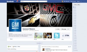
I took a look at what we can assume is the flagship page for the company, http://www.facebook.com/generalmotors. You can see it pictured here, but you should go check it out for yourself. Then go check out a few other pages, like Chevrolet (NOT “Chevy”) , Camaro, Chevrolet Volt and Corvette. Notice anything interesting? Yeah, the layout and content design is all the same. The whole thing is probably auto-filled by a content management system. If this is worth $30 million I want that gig!

Now notice what GM is doing to promote itself: promote ITSELF. There’s news of what this brand or that brand is doing, Guy Fieri driving a Corvette at the Indy 500 (let’s hope it doesn’t get stolen like his last car) and some proud customers pulling up to a plant in their car on a road trip. Yes, there’s a blurb at the top, “Welcome to the official GM fan page [sic]. Share your thoughts, tell us your story and join in on the discussion.” But nobody’s actually doing that. How about inviting readers to interact with you by sending in photos of their cars, telling stories about their first car, and maybe giving them a chance to WIN something?

And, almost none of these pages has any sidebar advertising. I’m guessing that Facebook pulled all the ads in a fit of pique, to make the pages even less interesting than they are. But here’s an idea: now that you’re spending 75% of your budget to build a “web presence”, is it worth the other 25% to give people a call to action and maybe buy something?

Probably not, if everybody is like GM executives and other WSJ reader: in a poll accompanying the article, 93.4% said they “rarely or never” are affected by Facebook advertising. What more proof could you want that this whole Facebook thing is a flash in the pan?