Lessons not learned in 2016

Brexit and Donald Trump’s election were, according to fivethirtyeight.com, well within the margin of error in polling predictions and so were shocking only because people were mentally and emotionally incapable of thinking these events would take place. This made me think of some experiences with focus groups and direct mail back in the days when both were a bigger thing than they are now.

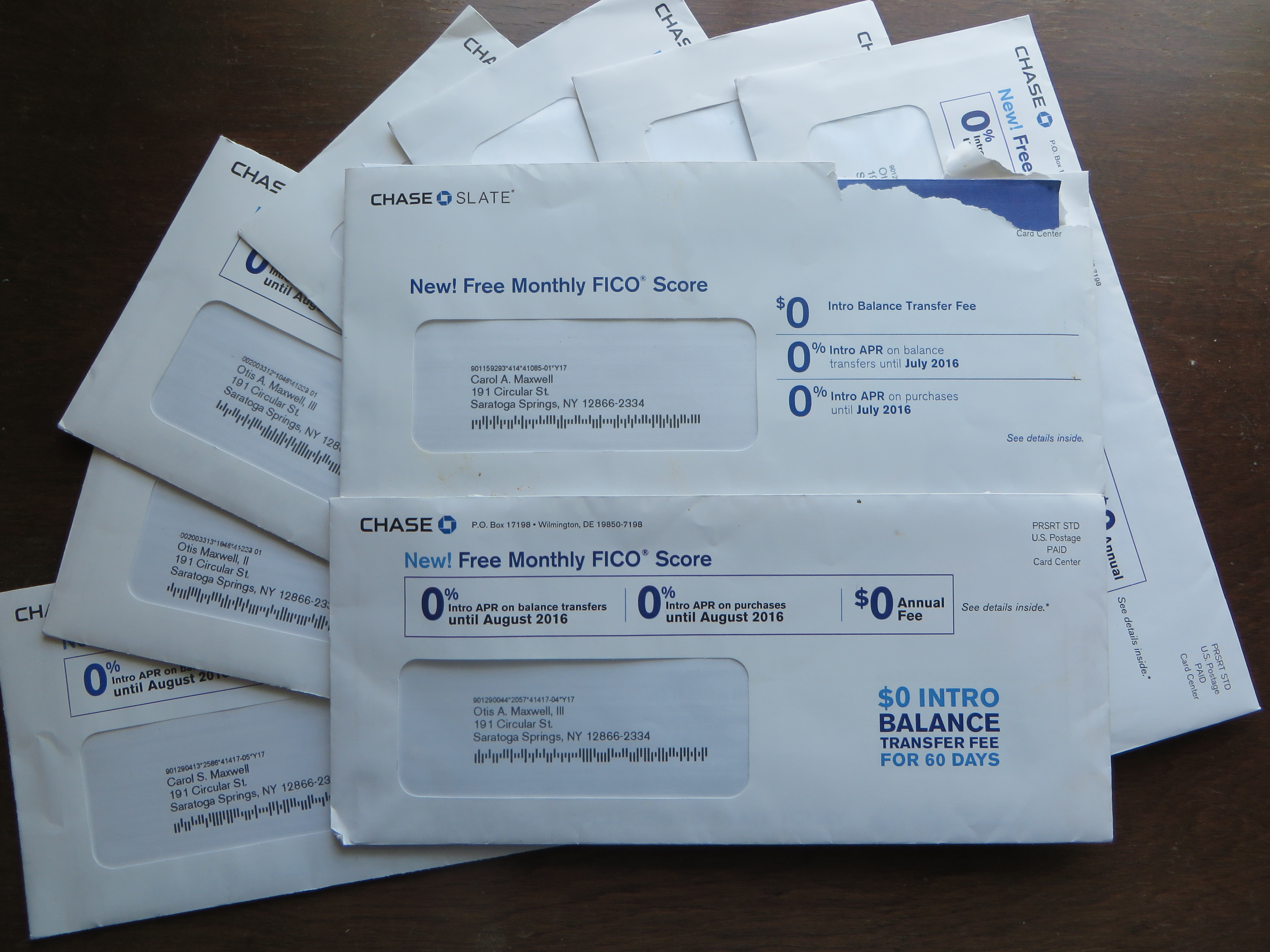
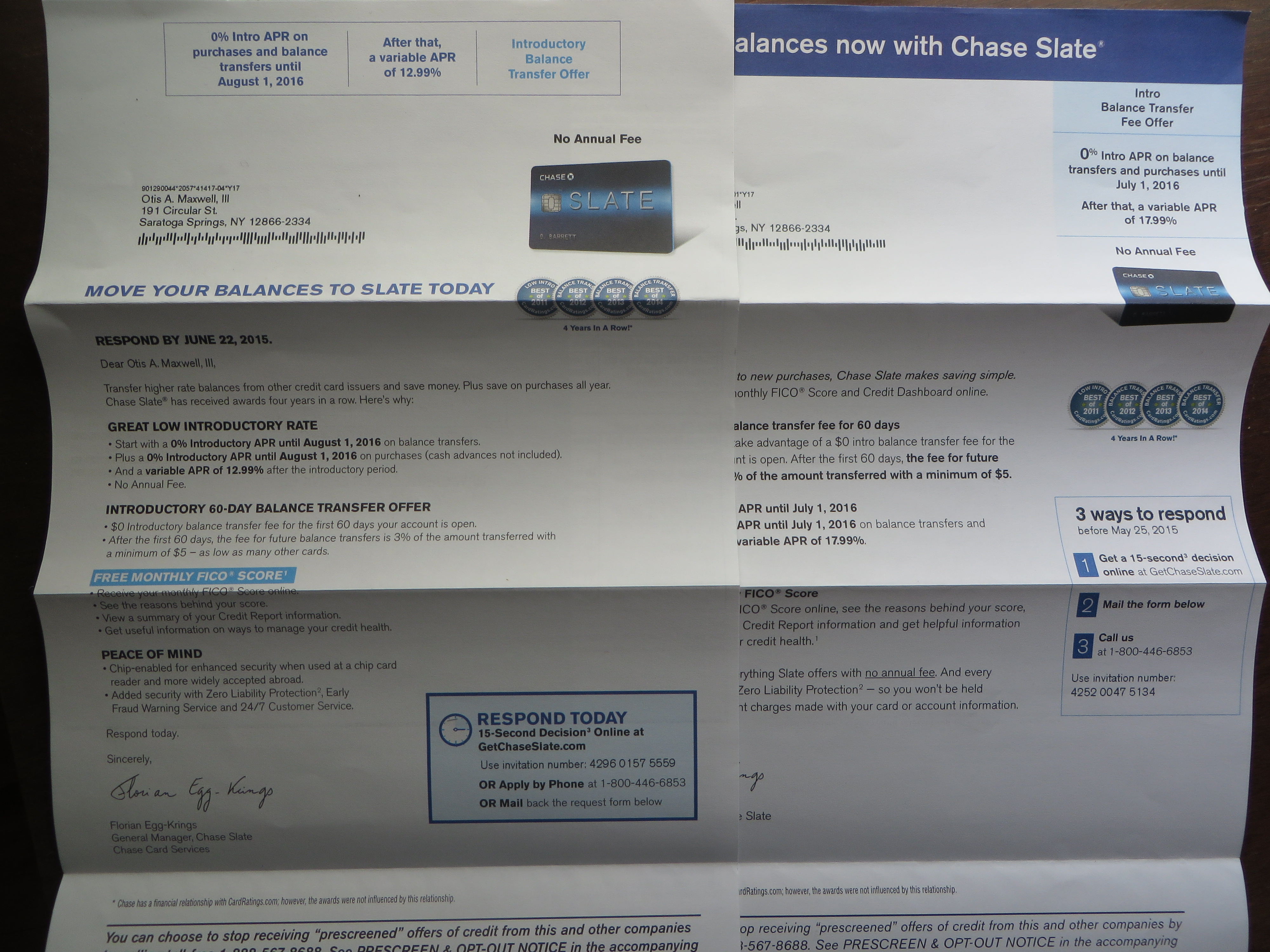
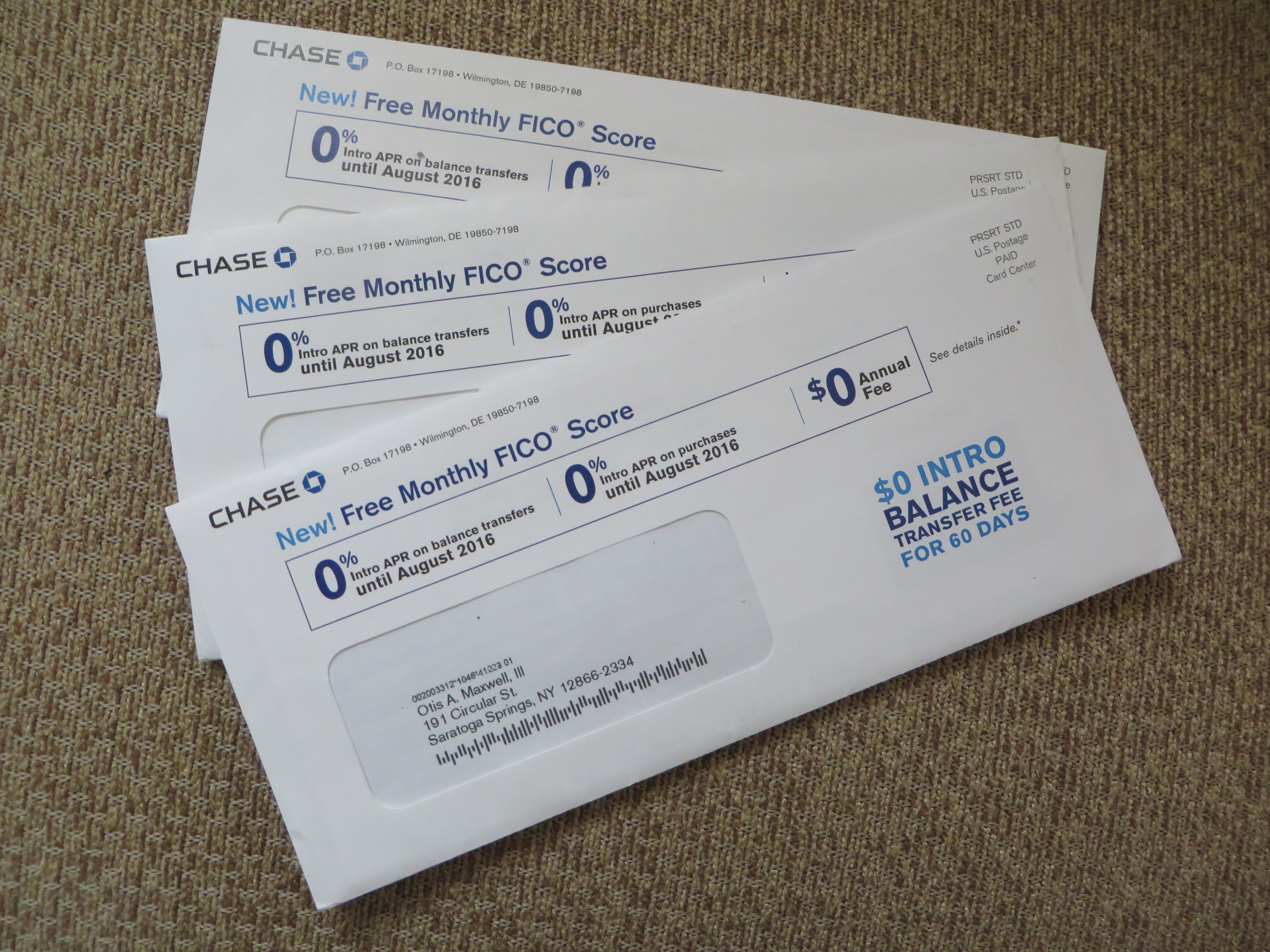
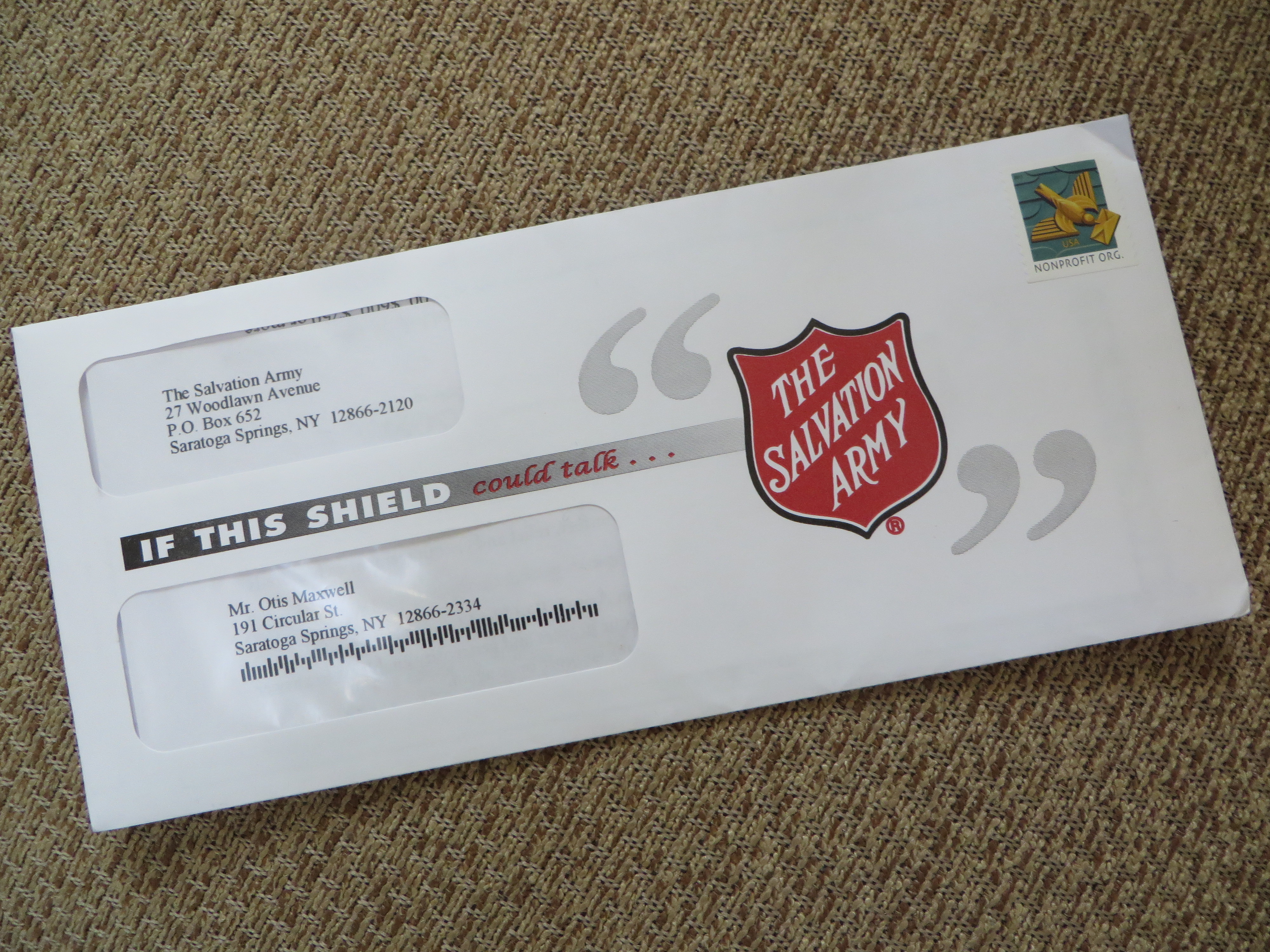
When shown a number of creative options, focus groups would inevitably veer away from the more promotional formats, especially when those formats had big screaming headlines and prominent offers. Yet every time the formats were tested head-to-head in the mail, the promotional format won.

My point: there is no substitute for real-world, boots-on-the-ground testing so long as you have two or more worthy options to consider. People will lie when they think the wrong answer might embarrass them, but not when they’re alone with the offer and their credit card.

Search marketers know this and so do online marketers who constantly refine their landing pages through multivariate testing. But I see many traditional marketers who don’t bother to test or—maybe worse—set up an a/b split and then fail to capture the results or are too busy to analyze them.

I always like to present a more and a less conservative option for any campaign. Of course, I am disappointed when the client chooses the conservative approach and even more disappointed if they test both and the conservative one wins. But the marketplace doesn’t lie. If you ignore this truth, you better be prepared to live with the consequences as well as explain them to your boss or client.

If you can’t read the results, why test it?

FICO envelope front
Envelope variations for Chase Slate FICO package, plus duplicates received at my address

My early direct mail copy chiefs beat this mantra into me: only test one thing at a time. If you change the offer and simultaneously change the letter lead, how do you know which change was responsible for any lift?

I thought of this as the drumbeat of “Free FICO Score” offers from Chase Slate continued, and I realized one of the envelopes looked different. Same color scheme, virtually the same OE copy on the front but arranged in a slightly different way. The first really noticeable change is on the back. One says “no annual fee” and the other has a lineup of four unidentifiable awards. (We know which would win in that test, don’t we, since benefits always eclipse chest pounding.)

FICO envelope back
FICO outer envelope back with testing variations

Inside the “alike but different” motif continues. One letter starts “Transfer high rate balances from other credit card issuers and save money.” The other, “From balance transfers to new purchases, Chase Slate makes saving simple.” Exact same facts, but one is about “you” and the other about “the card” so again, it’s pretty clear which would win if tested on its own. (That old copy chief of mine would have had the second writer start over, rather than testing the two leads.) However, the “you” copywriter is paired with the art director who put the shields on the back of the OE, so we’re tied.

Two FICO letters
Which of these letters is more persuasive? Why?

And it continues throughout the package, with design and copy slightly different without changing the facts or the basic presentation. What’s happening here is that two teams were tested against each other to see which one is “better”—a costly experiment on Chase’s part. This isn’t the same as a direct mail package test in which creative teams come up with completely different ideas from scratch. It’s an expensive waste of time.

My advice to Florian Egg-Krings, who signs both letters (no testing variations there): test spelling out “credit score” on the OE rather than calling it “FICO score”. Take one key benefit—I’d probably go with the reasons you’d want a monthly credit report and how great it is to get it for free—and lead one letter with that, then keep the other about your laundry list of benefits. Now you’ve got something worth testing.

Who else wants to see their FICO score? (and other mailbox mysteries)

FICO mailing for Chase Slate
Where’s your list hygiene, Chase?

This credit card promo from Chase caused me to fire up the mailbox monitor. The premise is that you get a free monthly FICO report with the Chase Slate card. My household has been carpet bombed with these packages recently, both my wife and I receiving multiple mailings sometimes on the same day. There are a few things about it that make me wonder.

A memorable signatory
I’m Florian Eggs-Kring, and I approve this message.

First, Chase practices poor list hygiene which doesn’t dedupe recipients with the same or similar name, and obviously does not do its own credit scoring. Speaking of which, does everybody know what the promise of a “Free FICO score” means? Would it have been better to simply say “free credit report”, a term that’s used inside? And note the name of the signatory of the main letter. Florian Eggs-Kring is a moniker which would have the Monty Python lads doing backflips, which is my point. Might a more neutral pseudonym have been a better choice? I understand that Florian is responsible for this mailing, but if he/she loses even a few responses because of distraction it’s probably not a good deal.

One of my maxims is “if you see a mailing repeatedly, that means it’s successful.” But I have the feeling this package is the exception that proves the rule; someone had a huge budget and didn’t feel it was necessary to test. Florian Eggs-Kring, if you’re reading this please tell me I’m off base. (Of note, it’s not a Visa or MasterCard or Amex so it’s not going to wotk initially in a lot of terminals; maybe Chase needs to build a huge user base quickly in order to convince merchants to accept it.)

Salvation Army red package
Salvation Army package has a legibility problem

Let’s move on. The Salvation Army envelope, for a large donor mailing, starts strong with “If this shield” but then trails off because “could talk” is illegible in the mailbox (it looks much more legible in the photo than in real life). The problem could have been solved, or at least mitigated, with some adjustments at blueline stage or even on press (dial back the magenta). The lesson is, no matter noble your ideals, you have to follow through in production.

Parents Meeting teaser
Great teaser on a simple self mailer

The green “Important Parent Meeting” on this academic-green self mailer is simple and brilliant. No parent of a school age child can ignore an apparently official announcement of a meeting. This solicitation is for a seminar on how to get financial aid and I bet it’s successful.

AAA Term Life
Beautiful stage management in an AAA Life 9×12 package

Our final example offers some beautiful stage management for AAA Life. Note the three-dimensional effect of the mock-vellum certificate seen through the window, and the shadow behind the fake mailing label below. Inside we find a complete application pack which asks the reader to mail a check for term life insurance. This company is extremely thrifty and I can’t believe they would have approved this package if it wasn’t a winner in testing. I hope it is so we can keep this great designer working; you don’t see much direct mail created with such care nowadays.

Term Life AAA
Here’s the entire AAA Life package.

NOTE: as always, click on the image if you’d like to see any of these in greater detail, then click again to blow up the photo for a super-close up look.