How to write a good lift note or publisher’s letter

International Living mail pack
Here’s the complete International Living mail pack. Click the photo to enlarge to a readable size.

The lift note, or publisher’s letter, is an additional element in a direct mail package which is designed to elevate (lift) the response rate and profitability sufficiently to repay its printing and production costs. It might highlight the offer, answer one specific objection, spotlight a key benefit, or emphasize the penalty for not responding.

The pub letter is a variation which is literally a communication from the publisher. The conceit is that he (in the old days, always a male) grabbed the mailer proofs as they were on their way to the printer and was inspired to add a personal message. He might talk about his pride in the product, make a guarantee, or offer the classic “frankly, I’m puzzled” perspective in which he wonders why more people don’t respond to such a great opportunity and urges the reader not to lose out.

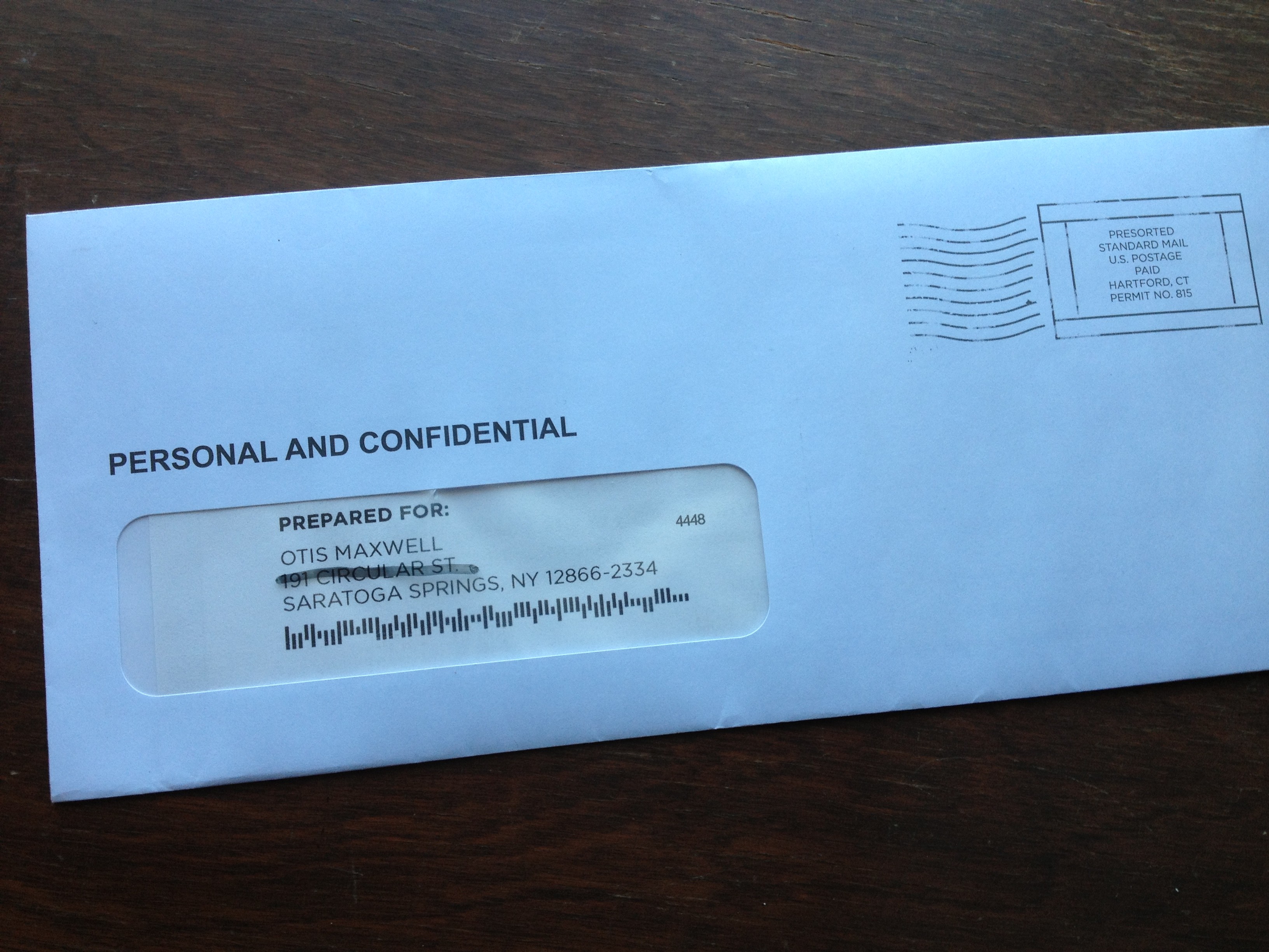
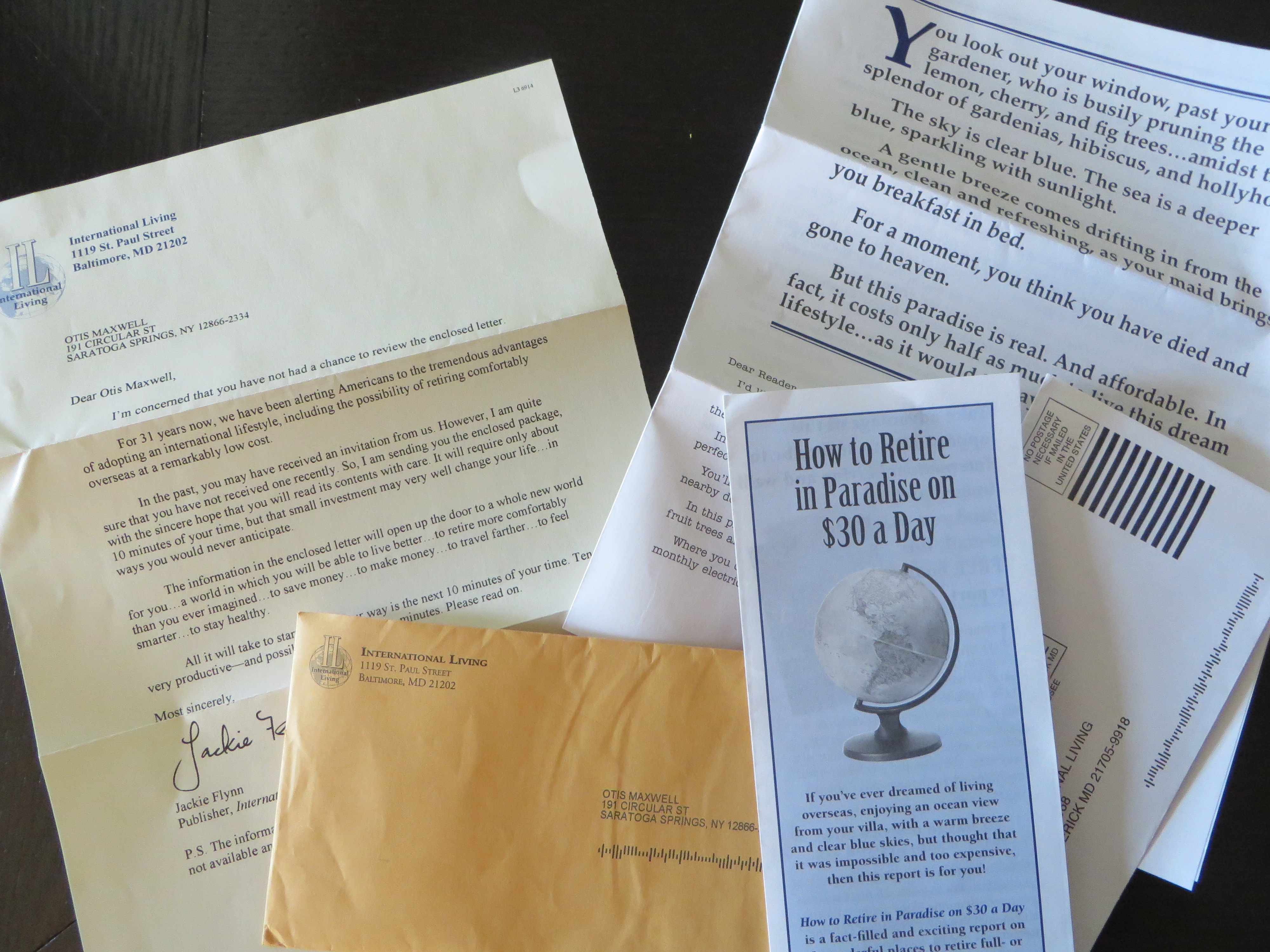
We don’t see too many lift notes in today’s lean direct mail packs, but I received a fine example recently from International Living. These folks are one of the last old-school newsletter publishers and they send a classic 8-page letter about the low costs and lifestyle benefits to be found retiring abroad.

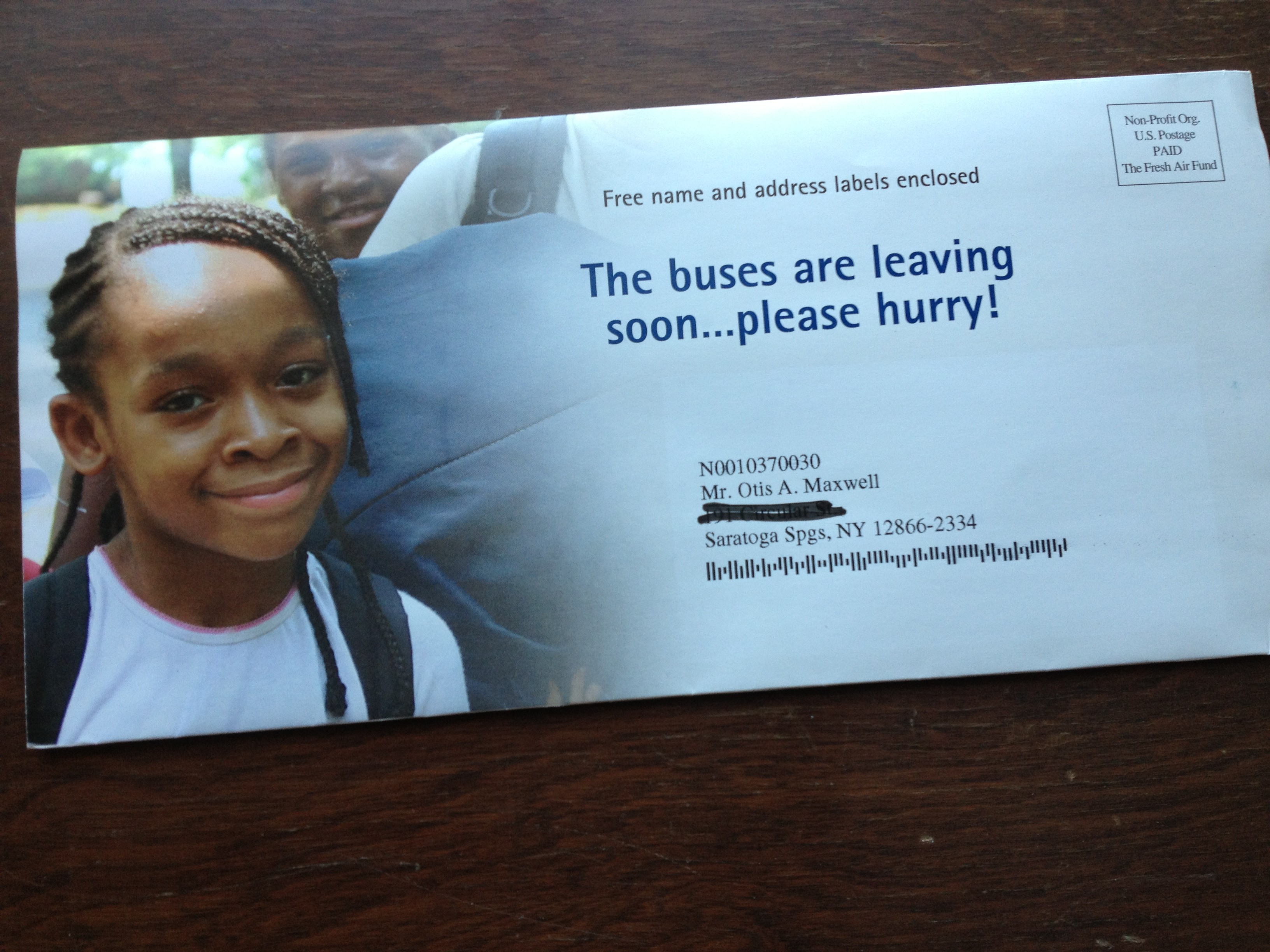
The pub note, which is personalized and the first thing you see upon opening the package, begins: “I’m concerned that you have not had a chance to review the enclosed letter”. The publisher (now it’s a she) drops in a paragraph describing the product then continues, “in the past, you may have received an invitation from us. However, I’m quite sure you have not received one recently…” and then goes on to sell not the newsletter, but the investment of 10 minutes of my time to read the rest of the package components.

What’s nice about this is that the copywriter took the knowledge that the name was rented from a list of people who have not been prospected previously, and turned this into a very personal message and benefit. (Reminds me of the classic Emily Soell letter for Vanity Fair which begins “if the list on which I found your name is any indication…”)

Does it work? I sure hope so. In essence, by elevating and personalizing the lift note, International Living has turned it into the driver of the package. The preprinted long form letter, which today’s distracted readers are less likely to pay attention to, becomes a supporting brochure. It’s a great way to refresh an appeal to an older audience which today is far more cynical and less trusting than the previous generation. I’m definitely going to try this tactic for myself, next time I have the budget to write a package with lots of components. How about you?

Why your writing could use an AutoCrit

I am working on a book, and before sending it out I wanted to eliminate as much sloppy language as I could. I’ve been experimenting with a tool called AutoCrit which I recommend to anyone who writes long form copy–and best of all you can try it for free.

The sample free report (which is limited to 500 words, but you can chop up your copy and make three submissions per day) will identify overused words and tell you how many to eliminate, and also identify cliches and redundancies. I was particularly happy at how often it flagged “it”, a trouble word that slows down readers because they have to take the time to figure out what “it” refers to if it’s not obvious.

The paid versions, which start at $47 for a year’s subscription (you can currently get 10% off with the promotion code fb2013), also identify repeated words and homonyms. Sometimes we repeat words intentionally, but sometimes it’s accidental, and the result is that the narrative loses texture and the reader might actually notice the repetition when the flow of your narrative should always be seamless with all grammatical tricks behind the scenes.

Homonyms are words that sound like other words–eg “in” which sounds like “inn”–and they’re mostly innocuous. But this feature will also catch words which can have more than one meaning, and those are deadly–“lie” being an example; the skimming reader might not know whether it refers to something in a prone position or someone who’s not telling the truth. (Something it doesn’t catch, but you should be vigilant against, is words that look similar to other words so they can be mistaken by the reader–“through” and “though” being an example pair.)

Seeing your text in the context of the report also helps you look at it with fresh eyes, and catch typos or awkwardness you might otherwise miss because you’re too close to it. I took perhaps 10% of the suggestions AutoCrit had for me, but that 10% has definitely improved my manuscript. Check it out.

Is this the John Caples of 2014?

Neetzan Zimmerman
Neetzan Zimmerman

Almost a century ago, John Caples wrote one of the most famous direct response ads of all time: “They laughed when I sat down at the piano. But when I started to play…” Caples combined a homespun way with words and a scientific approach to analyzing the interests of his audience, as documented in his classic Tested Advertising MethodS.

If John Caples were to re-animate, be zombified, or simply time-shift to the present day, what would he be writing now? Maybe something like the work of Neetzan Zimmerman, who was recently profiled in the Wall Street Journal. Zimmerman doesn’t write space ads, long-form direct mail or emails. He’s an editor at the website Gawker, where he’s charged finding story threads that are so irresistible, people not only read them but pass them along, in huge viral numbers, to their friends.

Zimmerman was responsible for “Mom Fined $140 Every Day Until She Circumcises Her Child” and “Black Man Arrested Dozens of Times for ‘Trespassing’ While At Work” among countless other gems. His posts generate an astonishing 30 million page views a month, more than all other Gawker contributors combined. When they linger on his posts, web visitors see the ads that accompany them; that’s the Gawker revenue model.

According to WSJ, Zimmerman’s ability to draw traffic allows Gawker to subsidize other deeper and longer pieces. He’s the equivalent of a retail loss-leader, but with words. Like Caples, he combines a scientific curiosity with the ability to connect with his audience on the topics they care about—“cute, outrageous, heartwarming, hilarious, anger-inducing” being some typical threads.

Zimmerman starts each day by analyzing the metrics (Twitter and Facebook mentions) for popular stories, then deciding which ones to pass along. “Within 15 seconds, I know whether an item is going to work,” he told WSJ. “It’s a biological algorithm… I’ve put myself into the system—I’ve sort of become the system—so that when I see something I’m instantly thinking of how well it it’s going to do.” He adds that he can no longer tell the difference between stories he finds interesting and stories that will be popular. “If it’s not worth posting then I’m not interested.”

Lee Euler, a savvy newsletter publisher who was my client at one time, describes this as “the common touch”. It’s not enough to write well, to know your subject and audience, to deliver up benefit statements that get readers reaching for their wallets. To be a truly great and consistently control-busting copywriter you need to be able to connect with people on a visceral level, where they trust you and want nothing more than to hang on your every word. It’s a rare gift, and this guy seems to have it.

Behavioral Economics at DMA2013

Dan Ariely is a professor of psychology and behavioral economics at Duke University, and also a consultant to the Wilde Agency. Yesterday he delivered an entertaining and eye-opening keynote called “Who Put the Monkey in the Driver’s Seat?” in which he documented irrational and yet predictable human behavior for the benefit of the direct marketers at DMA2013.

First example: statistics for organ donor signups in European nations. Organ donation doesn’t hit all the altruism hot buttons because it happens after you’re dead, and the recipient will never know who provided the life-saving transplant. So it’s not surprising that donations are close to zero in some countries, such as Germany. Yet in demographically similar nations, such as Austria, donations are close to 100%. The difference? In the high-donor nations people have to opt out at their DMV if they don’t want to donate and people will do almost anything to avoid doing something.

ArielyInsurance
This buckslip produced a 588% lift.
Moving on to direct marketing: a large insurance company wanted to improve response for its affinity accidental death offer. So a chart was added on a buckslip, showing people that although they are eligible for $3 million in coverage at present they are only at $800K. It’s obvious at a glance that the reader is missing out. Given a reference point, response increased from 0.34% to 2%.

Another example is a response form for The Economist. Given the choice of an online-only subscription for $59, print-only for $125, or online plus print for $125, 84% opted for the last option. Who wouldn’t—it’s like getting online for free! But in fact it’s a significant upsell for anyone who was considering an online-only subscription. And when the print-only option was removed the numbers reversed: 68% went for online-only, vs only 32% for the online plus print combo.

ArielyBigData
Ariely poked fun at the direct marketer’s infatuation with Big Data.
As a creative practitioner, I eat this up. It’s one thing to sell your prospects through a positive reception of your carefully presented benefits, but much better if you can cement the sale by making them feel like they’ve gotten a great deal or they aren’t missing out. As to that organ donor stat, most of us have found that negative option offers (in which you have to opt out to keep something from happening) lead to poor pay-up, conversions and renewals. But if the consumer is dead, I guess that isn’t a problem. Fascinating stuff.

Twitter Bios: the 160 character sales pitch

Here is a great project for your copywriting class or inhouse brainstorming session: give everybody five minutes to write the best possible Twitter bio, which has to be 160 characters or less, including spaces.

Your Twitter bio is what shows up in another user’s inbox when you follow them and they make a split second decision about whether to follow you in return. The New York Times had a nice sidebar piece in which they join Slate and the Washington Post in anointing Hillary Clinton’s bio a superb example of the craft:

Wife, mom, lawyer, women & kids advocate, FLOAR, FLOTUS, US Senator, SecState, author, dog owner, hair icon, pantsuit aficionado, glass ceiling cracker, TBD …

It states her qualifications, though not in a pompous way. It veers off into some relevant light touches (Hilary’s lack of hair savvy and her predilection for pantsuits are well known non-presidential attributes) which are amusing without being frivolous.

A bio like that promises that the tweets also will be interesting, and that you may meet other cool folk by following her. It’s much more effective than a straightforward statement of qualifications, or an unabashedly promotional bio like the one Lady Gaga is currently running: BUY MY NEW SINGLE ‘APPLAUSE’ AND PRE-ORDER MY ALBUM ‘ARTPOP’ HERE NOW!

Before writing this post I checked my own neglected bio for @otisregrets and found it pretty terrible:

Results-focused ad copywriter; blogger about writing, marketing, customer service, technology and more.

I gave myself the five minutes and came up with:
I write direct response ads, web pages, emails, direct mail & whatnot. Gold Echo & Caples Silver Cup winner. Guilty pleasure: streaming bluegrass videos at work.

Some work qualifications hopefully written in a  casual way… but I don’t like the personal aside because it might imply to some that I bill for time when I’m actually not working. (I don’t.) So I tweaked it to:

I write results-oriented ads, web pages, emails, direct mail & whatnot. Gold Echo & Caples Silver Cup winner. Read my blog for marketing tips & off-topic rants.

The blog’s a good call to action since that is indeed where I want the reader to go next, and the throwaway about “off topic rants” will hopefully garner curiosity. I’m sure I can do better but I only had 5 minutes. Let me know how you do on your bio.

Specifics sell… this example shows why!

National Parks
Beginning of the National Park Foundation’s email

Unfortunately, it’s an example of what NOT to do: The National Park Foundation saw the terrible wildfire currently out of control in Yosemite as a great opportunity to raise money for its cause. It’s exactly the same tactic used by The Salvation Army, The American Red Cross and many other charities which often have their best efforts on the heels of a disaster which triggers’ readers empathy and desire to help.

Unfortunately, as the NPF email was on its way to the coder some bone head saw the proof and said, “wait a minute, what about all the other parks? If they’re not in California, maybe they don’t give a hoot about Yosemite!” And so the “ask” was expanded to mention acts of vandalism, including green paint being splashed on the Lincoln Memorial.

I didn’t even realize the Lincoln Memorial was a national park, and it seems to me responsibility for cleaning it off (or keeping vandalism from happening) should rest with the local police. They then go on to tell us that there were 2,000 acts of vandalism in national parks last year and that the parks are underfunded. There’s also a reference to the fact this is the parks’ 97th anniversary and that the Travel Channel will match your gift. And they close with the unacceptably vague promise that a gift will “provide critical resources that directly aid and enrich our national parks and the work of the National Park Service.”

What should they have done instead? Leave the kitchen sink in the kitchen! In this case, a vastly stronger email could have been created by focusing entirely on Yosemite, saying how this makes us realize how precious our parks are and how much they need our support, and bringing in the Travel Channel match as exciting news that makes your gift go twice as far. Tell us very specifically what our contribution is going to do. Then get out.

And that anniversary announcement? Save it for the 100th, for goodness sake. Assuming this Foundation actually is doing good work, I hope they’ll be around that long. Meanwhile, this one goes straight to the Badvertising Hall of Shame.

Attention copywriters: nobody likes a downer….

Just finished watching “Young Adult” with Charlize Theron. The good news: great performance, solid directing. The bad news: it was free on Amazon Prime, barely 12 months after release. And therein hangs a story….

This movie is a downer. A ghost writer of “young adult” fiction gets a birth announcement for the baby of her old boyfriend. On a whim she decides to return to her small hometown and win back the old beau and in the process gets tangled up with a former classmate who was or was not gay but in any case was maimed by jocks who thought he was gay and now is as physically crippled as she is mentally. Are you laughing yet?

I wanted to see this movie when it first came out based on some trailers showing Theron trying to hide her dog checking into a motel and other deadpan moves. So did 8 or 9 other people but it didn’t work. The plot is incredibly depressing and you do not leave the film with an uplifted morale. So nobody wanted to see it except a very few who told their friends to stay away.

Moral for us copywriters is, nobody’s going to read something that makes them feel bad. Okay to turn on the spigots of negativity, but be sure to transition to that golden shower of redemption before you’re done… AND you need to let them know at the outset that said redemption is in sight. Make sense?

Too much of a good thing from Values.com?

HenryFordValuesBillboard
Values.com billboard in Latham, NY

I pass this billboard frequently on a busy highway in upstate New York. It has multiple inspirational headlines stacked like cordwood: Driven/ Innovation/ Pass It On/ Values.com. To the left, a photo of Henry Ford (we know it’s him because there is a caption that says Henry Ford), driving (not being driven in) an early horseless carriage. The net effect is too much of a good thing, and I see it all the time, so I finally had to write about it.

Part of the problem is that the placement is a stone’s throw from Troy, NY, birthplace of the Arrow shirt, the cast iron stove, Uncle Sam and The Night Before Christmas among innovations. It sticks in our craw that they chose a non-local for their innovator. But the bigger issue is the multiple inspirational sayings when just one or two would do. It’s like too much candy on Halloween.

I headed over to Values.com to learn more about exactly what inspires them to inspire. It’s an interesting website. You can’t join them or give them money or get money from them; they’re doing this because “We believe that people are basically good and often benefit from a simple reminder.” Fair enough, and a good reason they deserve a little gentle nudging to make sure those reminders are effective.

There’s a section on the website called “Billboards” and on it you can create your own values billboard and look at it online, or look at billboards others have created. Each has one photo, one headline and one value and works a lot better than Values.com’s “Driven” effort. Give it a try. (But be sure your inspiration is not something naughty like “beer” or you’ll get a server error.)

By the way, what the website does not say is that Values.com is apparently funded by evangelical Christian Phillip Anschutz, who according to Wikipedia has also funded a think tank that criticizes evolution and a ballot initiative designed to overturn local and state laws that prohibit discrimination against individuals on the basis of sexual orientation. If I were Mr. Anschutz, I would identify myself and make my case on the website rather than leaving it to the curious visitor to go googling and draw their own conclusions.

Headline Horrors (outer envelope teasers that don’t)

Fresh Air camp appeal
What buses? Where are we going?

It’s been far too long since we’ve visited the Badvertising Hall of Shame… that corridor of horrors where unfortunate marketers teach us by example what NOT to do. Let’s begin with this outer envelope teaser from Fresh Air Fund.

This is a seasonal appeal I used to struggle with when doing work for Salvation Army… the “send an inner city kid to camp” fund. It seemed less urgent than putting food on the table or rescuing a child from the streets, and it was complicated because you’d have to create a word picture of why this was important before the reader got away. No missteps are permissible.

So look what Fresh Air Fund has chosen as its teaser: The buses are leaving soon… please hurry! What buses? Am I supposed to be on one? Why on earth does this not say instead, “The bus is about to leave for camp without me… please help!” (Singular better than plural because it’s more specific, and let’s mention the reason for the appeal for chrissake.) Also, while camps are universally recognized as a good thing buses are not. Seems like a terrible choice for the opening salvo in this appeal. Next.

Personal and Confidential OE
Do you believe this?

From… I don’t know who because I never opened it… I have a blind outer with nothing but PERSONAL AND CONFIDENTIAL printed above my name. Maybe I notice the “standard postage” indicia that spoils the illusion, but maybe I don’t; they’ve done a good job of designing something that looks like a real meter imprint.

But, look what’s above my name: PREPARED FOR: Okay, that’s too much and it’s also discordant with PERSONAL AND CONFIDENTIAL which suggests a very individualized letter, maybe a collection notice, whereas PREPARED FOR suggests a mechanized process like maybe a refund. Either would have been good on its own, together they cancel each other out. The blind outer has lost its intrigue so out it goes.

Pella 72 hour sale
When did the 72 hour sale begin anyway?

Finally we have this from Pella: OPEN IMMEDIATELY: 72-hour event ends soon. Well, is it 72 hours or isn’t it? If it is, it ends in 72 hours, not “soon”. The contradiction completely bursts the bubble of urgency and anticipation. Also, since this is clearly a piece of advertising mail, there needs to be more reader context, eg “Hurry! You’ve only got 72 hours to save” or “Open for your private invitation to our 72 hour preferred customer sale”.

That’s enough for today. Three examples in which the client or product manager is wondering why their mailing was not more successful, when in each case the fault lies with the copywriter who is probably making mischief on another campaign right now. I’ll have a couple more good ones in my next post.

The wrong (and right) way to use infographics in your marketing

Infographics seem to be the newest arrow in the art director’s quiver. Why say it with words when you can throw in a clever graphic? I’m fine with this as long as it enhances the communication, but recently I’ve seen some examples in which the visuals actually got in the way.

Rovi infographic
Rovi infographic

Here’s a simple infographic from Rovi (they’re my client, but I wasn’t involved in this) which demonstrates several best practices. The stat is about the effective life of different categories of device and it turns out the bigger the screen, the longer it tends to stay around. So the designer created a graph in which time is expressed by the size of the screen and is reinforced by the more precise timeline at the top. It’s memorable and instantly understandable. It pulls one fact out of a longer article which is particularly appropriate for visual expression.

Less good are infographics in which a legend is required to understand what the visual is communicating—in other words, there are design objects that symbolize something and then off to the side there’s a caption that says what they mean. This is a necessary feature with complex charts but an infographic is not supposed to be complex. If you need a legend to make your point, start over.

Google+ infographic
Google+ infographic

Still less good are infographics in which numbers are just translated into graphics with color and clever type treatments. This seems to be the most common type of faux infographic. Our friends at eConsultancy shared this classic from Google+ in “How Not to Make an Infographic: Four Examples to Avoid”. (Sorry it’s tiny; click through to the jpg then click on the magnifying glass to blow it up.) There’s nothing in these numbers that could not have been said just as effectively with simple words. The graphics don’t add anything; they’re arbitrary and don’t add the visual revelation we saw in the Rovi example.

Finally, at the bottom of the barrel, we find infographics that are actually incomprehensible. This is the kind of work I’ve seen from a couple of would-be infographics designers who pull out words or numbers that look important, then turn them into graphics and assume they will support the text. But it doesn’t work like that. An infographic has to work on its own as an element of the message.

None of this is news, of course. Edward Tufte’s The Visual Display of Quantitative Information, first published in 1983, has great examples of infographics dating back to the time of Napoleon. I wish some of today’s would-be infographers would read it.