If you can’t read the results, why test it?

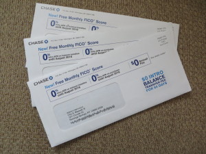
FICO envelope front
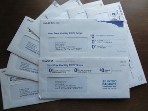
Envelope variations for Chase Slate FICO package, plus duplicates received at my address

My early direct mail copy chiefs beat this mantra into me: only test one thing at a time. If you change the offer and simultaneously change the letter lead, how do you know which change was responsible for any lift?

I thought of this as the drumbeat of “Free FICO Score” offers from Chase Slate continued, and I realized one of the envelopes looked different. Same color scheme, virtually the same OE copy on the front but arranged in a slightly different way. The first really noticeable change is on the back. One says “no annual fee” and the other has a lineup of four unidentifiable awards. (We know which would win in that test, don’t we, since benefits always eclipse chest pounding.)

FICO envelope back
FICO outer envelope back with testing variations

Inside the “alike but different” motif continues. One letter starts “Transfer high rate balances from other credit card issuers and save money.” The other, “From balance transfers to new purchases, Chase Slate makes saving simple.” Exact same facts, but one is about “you” and the other about “the card” so again, it’s pretty clear which would win if tested on its own. (That old copy chief of mine would have had the second writer start over, rather than testing the two leads.) However, the “you” copywriter is paired with the art director who put the shields on the back of the OE, so we’re tied.
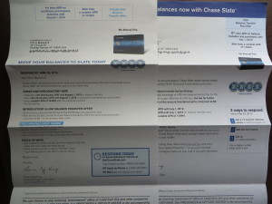
Two FICO letters
Which of these letters is more persuasive? Why?

And it continues throughout the package, with design and copy slightly different without changing the facts or the basic presentation. What’s happening here is that two teams were tested against each other to see which one is “better”—a costly experiment on Chase’s part. This isn’t the same as a direct mail package test in which creative teams come up with completely different ideas from scratch. It’s an expensive waste of time.

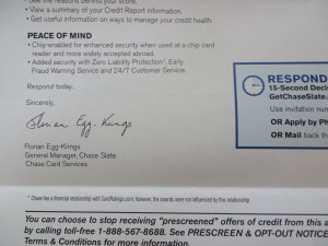
My advice to Florian Egg-Krings, who signs both letters (no testing variations there): test spelling out “credit score” on the OE rather than calling it “FICO score”. Take one key benefit—I’d probably go with the reasons you’d want a monthly credit report and how great it is to get it for free—and lead one letter with that, then keep the other about your laundry list of benefits. Now you’ve got something worth testing.
Who else wants to see their FICO score? (and other mailbox mysteries)

FICO mailing for Chase Slate
Where’s your list hygiene, Chase?

This credit card promo from Chase caused me to fire up the mailbox monitor. The premise is that you get a free monthly FICO report with the Chase Slate card. My household has been carpet bombed with these packages recently, both my wife and I receiving multiple mailings sometimes on the same day. There are a few things about it that make me wonder.

A memorable signatory
I’m Florian Eggs-Kring, and I approve this message.

First, Chase practices poor list hygiene which doesn’t dedupe recipients with the same or similar name, and obviously does not do its own credit scoring. Speaking of which, does everybody know what the promise of a “Free FICO score” means? Would it have been better to simply say “free credit report”, a term that’s used inside? And note the name of the signatory of the main letter. Florian Eggs-Kring is a moniker which would have the Monty Python lads doing backflips, which is my point. Might a more neutral pseudonym have been a better choice? I understand that Florian is responsible for this mailing, but if he/she loses even a few responses because of distraction it’s probably not a good deal.

One of my maxims is “if you see a mailing repeatedly, that means it’s successful.” But I have the feeling this package is the exception that proves the rule; someone had a huge budget and didn’t feel it was necessary to test. Florian Eggs-Kring, if you’re reading this please tell me I’m off base. (Of note, it’s not a Visa or MasterCard or Amex so it’s not going to wotk initially in a lot of terminals; maybe Chase needs to build a huge user base quickly in order to convince merchants to accept it.)

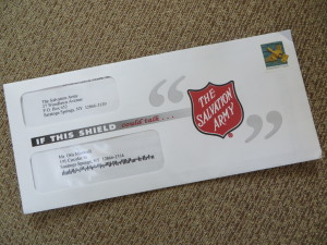
Salvation Army red package
Salvation Army package has a legibility problem

Let’s move on. The Salvation Army envelope, for a large donor mailing, starts strong with “If this shield” but then trails off because “could talk” is illegible in the mailbox (it looks much more legible in the photo than in real life). The problem could have been solved, or at least mitigated, with some adjustments at blueline stage or even on press (dial back the magenta). The lesson is, no matter noble your ideals, you have to follow through in production.

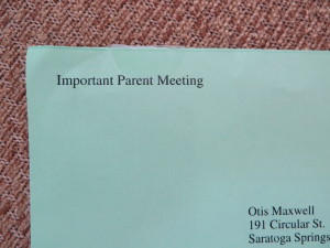
Parents Meeting teaser
Great teaser on a simple self mailer

The green “Important Parent Meeting” on this academic-green self mailer is simple and brilliant. No parent of a school age child can ignore an apparently official announcement of a meeting. This solicitation is for a seminar on how to get financial aid and I bet it’s successful.

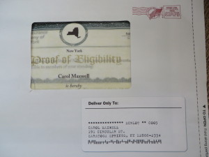
AAA Term Life
Beautiful stage management in an AAA Life 9×12 package

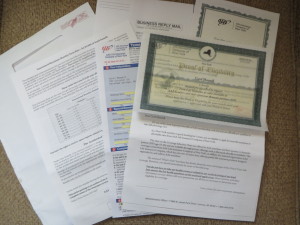
Our final example offers some beautiful stage management for AAA Life. Note the three-dimensional effect of the mock-vellum certificate seen through the window, and the shadow behind the fake mailing label below. Inside we find a complete application pack which asks the reader to mail a check for term life insurance. This company is extremely thrifty and I can’t believe they would have approved this package if it wasn’t a winner in testing. I hope it is so we can keep this great designer working; you don’t see much direct mail created with such care nowadays.

Term Life AAA
Here’s the entire AAA Life package.

NOTE: as always, click on the image if you’d like to see any of these in greater detail, then click again to blow up the photo for a super-close up look.

Starbucks shows how not to go viral with #RaceTogether campaign

Starbucks recently initiated a viral social media campaign that flamed out immediately. Baristas were instructed to write “Race Together” on coffee cups to initiate a dialog about race and inequality with their customers.

An excellent LinkedIn post by UC Berkeley undergraduate Tai Tran describes the problems with this and the subsequent PR clusterf*ck, which in retrospect seems inevitable, along with the lessons to be learned.

First, the message didn’t fit the corporate culture. Starbucks tends to sell its expensive products in upscale neighborhoods to a non-diverse customer base. One critical tweet asked how many people of color work in Starbuck’s corporate office; another noted that all the hands holding cups in a SBUX promo were white.

Then, when outraged customers and employees began tweeting to Starbucks Sr. VP of Global Communications Corey duBrowa’s Twitter account, he responded by blocking them and freezing the account (it has since been reactivated).

An inauthentic campaign>handed down from on high>with backlash met with stonewalling instead of engagement and big time mea culpa=how not to go viral with a corporate social media campaign.

I’m summarizing here because I want you to go read Tai Tran’s full article. He describes himself as “ready to disrupt the tech industry with his infectious passion and energy for marketing!” Somebody, hire this guy.

Cadillac “Dare Greatly” ad campaign has an elephant in the back seat

During 2015 March Madness I’ve seen the Jason Wu Cadillac ad numerous times. Certainly it’s daring greatly to heavy up on a story about a guy whose mom gave him a sewing machine during the uber-macho celebration of NCAA basketball, and the ad is a great story. But what’s that vehicle rolling into frame at the end? Oh, wait, it’s a Cadillac… whaat?

I went googling and found Cadillac’s Dare Greatly page, which provides nice access to all the celebrity stories featured in the campaign. I watched the story of Jason Wu in full (that’s the video link above; the ad itself doesn’t seem to be available online) and also that of Anne Wojcicki, founder of 23andme. They’re well done. The overall impression is of somebody who was immensely talented to begin with, but then took a career path that took them out of their comfort zone. Obviously that’s a great metaphor for a once adulated, now staid luxury car brand that wants to reinvent itself.

But here’s the thing. I can’t imagine any of these people actually driving a Cadillac, other than maybe Steve Wosniak who’s a car collector and something of a schlub. (In fact, if you can prove to me Anne Wojcicki doesn’t drive a Tesla S, I’ll send you a free copy of my book right now.) So the ads, while celebrating the daring and talented, inadvertently separate the product from the celebrity endorser.

This campaign is often compared to the iconic Chrysler spots featuring Eminem and later Clint Eastwood. But those gentlemen weren’t endorsing a car. They were endorsing a spirit: Rocky, relocated from Philadelphia to Detroit, the downtrodden American underdog rising from the ashes of defeat. You buy a car from these guys not because they drive one, but because it’s the right thing to do.

When Chrysler next hired Bob Dylan and turned him into an Ed McMahon-type huckster, it was cringeworthy. A better use of the celebrity as pitchman was the Lincoln ad with Matthew McConnaghey where he comes right out and says “I’ve been driving a Lincoln since long before they paid me to do it.” Anyhow, what all these ads had in common was that they make a direct connection between the celebrity and the car—in most cases, the spokesperson is behind the wheel in at least one scene. (I think Eastwood may have stepped from the shadows behind a Chrysler.)

And that’s the disconnect with Cadillac’s Dare Greatly campaign and its celebrities. In order to convince them to participate, Cadillac obviously told them they did not have to mention Cadillac, appear with Cadillac, or drive a Cadillac. So we have the choice of questioning the credibility of the endorsement, or realizing it’s not an endorsement at all.

Celebrities are infinitely useful as metaphors, especially if they’re dead. (Think of the “Here’s to the…” images in the Apple “Think Different” campaign.) But if you’re interacting with live ones you can’t put up a firewall. You have to ask them about the car. That’s the lesson here.

The creative parable of the 100 light bulbs

A creative director recently shared with me the parable of the 100th light bulb. It goes like this:

When you turn on the first light bulb in a dark room, the effect is transformative. Where before there was only darkness, now there is light. But by the time you switch on the 100th light bulb, the incremental difference is so small that nobody notices. The lesson is that there’s a point of diminishing returns where it’s not worth the effort to keep exploring new ideas.

I disagree.

For one thing, if your project is a web page or an email, turning on the light bulb is so trivial a task you shouldn’t give it a second thought. Through multivariate testing, marketers can not only turn light bulbs on and off, but move them around at will to see if one arrangement is better than another.

But beyond that, turning on the 100th light bulb is what we as creatives are paid to do, assuming we charge more than the journeyman copywriter who can take a brochure and turn it into a sales letter.

In the heyday of subscription direct mail, the 1980s and early 1990s, writers like Bill Jayme and Linda Wells were paid tens of thousands of dollars (1980s dollars) to produce circulation promotions that, if they were successful, might increase response rate by a microscopic fraction of 1%. But because the numbers mailed were so large, it was a savvy investment by the publishers.

I myself once wrote an ad that appeared in Computerworld, for a long departed agency and software client. They marketed primarily through direct mail, but some targets just didn’t ever respond. This ad won a new account from one of those targets, and the value of the business was such that it paid for the entire cost of the ad, including media, for the life of the campaign.

Was that worth the 100th light bulb? I think so.

Brands get their (big) game face on for Super Bowl FSIs

Big Game FSIs 2015
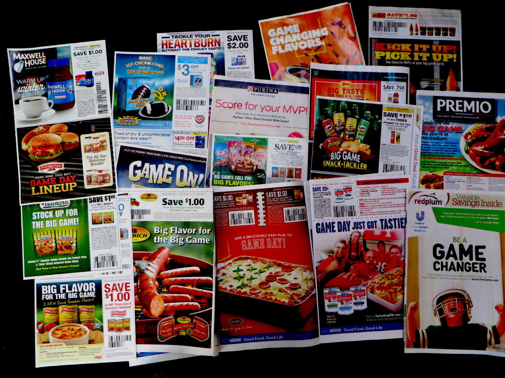
How many ways can you say “Big Game”? Not that many, apparently.

The big day for football fans has come and gone. Of course, I’m referring to the Sunday before the Super Bowl when the newspapers are full of FSIs touting snacks of all varieties (except healthy) as super savory, fan favorites or a tasting touchdown without ever using the actual name of the event which requires an exclusive and very expensive license from the very litigious (unless you are a wife-whacking or child-whipping pro athlete, in which case you are exempt) National Football League.

Except… hardly any of the headlines are anywhere near as creative or alliterative as the descriptives I tossed together above. Take a look above… a majority of the ads have “Big Game” in some variation as their headline with only the lamest attempt to tie it to the product. We have two incidences of “big flavor for the big game” and one “big taste for the big game” along with “big game lineup”, “stock up for the big game” as well as “game plan” and the ever popular “game changer”. You’d think that copywriters have a vocabulary of 50 words, but that’s wrong because a lot of the non-Super Bowl ads in the same edition are very clever. (My personal favorite, “What the Yuck?” for a super strength detergent that gets the “yuck” out of deeply soiled clothes.) They are bored with this tiresome yearly charade and as a result get sacked for a loss, creatively speaking.

Super Bowl P&G ad
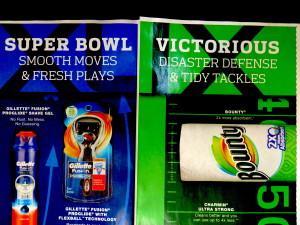
Look! A Super Bowl ad that says Super Bowl!

Interestingly, the words “Super Bowl” actually do appear, in a spread in the P&G Brand Saver. Their Gillette shavers, it turns out, are indeed an official sponsor. All the senior people were in the jet on the way to Phoenix (where this year’s game will be played) so the playbook was left in charge of a novice copywriter and a too-cute art director. “Smooth moves and fresh plays?” I don’t think so. And can you find the Roman numerals XLIX, for 49, hiding in the ad? Sadly, Ex-Lax is not a sponsor and this will be the last Roman-enumerated Super Bowl; we’re moving to 50 next year.

My prediction: Seahawks by seven.

One-of-a-kind at CES 2015

One of the pleasures of attending the Consumer Electronics Show is seeing new concepts making their debut for the benefit of prospective investors and manufacturing reps. Many of these are clustered in the “Eureka Park” area which, unlike last time I was here, was part of one of the main exhibit halls.

Easy Sim 3D
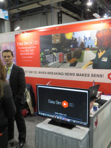
Easy Sim 3D quickly reconstructs an accident or crime scene.

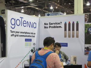
Some products are very very niched yet seem like they’d be highly attractive to their intended audience. One example was Easy Sim 3D, a web application that quickly recreates a 3D representation of an event that can be viewed from multiple angles. It’s designed for news reporters. Then there was the GoTenna, an antenna that turns your phone into a homing device if you should be in trouble and out of cell range.

GoTenna
goTenna turns your cell phone into a homing device

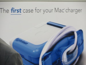
But there’s also the “first case for your Mac charger”, probably first because nobody knew they needed it. The first ever handheld dashboard camera. And Belty™,  The New Belt Experience.

Mac Charger Case
Mac Charger case solves a problem you may not have realized you have

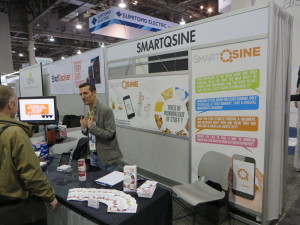
I wondered about the broad application of  Social Media Counter, one of those “visual radio” displays you see in restaurants that scrolls news headlines and sports scores, except this one scrolls your updated count of Twitter followers. Then there’s Smart Sine Food Minder, a collection of little radio equipped scales you put a carton of milk or other staple on; the scales know how much it’s supposed to weigh and send you a message when it’s running low.

Smart Sine Food Minder
Smart Sine Food Minder tells you when you’re out of something. The question is whether this is easier than a shopping list, and I fear not.

But I could be wrong. Or a buyer could be looking for exactly that niche kind of solution.

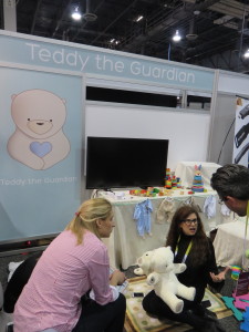
Witness the interest in Teddy the Guardian (watch the video), the sensor-loaded teddy bear that collects a wealth of information about your baby, then transmits it when you touch the bear’s paw.

You never know when the next big thing will come along in the form of something which you never imagined, but that now makes you say “of course!” That’s the magic of CES.

Smart homes and smart marketing at CES 2015

Oomi Smart Home system
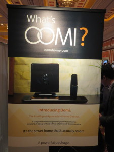
What’s Oomi? Tell me why I should care.
“Smart homes” is a useful topic for a marketing review because, while it’s exciting (or maybe ominous) to think about gadgets turning out the lights, managing security or monitoring our baby’s heartbeat, it’s up to the marketers to tell us exactly what their specific products do. Witness a few examples, good and bad, from the recent Winter 2015 Consumer Electronics Show.

Smart Home famil
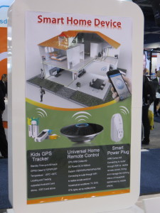
Generic smart home marketing
Oomi makes the mistake of thinking others are as interested in their product as they are. “What’s Oomi?” was the headline of their booth at the Showstoppers press event. Without a benefit or point of reference, it’s not likely many will stick around to find out. The subtext “the first smart home that’s actually smart” provides context but is too clever for its own good: I don’t know that there’s a perception of lots of smart home products that are stupid. It’s a solution for a problem that may not exist. And meanwhile, we haven’t learned anything about the product. (Like many others, it’s a set of modules that work together to handle various home automation functions.)

Not much better are a number of OEM booths I passed in the nether regions of the second floor in South Hall. By focusing entirely on technology, these importers make their systems generic. There’s a “home” graphic but otherwise they lean heavily on the “what” rather than the “why”. This is a common problem with marketing at the CES where thousands of new products and unfamiliar concepts jostle for attention simultaneously. In a few seconds as I stumble down the aisle you need to tell me not only what you are selling, but why I should care.

Teddy the Guardian
“Teddy the Guardian” baby monitor

For smart homes, it’s obviously about emotion, and the shoestring display for “Teddy the Guardian” does this very well. In fact, the signage doesn’t even say what the product is but the baby tcotchkes make a strong emotional appeal and you hang around long enough to find out it’s a teddy bear with all kinds of baby monitoring built in. There was a lot of interest in this one.

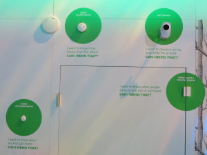
Four WeMo examples
Can I wemo that?

Finally, WeMo is a family of devices that monitor and automate activity in the home. Belkin created a mock home and then stuck devices all over the places with captions describing hypothetical problems and “can I WeMo that?” Compare this to Oomi, which seems to do the exact same thing, and you can see why Belkin’s marketing is so good. It’s a complete conversation that combines technology and the human factor and is fun to interact with as well. The booth was packed.

The Idiot of Things visits CES 2015 Las Vegas

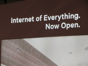
Internet of Everything Now Open
Qualcomm’s takeoff on the Internet of Things

I saw IoT all over Las Vegas on buses and billboards, and asked a booth staffer for an explanation. She said it stands for the Internet of Things and then proceeded to explain what that meant. I already knew the concept, just not the acronym but too late; I felt like a clueless Luddite. Anyway, it is indeed the Year of the Thing at the Consumer Electronics Show with heavy emphasis on apps for connecting mobile devices to all aspects of your daily life.

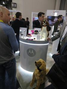
Pet monitoring gadgets
Lots of pet monitoring devices at CES 2015

Over two days I saw many gadgets for monitoring every aspect of your fitness, or your child’s, or even your pet’s. You can buy an electric toothbrush that has Bluetooth that connects to an app to show you how effectively you’re brushing. You can control your home remotely or turn your car into a nerve center for managing what will happen when you arrive while hopefully not getting into an accident due to distracted multitasking. (As a car company executive pointed out in a keynote, one thing that has to be sorted out is liability when a self driving car gets into an accident.)

3D family
3D printing and printed 3D products are huge at CES. Here, your family miniaturized for posterity.

What’s hot this year, in addition to things? Drones, lots of drones. 3D printers, and products and services connected to 3D printing. Smart cars that can be controlled with hand gestures (Volkswagen), will park themselves (Hyundai) or run on fuel cells (several). Fitbits and other performance monitoring electronics on steroids, so you don’t have to be because your conditioning is so efficient and awesome. And endless lineups of 4k televisions and monitors, each more vivid and breathtaking than the last.

Drones, also totally hot

What’s not? 3D television. (I saw just one at the show, billed as the world’s largest glassless meaning you don’t have to wear goggles.) Google Glass is ice cold… again, just one showing. And very few laptops, tablets or conventional PCs…. This was a gadget show, and it’s fully returned to its roots as a “consumer” show with very little business spillover. (Microsoft, which had an enormous presence in years past, was behind closed doors with a single hospitality suite.)

I’ve got a few reports coming up over the next couple of weeks:

  • Some interesting “mobility experiments” described in the keynote by Ford President Mark Fields
  • Best and worst of CES: some niche concepts that fill a narrow but credible role and others that left me shaking my head
  • Marketing makeover: I look at how, and how not, to present the “smart home” concept based on examples from many exhibitors
  • A historical retrospective on CES—an institution that would seem to have no history, since it’s always looking for the next big thing
Google Glass
Google Glass, not hot

Stay tuned.

Instead of protecting trees, Sierra Club turns them into advertising

Sierra Club Note Card Mailing
Sierra Club note card mail pack… that’s a lot o’ timber, podner!

John Muir must be spinning in his grave like a lamb on a campfire rotisserie. The organization he founded to “preserve the forests and other natural features” of the California Sierra Nevada Mountains has, in its most recent prospecting mailer, delivered a set of five two-panel note cards (complete with mailing envelopes) that must have taken out quite a swath of those forests.

Thinking about how many of these mail packs likely end up in the trash (or hopefully, recycling bin) unopened, it has to amount to a Giant Redwood-sized waste of natural resources. Hopefully it grates on the sensitivity of the target audience so it fails and they don’t do it again. Especially because the purpose of the mailing is not to protect the forests but wolves, who are being removed from the Endangered Species list presumably because they are no longer endangered.

I’ve been mildly irritated by previous Sierra Club mailings for their promotional nature but it wasn’t until today that I got rankled enough to dig into the mailing. A small notice that your gift is NOT tax deductible tipped me to go trolling on the web where, in spite of some excellent reputation management, it soon becomes clear that the Sierra Club you’re supporting is NOT the Sierra Club Foundation that spends 89% of its funds on worthy activities and gets high marks from charitywatch.org.

Sierra Club disclosures
Disclosures on the back of the reply form (which you send back). Click the picture to read the fine print.

Rather, “Sierra Club Founded 1892” is a PAC that spends almost half the money it receives on lobbying (this information is on the back of the gift form in the mail pack, which you are going to be sending back with your gift so it’s no longer in your possession). I took a picture of this document so you can see the budget breakdown, winsomely portrayed as a sectioned tree. I do see that 7.6% goes for “outdoor activities” which might be wilderness hikes, but might also be lobbyist picnics.

In short, I smell a polecat up this tree. If you’re looking for a year end tax deduction (which “Sierra Club” wouldn’t give you anyway) a better choice is Doctors without Borders which, while governments and NGOs dither about the fight against Ebola, is in Africa in force with boots on the ground. Grit your teeth as I did and check the “may we share your info?” box because it really does save them money if they can exchange lists, rather than renting them. Plus how else would you get on the list of other organizations and receive mailings like the one from the “Sierra Club”?