Copywriters, don’t spill your candy in the lobby

Bowtie Cinema urinal sign
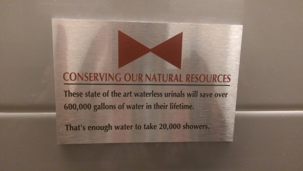
Sign over the urinal at Bowtie Cinema, New York

Gore movie maven and direct mail copy guru Herschell Gordon Lewis had a great admonition in one of his books: “Don’t spill your candy in the lobby.”* It means that you should not give away the premise of your selling message too soon but instead should take the time to build up some interest and curiosity. I have a good example in a OE teaser for Investor’s Daily which I show in my direct mail class:

40% are millionaires
35% have portfolios over $500,000
60% are in management
37% own two or more homes
What are they all reading?

Now, think what would happen if they left off that final line. You’d be fascinated by these impressive stats and would be thinking “who are these financial overachievers” and would tear open the envelope to find out. But IBD (which does not identify itself on the OE; the return address is an anonymous street address) has to refine the discussion and let us know they are selling a publication. If I’m not a reader, out it goes. The marketer spilled its candy in the lobby and arrives at the loge seating alone and empty handed.

I was reminded of this advice when visiting an actual movie theater the other day, where I spied the pictured plaque above the self-composting urinal. The initial message is praiseworthy: These state of the art waterless urinals will save over 600,000 gallons of water in their lifetime. Which is great, and they should stop there. But then comes the spillage: That’s enough water to take 20,000 showers.

It takes 30 gallons of water to take a shower? I had no idea… shame on me for taking so many showers. A positive message has been turned into a negative, unless this is exactly what the management of the theater intended. And maybe it is. But think what would have been the effect if the final line had been left off. You’d be left with a positive impression of the theater’s conservation practices, and that would be that.

* Actually, I don’t know if he said it or not but he’s said a lot of other clever things so I’ll give him credit for it.

If you can’t read the results, why test it?

FICO envelope front
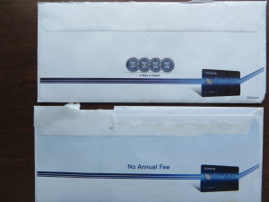
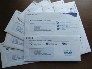
Envelope variations for Chase Slate FICO package, plus duplicates received at my address

My early direct mail copy chiefs beat this mantra into me: only test one thing at a time. If you change the offer and simultaneously change the letter lead, how do you know which change was responsible for any lift?

I thought of this as the drumbeat of “Free FICO Score” offers from Chase Slate continued, and I realized one of the envelopes looked different. Same color scheme, virtually the same OE copy on the front but arranged in a slightly different way. The first really noticeable change is on the back. One says “no annual fee” and the other has a lineup of four unidentifiable awards. (We know which would win in that test, don’t we, since benefits always eclipse chest pounding.)

FICO envelope back
FICO outer envelope back with testing variations

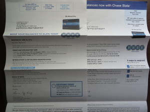
Inside the “alike but different” motif continues. One letter starts “Transfer high rate balances from other credit card issuers and save money.” The other, “From balance transfers to new purchases, Chase Slate makes saving simple.” Exact same facts, but one is about “you” and the other about “the card” so again, it’s pretty clear which would win if tested on its own. (That old copy chief of mine would have had the second writer start over, rather than testing the two leads.) However, the “you” copywriter is paired with the art director who put the shields on the back of the OE, so we’re tied.

Two FICO letters
Which of these letters is more persuasive? Why?

And it continues throughout the package, with design and copy slightly different without changing the facts or the basic presentation. What’s happening here is that two teams were tested against each other to see which one is “better”—a costly experiment on Chase’s part. This isn’t the same as a direct mail package test in which creative teams come up with completely different ideas from scratch. It’s an expensive waste of time.

My advice to Florian Egg-Krings, who signs both letters (no testing variations there): test spelling out “credit score” on the OE rather than calling it “FICO score”. Take one key benefit—I’d probably go with the reasons you’d want a monthly credit report and how great it is to get it for free—and lead one letter with that, then keep the other about your laundry list of benefits. Now you’ve got something worth testing.

Cadillac “Dare Greatly” ad campaign has an elephant in the back seat

During 2015 March Madness I’ve seen the Jason Wu Cadillac ad numerous times. Certainly it’s daring greatly to heavy up on a story about a guy whose mom gave him a sewing machine during the uber-macho celebration of NCAA basketball, and the ad is a great story. But what’s that vehicle rolling into frame at the end? Oh, wait, it’s a Cadillac… whaat?

I went googling and found Cadillac’s Dare Greatly page, which provides nice access to all the celebrity stories featured in the campaign. I watched the story of Jason Wu in full (that’s the video link above; the ad itself doesn’t seem to be available online) and also that of Anne Wojcicki, founder of 23andme. They’re well done. The overall impression is of somebody who was immensely talented to begin with, but then took a career path that took them out of their comfort zone. Obviously that’s a great metaphor for a once adulated, now staid luxury car brand that wants to reinvent itself.

But here’s the thing. I can’t imagine any of these people actually driving a Cadillac, other than maybe Steve Wosniak who’s a car collector and something of a schlub. (In fact, if you can prove to me Anne Wojcicki doesn’t drive a Tesla S, I’ll send you a free copy of my book right now.) So the ads, while celebrating the daring and talented, inadvertently separate the product from the celebrity endorser.

This campaign is often compared to the iconic Chrysler spots featuring Eminem and later Clint Eastwood. But those gentlemen weren’t endorsing a car. They were endorsing a spirit: Rocky, relocated from Philadelphia to Detroit, the downtrodden American underdog rising from the ashes of defeat. You buy a car from these guys not because they drive one, but because it’s the right thing to do.

When Chrysler next hired Bob Dylan and turned him into an Ed McMahon-type huckster, it was cringeworthy. A better use of the celebrity as pitchman was the Lincoln ad with Matthew McConnaghey where he comes right out and says “I’ve been driving a Lincoln since long before they paid me to do it.” Anyhow, what all these ads had in common was that they make a direct connection between the celebrity and the car—in most cases, the spokesperson is behind the wheel in at least one scene. (I think Eastwood may have stepped from the shadows behind a Chrysler.)

And that’s the disconnect with Cadillac’s Dare Greatly campaign and its celebrities. In order to convince them to participate, Cadillac obviously told them they did not have to mention Cadillac, appear with Cadillac, or drive a Cadillac. So we have the choice of questioning the credibility of the endorsement, or realizing it’s not an endorsement at all.

Celebrities are infinitely useful as metaphors, especially if they’re dead. (Think of the “Here’s to the…” images in the Apple “Think Different” campaign.) But if you’re interacting with live ones you can’t put up a firewall. You have to ask them about the car. That’s the lesson here.

Dealing with writer’s block

Early in my freelance copywriting career, I suffered three serious episodes of writer’s block. I no longer have any memory of the assignments or why I was stuck, but I have an intense physical recollection of each attack.

At the time I was living in the Silver Lake area of Los Angeles, just below the reservoir. First time it happened, I decided I would pace around the park as a way to calm myself down. I remember a beautiful day, warm sun beating down, and me miserable because I got nothin’. I’d give myself a few minutes of strolling, then go home and sit down at the typewriter (yes, this was a while back), flail, repeat. I put on a lot of miles and probably got some sun damage that day.

During the second episode I got so agitated I could not eat. I was subsisting on peanut butter sandwiches at that time and I made one and cut it into bites and left them on the wraparound butcher block counter of the kitchen. Each time I passed I’d grab one of the bites and stick it in my mouth without looking. Some made it down, some didn’t.

The third must have been years later because I had a daisywheel printer (remember?) and my downstairs office. When writer’s block attacked, I decided I would just keep writing till I got it right. When I was finished, or maybe gave up, I pressed the print button on my Mac Plus (remember?) and page after page of virtual identical paragraphs spat out, a piece of evidence I still have posted on an office bulletin board.

I’m remembering this because I had a near-attack the other day, the first in many years. I was working on a large-scale, long term project (doing a new draft of my novel after it came back from an editor, to be specific) and I got to a part and realized it wasn’t very good. I started in, got stuck like a car with bald tires in snow, took a deep breath and backed off. Then, within a few hours, a number of short-turnaround paying projects came to life and I knew I would not return to the big project for a while. I also knew, from experience, that when I did return I would feel blocked.

So I gave myself an hour to return to the troublesome episode, and write through it. I actually came up with a solution that I think will work, but that was a bonus. The main thing was not to find myself greeted with failure and a problem when I next approached this project. I went through the black hole and came out the other side. The key to this technique was that I did not require the section to be any good. It simply needed to take my main character from point a to point b.

There’s another solution to writer’s block, which is to stop as soon as you feel it coming on. But this isn’t always possible when you’re on assignment. How about you? Am I the only one this happens to? If not, you might want to get my book. There are several ideas for curing writer’s block in there.

Brands get their (big) game face on for Super Bowl FSIs

Big Game FSIs 2015
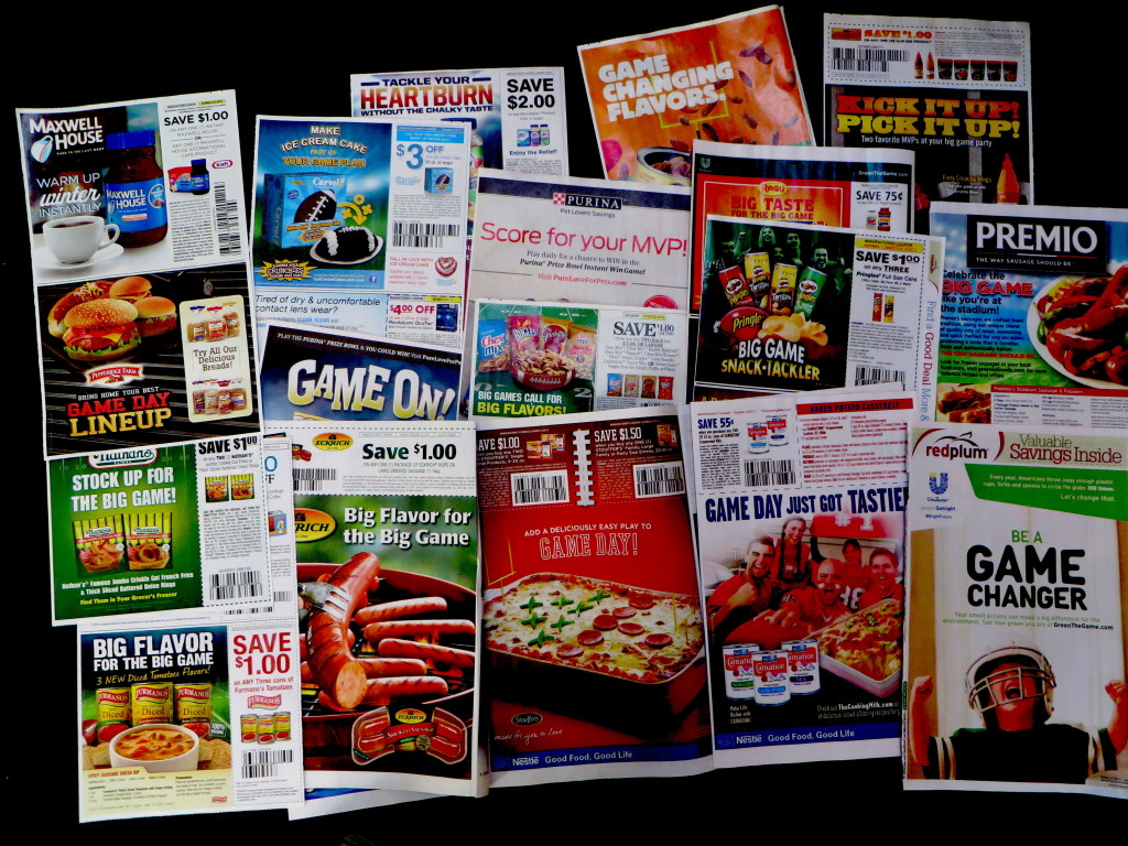
How many ways can you say “Big Game”? Not that many, apparently.

The big day for football fans has come and gone. Of course, I’m referring to the Sunday before the Super Bowl when the newspapers are full of FSIs touting snacks of all varieties (except healthy) as super savory, fan favorites or a tasting touchdown without ever using the actual name of the event which requires an exclusive and very expensive license from the very litigious (unless you are a wife-whacking or child-whipping pro athlete, in which case you are exempt) National Football League.

Except… hardly any of the headlines are anywhere near as creative or alliterative as the descriptives I tossed together above. Take a look above… a majority of the ads have “Big Game” in some variation as their headline with only the lamest attempt to tie it to the product. We have two incidences of “big flavor for the big game” and one “big taste for the big game” along with “big game lineup”, “stock up for the big game” as well as “game plan” and the ever popular “game changer”. You’d think that copywriters have a vocabulary of 50 words, but that’s wrong because a lot of the non-Super Bowl ads in the same edition are very clever. (My personal favorite, “What the Yuck?” for a super strength detergent that gets the “yuck” out of deeply soiled clothes.) They are bored with this tiresome yearly charade and as a result get sacked for a loss, creatively speaking.

Super Bowl P&G ad
Look! A Super Bowl ad that says Super Bowl!

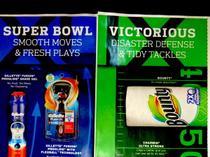
Interestingly, the words “Super Bowl” actually do appear, in a spread in the P&G Brand Saver. Their Gillette shavers, it turns out, are indeed an official sponsor. All the senior people were in the jet on the way to Phoenix (where this year’s game will be played) so the playbook was left in charge of a novice copywriter and a too-cute art director. “Smooth moves and fresh plays?” I don’t think so. And can you find the Roman numerals XLIX, for 49, hiding in the ad? Sadly, Ex-Lax is not a sponsor and this will be the last Roman-enumerated Super Bowl; we’re moving to 50 next year.

My prediction: Seahawks by seven.

Boredom banished at DMA 2014

The Direct Marketing Association’s annual conference is happening this week in San Diego, and I’ll shortly get on a plane to join my colleagues. I will be on a panel Tuesday morning October 28, called “Creative Slamdown: How world-class creatives successfully sell strange, obscure, boring or even the most mundane products” put together by estimable designer and freelance creative director Carol Worthington Levy. Panelists Kathy Lemmon and Michelle LaPointe and I will vie to present the most interesting case history of a dry, difficult or tedious assignment which was executed in an interesting and hopefully effective (since this is a direct marketing conference, after all) way.

My centerpiece is a print ad for Rovi’s advertising in the guide (the ads the appear on your TV channel guide while you are looking for a show to watch) aimed at media buyers. Come see how we turned a straightforward and complex pitch/explanation into something memorable, or at least unexpected.

The session is at 11 am, just before the “Hall of Fame” luncheon which is traditionally a barn burner, so this is a great way to get all fired up and ready to go.

Persado is not going to put copywriters out of business. (Whew.)

Persado Try It Page
Persado “Try It” page; click the image to try it for yourself

A recent article on artificial intelligence in the Wall Street Journal had me trembling with fear. It described a technology called Persado which writes emails and landing pages for multivariate testing, stating each component of the message in an infinite number of ways which can be mixed-and-matched through AI to surface the result that gets the best response.

“A creative person is good but random,” according to Lawrence Whittle, head of sales at Persado. (Note that the reporter relies on the sales department, rather than talking to a technologist.) “We’ve taken the randomness out by building an ontology of language.” The article goes on to explain how Persado deconstructs each ad into five components including “emotion words”, product descriptors, the CTA, text position and images and then offers up every conceivable option. (Actually I guess it does not offer them up but simply inserts them into an automated test.)

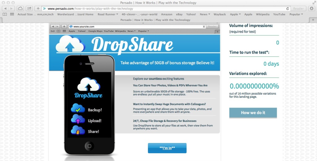
I experimented with the “play with the technology” page today (after taking over a month to get up the courage to visit the site) and am greatly relieved. The static page is shown here; you can click through to the site and try it for yourself. The “free storage” subhead, button and the text in between will dance around as you mouse over them showing all the options Persado has come up with.

However, there’s one thing that’s obviously wrong with this example landing page that Persado doesn’t address, at least in the demo. Any cub copywriter can tell you the biggest problem with the ad, which is that the company’s logo is used as the headline and the true head, a benefit statement about free storage, becomes the subhead. The logo head is actually completely unnecessary since the logo is repeated in the screen shot of the smartphone. (To be fair, Persado lists “image” as one of the things it tests, but it’s not happening here. It would be embarrassing if they put up a demo which does not properly represent the product.)

What Persado is going to kill is not copywriters, but boredom. I’ll certainly experiment with headlines and different button text, and if there’s more than one way to express a key selling point I’ll give my client options. But I don’t have the patience, and you’re not going to pay me, for micro-experimenting with every word in the copy. Persado, be my guest.

Why Words Matter… in bank marketing

We work hard to make banking easy.
How about…”We work hard to make banking easy”?

A regional bank has invested in an image campaign, and the results are visible in the window of their local branch. Unfortunately, the copywriter has a tin ear. Let’s take a look at three sequential pieces of signage to see what I mean.

“We strive to make banking simple.” Making something simple is a benefit, but strive is a word that implies difficulty. It’s also a little bit above the average person’s everyday vocabulary. “We work hard to make banking easy” would have been better, especially because hard/easy balance each other in a way that strive/simple don’t.

We'll give your money a good home
“We’ll give your money a good home”?

“Feel good about your finances.” Another five dollar word. “Finances” is not a word in the average person’s vocabulary or, if it is, it’s not something you feel good about. “Feel good about your money” would be better but it doesn’t really tie back to the bank. (Neither does the original line, of course.) How about “We’ll give your money a good home”?

The convenience you want, with the security you need
“The convenience you want, with the security you need”?

“The convenience you need with the expertise you trust.” The copywriter was running on empty when s/he got to this one. Convenience isn’t something you need. Want, crave but not need. Expertise is another of those high falutin’ words. What’s wrong with “experience”? Again, we have two concepts strung together so thought should be given to how they balance. Is it news that you can have expertise/experience AND convenience? Not really because they’re two unrelated benefits.

For that matter “need” and “trust” aren’t very well balanced either, are they? Let’s choose something you wouldn’t really expect to get with convenience, and use verbs of equal weight. “The convenience you want, with the security you need.” Because usually the more secure things are the, less convenient, right?Vestibule

So there we are. Didn’t take that long, did it? But I have the feeling the copywriter’s not wholly at fault. I say that because of what’s written over the ATM entrance. “Vestibule”? How about “lobby”? The client probably got the big words because that’s what the client demanded. It reminds me of David Ogilvy’s maxim, “don’t keep a dog and bark yourself.”

Mumblecore Marketing

We Boomers have a bug up our rear for Millennials, much as the “Greatest Generation” probably felt about us back in the day. Wall Street Journal reported on how they don’t like to use the telephone (probably because it intrudes too much on their personal space), and there’s now an app that allows them to hire household help without the awkwardness of meeting face to face and giving instructions.

In short, Millennials are self absorbed. Just look at them: walking with their heads down, obsessed with their iPhones, as they board their Google buses with the dark windows that will swoop them up to earn big bucks at whatever it they do. Goddam kids…

I have noticed a consequence of this in what I’ll call Mumblecore Marketing: emails that are deliberately casual and slouching, as if it’s almost too much trouble to get around to selling you something. As a side benefit these emails seem like they were written by somebody you know, though you can’t remember exactly how you know them.

Nicole Marshall of DMNews—by definition a direct marketing best practitioner and careful tester—is a great mumblecore marketer as far as subject lines go. “Did you see this email” “Re: 2 weeks left” “Are you free at 1 PM ET?” and “Log in now!” are a few that made me look. The body content is fairly straightforward, but the casual subject lines get my attention which is what they’re supposed to do.

Peter Coates of insideout.com starts with the subject line “Following up” and begins,

Hi Otis,

I sent you an email the other day… if your inbox looks like mine, you may have missed it. Just wanted to let you know Inside Out is holding a Performance Coaching workshop at the Fremont Marriott Silicon Valley on March 11.

It’s designed to help more leaders coach more often, for more business impact. Would you or your colleagues like to attend the training? There are a couple of discounts available if you are in a position to evaluate for your company or if you would like to bring your colleagues with you.

I’m happy to set up a call. Let me know a few times this week when you are available for a conversation.

Warm regards,
Peter

This is a very hard sell situation—a paid seminar—but the casual tone is disarming. Mentioning a previous email I didn’t read—a classic direct response no-no—makes it fresh and personal. And referring to “a couple of discounts” without getting into the details of pricing raises curiosity rather than objections. Once I get this far, there’s more straightforward content (including the price) below his signature.

Mumblecore, as you no doubt know, has its roots in independent film, usually low budget and featuring actors who try to appear non professional in order to create a realistic, slice-of-life storyline (though often there isn’t a storyline) including Greta Gerwig taking off her clothes. The term was coined by a sound editor, who was probably frustrated that he could not always understand what the actors were saying.

In mumblecore movies and in mumblecore marketing, the illusion of authenticity is absolutely essential. Make one false step and you turn yourself into a laughingstock. Such was the case with this email, which arrived with the subject line: “Young entrepreneurs… disrupting the food industry – Fancy Food Show 2014”.

Otis-

My name is Blake & I’m the Founder at eatKeenwa. We’re a bunch of mid-to-late 20 year old entrepreneurs disrupting the status quo in the food industry and re-pioneering American manufacturing. We’re doing something different for once.

We make a stellar snack out of quinoa. It’s robust in flavor, full of functional benefits and packaged with commanding presence.

Please stop by our booth, #5126. I would love to share our story with you. It will leave you engaged and will resonate with your audience.

Please check us out at www.eatkeenwa.com.

Thanks & Be Well,

Blake Niemann

The casual tone is there, but it’s disrupted by jargon and hype: “resonate” “engaged” and “commanding presence” are meaningless and overused and instantly tip off the reader. Kudos, though, for inventing a new word, “re-pioneering”. That truly is “doing something different for once”.

I hear often from Peter and Nicole, suggesting their marketing works; Blake was a one-shot wonder. I have the feeling the mumblecore marketing for eatkeenwa was suggested by a consultant, probably an elderly wretch with tobacco-stained fingers, who then couldn’t resist adding a few time-tested zingers. Blake, if you’re reading, try writing your own copy next time. After all, you and your fellow rambunctious twentysomethings are the real deal.
“Hope you are well” email intro makes me sick

Here’s an email typical of many I receive these days. It’s to a business account, and it begins:

Otis,

I hope all is well. I’m not sure if you’re attending the Fancy Food Show in NYC on June 29th – the July 1st, but if you are I thought you would be interested in visiting the Crown Maple booth…

Why do so many marketers these days think it is appropriate, and maybe disarming, to inquire about the recipient’s health as a way to start a mass email? What’s it to them? What business is of theirs? If I’m well I’ll attend the event, unless I get run over on the way, and if I’m not I don’t need you reminding me of it.

Note the odd use of “the” above, before “July 1st”, which suggests the writer is not a native speaker. Could this have something to do with it? The French (this is for a maple syrup product, so I suspect un Habitant at work) have the equivalent phrase Comment ça va but that just means “how’s it going?” which I don’t find at all offensive.

I’m preparing a longer post on the general trend toward faux-casual business email but this stuck in my craw so I couldn’t wait to get it out. There. Now I feel better. Thanks for asking.