Tips for making the most of DMA &Then annual conference in New Orleans

The DMA Annual Conference happens next week, October 8-10, in New Orleans. If you haven’t registered, you can still get a ticket here. The format has been revised again, eliminating the Ignition sessions I’ve led the last three years, so I will be sitting this one out. Please have a beignet and a muffuletta on my behalf.

In case this is your first DMA, a couple of tips. The content has reverted to a focus on use histories presented by marketers and their agencies, which can vary from life-changing to self-serving and there’s often no way in advance to know which is which. My strategy is to choose backup sessions in each time slot and sit at the back of the room, so I can slip out unobtrusively if the session turns out not to meet my needs. I’ve found there is little correlation between the size of the room or the popularity of a session and its quality, so you shouldn’t necessarily jump into a room because it’s standing room only. Read up on the speakers and their companies and plan accordingly.

My second tip is to spend a good amount of time in the exhibit halls. Of course you want to see what the exhibitors are up to (and support their investment in the show), but this is also the place where I run into old colleagues, clients and friends who are randomly trolling the floor like I am. Speaking of networking, my third tip is to sit at tables during the meals where not only do you not know anybody but the participants don’t appear to know each other. That’s how to meet new prospects (because I’m a copywriter, almost everybody is a potential prospect for me) and learn new things.

And finally, take the time to enjoy New Orleans, one of the great food and entertainment cities of the world. The Convention Center is somewhat removed from the most interesting areas as are the big hotels, so you’ll need some initiative to make the most of the city. Go to the French Quarter early in the morning when the locals are waking up. Stroll, smell the flowers, get chicory coffee along with that beignet at Cafe du Monde. If you’re there on Sunday, take the streetcar out to the Garden District and have brunch at Commander’s Palace. Walk the French Quarter again at night, where you can enjoy much of the jazz (including Preservation Hall) simply by standing outside the open windows. I’m jealous!
Free marketing advice from Warby Parker

The other day I was on a plane and got in a conversation with my seat mate. When she found out I worked as an advertising guy she told me her husband designed neckwear and wanted to sell his ties via the internet. What free marketing advice did I have?

My first thought was, uh oh. Fashion is a very fickle industry. I had some experience early in my career when I was an ad manager for a large department store. In that bricks-and-mortar era a men’s fashion manufacturer had to sell a network of retail buyers each season, starting with the MAGIC Show  (is it still around?) and other industry events and and once you had a few retailers signed up, manufacture and distribution was the next channel. Maybe online sales have broken down some of those barriers, but the subjectivity of the ultimate buyer probably hasn’t changed.

Then it occurred to me: Warby Parker. Here’s another niche fashion product that seems to be very successful, based on the frequency with which I see their Facebook ads. So I advised her to study Warby Parker, or another single-line internet retailer, to see what they do. If it seems successful, then consider emulating their strategy.

I don’t think this is bad advice. One of the great things about working in marketing is its transparency. It’s not like the technology industry where a company’s special sauce is kept under lock and key so competitors won’t steal it. To the contrary, retail advertising is in plain view and the more you see it the more successful it probably is.

“What advice can you give me as a marketing pro” has just been added to the topic list for my DMA Ignite session on Monday, October 17 at the DMA &Then conference. This session is evolving into a sort of town hall meeting in which creative practitioners and ad managers will share their ideas and frustrations with their peers. Come join us at 4 pm at the Los Angeles Convention Center. And in the meantime, if you have any free advice of your own, please comment below.

DMA &Then 2016… I’ll be back

I’ve been asked to repeat my Ignition session at this year’s annual Direct Marketing Association conference, which will take place in Los Angeles. My slot is Monday October 17, 4:00-4:45 PM.

Titled (for legacy reasons too complex to go into here) “Devilish Details: Looking for an Advantage in Your Copy and Design”, it’s essentially an opportunity for creative practitioners and managers to let down their hair in a town hall setting. You know all those times you’ve seen a really good or bad example of creative and wished you could talk to somebody about it? Or that ridiculous assignment that you aced in spite of the suits? Or how your legal department maimed your dream concept? Here’s your chance to share.

I’ll come prepared with a few examples to prime the pump, and would love your suggestions either as comments or emails to me. Some of the areas I want to touch on are “Brands saying bae” (cringeworthy examples of corporations trying to be hip in social media, as featured by the @BrandsSayingBae handle or seen in the wild), infographic abuse (some are ok, but some are graphics for the sake of graphics, right?), mumblecore emails and whether they work, and fake-official direct mail that makes you wonder how stupid marketers think we really are.

Got any more ideas? Please share!

We will also have food! Not in the session (though copies of my book will be given away), but repeatedly during the conference because Los Angeles is a great food town. I’m specifically interested in great Chinese in the San Gabriel Valley and interior Mexican and am starting the research process now. Again, suggestions appreciated. This will be fun!

DMA 2015 &then was a home run

&then2015, also known as #andthen2015 or simply the DMA Annual Conference, is in the books. The Boston event concluded with an emotional keynote from John Legend that wrapped up about 4:15 this past Tuesday, October 6. I would venture to guess that the event succeeded beyond anybody’s wildest hopes and dreams.

A huge format change had staff scrambling up to the last minute to get relevant information online. As a presenter, I was a bit worried about who might show up or if nobody would. But they came, and they were engaged, by a curriculum that somehow weeded out the self-serving promotional sessions of prior years as well as cutting a full day off the program by removing the Hall of Fame Luncheon, report from the DMA President and other excuses to take your client offsite for lunch.

I’ve rarely seen a mature organization give itself such a radical makeover and objectively the possibility of a failed event was pretty high. But these guys pulled it off and it really was the best of maybe 20 DMA conferences that I’ve attended. Special thanks and congratulations to my immediate contacts, Jeremy Ladson and Keith Baker of the programming committee. See you next year, I hope.

Get a free copy of my book at DMA2015 &then

Update: DMA &then website has now been updated with full schedule information. Go to http://dma15.org/schedule/ to read all about it. BE SURE TO USE THIS LINK; the “build your schedule” menu on the home page of dma2015.org still produces the old placeholder content.

Here’s the session I am leading on Monday, October 4, from 4:45-5:30 at the DMA’s revamped &then conference in Boston:

Devilish Details: Looking for an Advantage in Your Copy and Design
An interactive sequel to one of last year’s most popular sessions, “The Devil’s in the Detail”. Share clever tweaks and clumsy misfires that made a big difference in creative execution and bottom line results—good or bad. Veteran copywriter Otis Maxwell will kick things off with examples of a few gems and gaffes, then you join the fun. Fabulous prizes for the best ideas!

This is an “Ignition” session which is designed for attendees to interact in a town-hall environment. I’ll share some examples of copy and design decisions that had a negative impact on campaigns, then make suggestions for how to improve them. After a few examples I’ll open things up to the floor and ask folks to share their own experiences which can be a/creative home runs and pratfalls they’ve experienced in their own work and what they’ve learned from them, or b/third party examples similar to my own.

While copies last, everybody who makes a meaningful contribution gets a free copy of my copywriting book, Copywriting that Gets Results!

Note: As of September 27, there is still placeholder copy on the DMA15.org website. This is the session in the slot called “Concentrating on the Detail: Copy & Color Choice”. That’s the placeholder title; what I’ve described above is the real deal.

Why too many good ideas can sink your direct marketing campaign

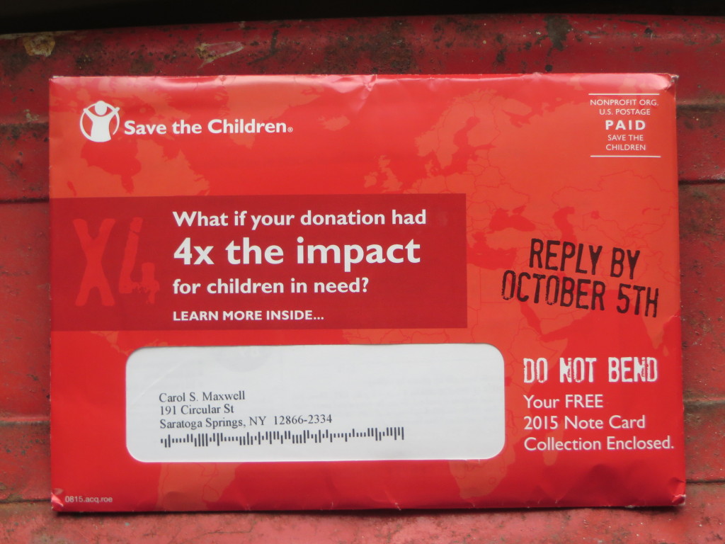
Front of Save the Children OE
Save the Children outer envelope has lots of good ideas

It’s great that you are brimming over with good ideas. Unfortunately, your prospect is not nearly as enchanted with your creativity as you are. They’ll sit still for one powerful marketing statement, perhaps supported by a call to action subhead, then it’s off to the deleted messages folder or the recycling bin. When you put out too many good ideas, you run the risk of getting none of them across.

This Save the Children appeal is an example of too many good ideas. On the front of the outer envelope is this headline: “What if your donation had 4x the impact for children in need?” That’s a very legitimate teaser and it’s supported by the subhead “learn more inside…” Unfortunately, the reply-by date is a complete non sequitur. Does the 4x benefit cease on that date? Then there’s the free notecard statement which I’m aware is a popular fundraising technique in today’s society, but it appeals to greed which is a different motivator than wanting your gift to do the most good so it’s misplaced here.

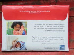
Save the Children OE back
Still more good ideas on the back of the same envelope (click the photo to enlarge and read the quotes)

On the back there are MORE good ideas. Here’s a quote from Bill Gates that would support a package all by itself. When asked to recommend a top philanthropic cause on the Today show, he replied, “you can go to Save the Children—they help mothers have safe births… It’s amazing. You can be sure that [this organization] will put your money to good use.” A minor quibble, not everybody knows who Bill Gates is so I’d set the stage by saying he was the world’s richest man until he started giving away his money. Then we’d have a very nice setup for a direct mail pack or maybe a long form print ad.

Unfortunately, the Bill Gates quote is diminished by a quote from the Save The Children’s own president, in the same size type. Since she has maybe a tenth the credibility of a legendary philanthropist in this context, that should be the weight of the two quotes—or, better yet, leave it off. And we’re not done; the envelope needs to tell us that Save the Children has earned its 14th consecutive 4-star rating from Charity Navigator. For what? Hopefully it’s for using my money efficiently instead of spending it on administration and marketing. But tell me; don’t just show me the Charity Navigator logo.

Save the Children is a fabulous organization that really does great work; I was quite familiar with some wonderful packages written by my mentor Robbin Gehrke at Russ Reid. But this isn’t a winning effort. It falls victim to too many good ideas.

Coming to DMA &then in Boston? We’ll be talking about this and other examples of marketing milestones and miscues in my interactive Ignition session, Devilish Details: Looking for an Advantage in Your Copy and Design. It’s at 4:45 pm on Monday, October 4. See you there!

TV ads during the World Series: the good, the bad, the strange


For somebody who works in marketing, I don’t watch all that much commercial television. This changed during the recently concluded World Series, where I was following the fabulous Giants in a hotel room without a DVR while attending the Direct Marketing Association’s conference and so giving a lot of thought to advertising.

Certain ads played over and over again, making me the beneficiary or victim of frequency. An ad I never tired of was Budweiser’s “Friends Are Waiting” spot. A young guy bids farewell to his dog as he heads out the door with a suitcase of beer; later it’s night and we hear ominous music and the dog is sulking, making us guess something bad happened; then it’s morning and the guy comes home after all because he decided not to drive after drinking. The punch line: “Some never make it home. But we can change that.” A bit cryptic, yet absolutely perfect.

The Matthew McConaughey ad was another winner in a fine series, which equates driving a Lincoln to being an American success. It gets a special mention for this line: “I’ve been driving Lincolns since… long before they paid me to do it.” As copywriters we struggle to include the mandatory compensation disclosure in spokesperson ads. This is a beautiful solution.

Bad was everything from T-Mobile, and especially the ad with a Pirates outfielder making a last minute catch. The rather obscure message of this campaign is that they have better broadband coverage than some competitors (maybe because they have so few customers?) so if you want to capture the moment with a video at the event you won’t get timed out. The problem was we were already at the event, watching the game. The incredibly high production values/expense to create something that look like a high definition tweak of reality was wasted and ultimately annoying.

And just peculiar was the Bank of America ad featuring the dad Rafael Feliz who’s bopping around making strange purchases with the money he’s earned with a cash back card until finally it’s revealed he is putting together a night sitting on the beach watching a surfing video with his family on a portable projector—presumably all bought or rented with points. Rafael looks hapless throughout this spot and his kids, the beneficiaries of his largess, look like they’d rather be somewhere else.

Since “responsibility” is the theme of most of BofA’s commercials these days, one wonders how this even made it off the storyboard. It’s just tone deaf instead of whimsical or charming and one also wonders if they test this stuff against real audiences. A presenter at the DMA shared some car ads and results—one for Audi (as I recall) where the car helps avoid accidents just as a parent does with kids, and another spy vs spy for Hyundai with a lot of chases through tunnels, helicopters and other James Bond silliness. The sweet one dramatically increased “intent to buy” while the spy themed ad actually reduced intent to buy, so maybe not.

Boredom banished at DMA 2014

The Direct Marketing Association’s annual conference is happening this week in San Diego, and I’ll shortly get on a plane to join my colleagues. I will be on a panel Tuesday morning October 28, called “Creative Slamdown: How world-class creatives successfully sell strange, obscure, boring or even the most mundane products” put together by estimable designer and freelance creative director Carol Worthington Levy. Panelists Kathy Lemmon and Michelle LaPointe and I will vie to present the most interesting case history of a dry, difficult or tedious assignment which was executed in an interesting and hopefully effective (since this is a direct marketing conference, after all) way.

My centerpiece is a print ad for Rovi’s advertising in the guide (the ads the appear on your TV channel guide while you are looking for a show to watch) aimed at media buyers. Come see how we turned a straightforward and complex pitch/explanation into something memorable, or at least unexpected.

The session is at 11 am, just before the “Hall of Fame” luncheon which is traditionally a barn burner, so this is a great way to get all fired up and ready to go.

Back by popular demand at DMA2013

My panel discussion on K.I.I.S. (Keep it simple, stupid) marketing was asked to return to the Direct Marketing Association’s annual conference based on our being one of the top-rated panels at last year’s event. DMA2013 is happening in Chicago and we’ll be the last session before the wrap-up lunch presentation on Wednesday, October 16. I love Wednesday sessions because they happen after the trade show is over and the Echo awards are done, so anyone who’s still around has a serious reason for being there.

Once again, Dawn Wolfe of Autodesk and Philip Reynolds of Palio+Ignite will join me and show what happens when, instead of technical jargon or corporate posturing, your advertising connects with the reader or viewer or web browser based on a simple appeal to the things that are important to them. The rules of “back by popular demand” are that the framework of the topic is the same, but the examples and case histories used have to be completely new. Come sit in… it will be an interesting and hopefully entertaining hour.

Nerds are people, too!

Here’s a preview of the KISS panel we’re presenting at the Direct Marketing Association’s annual conference in Las Vegas. Come see us next Wednesday, October 17 at 9 am to get the full story!

When you’re selling complex products and services, that often have a high price tag, it’s easy to overcomplicate your marketing message. A copywriter might think, it’s hard to know which of the technical specs is most important so I better include all of them. Or, this buyer will need a lot of information in order to justify the cost. The problem is that ultimately you’re still selling to people. And we can only absorb so much information, especially when we may not have asked for that information in the first place.

The solution is to keep it simple—tell your complicated story in basic human terms that boil down to easily understood story lines and personal benefits. Because even if we’re the chief technology office of a large company, we’re also a human being and we will evaluate rationally but ultimately make an emotional decision.

For example, here are the “Six Universal Buying Motives” as described by Roy Chitwood at Max Sacks International. A powerful appeal may speak to more than one of these emotions. And if you are appealing to none of them you’re going to have a lot harder time making the sale.

1. Desire for gain (usually financial)
2. Fear of loss (again, usually financial)
3. Comfort and convenience
4. Security and protection
5. Pride of ownership
6. Satisfaction of emotion

Now, let’s look at how these might translate into a technology workplace environment:

1. Desire for gain (usually financial)
=career advancement, better performance reviews.
2. Fear of loss (again, usually financial)
=job security, avoidance of unpleasant surprises.
3. Comfort and convenience
=less late hours, fewer angry users/bosses.
4. Security and protection
=systems work as they are supposed to do.
5. Pride of ownership
=taking credit for a new and better solution.
6. Satisfaction of emotion
=elegant systems that make the enterprise work better

The moral: people are still people, even when they’re on the job and deciding which technical products to buy. At the end of the day they want to be praised for their good work, have a comfortable lifestyle because they’ve been promoted, and go home at a reasonable hour instead of having to solve headaches. And you can tell them how your product helps them do this.

There’s lots more KISS (keep it simple) creative on tap from Dawn Wolf, Philip Reynolds and me. Come see us at 9 am on Wednesday, October 17 at the DMA in Las Vegas!