The new American is arriving

I love the new commercial announcing the US Airways/American Air merger. It’s stirring, and poignant, and on-message. Who would have thought that a corporate merger could make your heart swell with pride? They did it with an emotional tug at the appeal of new beginnings… an empty airport becomes filled with promise and we remember that flying used to be romantic and exciting. Here’s the script, as narrated by John Hamm:

It’s time to make a change.
It’s time to become better versions of ourselves.
To be greater than you expected.
And more than you had hoped for.
So starting now, we begin a new chapter.
One written in passion, and skill, ambition, and sweat.
One where two companies take the best of themselves to create something better.
And when all is said and done, we will not only have become a bigger airline
But also something so much greater.
So let’s introduce ourselves to the world…
Not again, but for the very first time.
The new American is arriving.

What’s even better is that the spot was completed on February 12 (per the slate at the beginning), the day before the merger was announced, so it would seem to have been produced in record time. How did they do it? Perhaps it was in the can in anticipation of the event (which had been publicly discussed for several weeks), but I like to think they (McCann Worldwide) quickly threw it together using footage from the recent “Change is in the Air” campaign which debuted last month.

That campaign, by the way, fails for me in the same way this new spot succeeds. All the people stopping what they’re doing to look into the skies seems manipulative and unlikely, and also brings unfortunate echoes of 9/11, especially the peek at the tail of the plane disappearing over the top of the building. The evolution from that campaign to this one is to be applauded. I also like the fact I’ll finally be able to use my AAdvantage miles, since US Airways but not American flies to my local airport. Well done.
Do Initial Caps Improve Response?

I was half-dozing through a Google Adwords tutorial the other day when something woke me up: the instructor’s advice that you can improve results by putting all the words in your ad, but especially your keywords, In Initial Caps Like This.

David Ogilvy must be spinning in his grave as if on a rotisserie. He railed against ALL CAPS in Ogilvy on Advertising because they deconstruct a word and turn it into a bunch of separate letters which the reader must look at one by one in order to make sense of it. Readers don’t do this. If there is any impediment to readability, they move on.

I have always assumed that Capitalizing The First Letter Of Each Word presents a similar problem, and I thought Ogilvy wrote about it, although I can’t find the source right now. But it’s the same issue of comprehension. Inappropriate use of initial caps means the reader sees individual words, not phrases, so it’s that much more trouble to seamlessly absorb the message. What’s more, overuse of initial caps gives your advertising a kind of stilted, affected, 19th century look. It’s certainly not what you want if you are selling a product or service which is closely attuned to the needs of 21st century consumers or businesses.

For these reasons I’ve always advised my clients against unnecessary initial caps, and often changed their copy if I get my hands on it. That’s why the Google “tip” is so demoralizing. Have people stopped reading copy completely, so they no longer have the mental acuity to focus on more than a single word or at most a keyword phrase?

Please, tell me it ain’t so. If you have testing experience with standard capitalization (what Microsoft Word calls “Sentence case”) vs initial caps, I’d love to hear the results. If initial caps are indeed the wave of the future, I’ll accept that. But I Won’t Like It.

Lincoln, I like you better now. Oh, wait.

Lincoln New Yorker ad
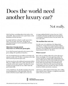
Lincoln Ad. Click on the image to enlarge, then click again to read.

I am surely in the demo for the reimaged Lincoln, for the day after I saw the WSJ ad I ran across this in the New Yorker. It’s so dramatically superior to the “Hello. Again.” ad that the two could be compared as a copywriting clinic. Again, I’ve reproduced the actual ad since I can’t find the full text online and am too lazy to retype it. Let’s see what is better this time around.

1. There is a clear narrative. This is the story of Edsel Ford and how he had a dream, built great if eccentric cars, and now we are back presenting this new vehicle in his spirit. So much better than the “Hello. Again.” ad that darted back and forth between the past and the present, then swerved into the service commitment and ultimately made me carsick.

2. The proof points are big and dramatic. Instead of a sunroof, this new Lincoln has an entire “panoramic glass roof” that makes driving it like driving a convertible. And they have a hybrid model, getting an impressive 45 MPG, that costs not a penny more than the standard version.

One wonders how the copywriter for the other ad missed such clear differentiators and instead focused on the push button gearshift. Which makes an appearance here, by the way, but it’s tied to a benefit: “And what if we want to hold our spouse’s hand once in a while? Enter the push-button shift.” I do wish they’d chosen a more adventurous word such as “seat mate” or “companion” though… we Lincoln prospects are not totally moribund.

3. The voice of the copy is clear and consistent. There is a sure hand on the tiller this time, different from the preening narrator of “Hello. Again.” who kept distracting himself from self-important statements with news about the car. The story is told cleanly and well, up until a closing paragraph which is aspirational yet tight: “Call it luxury. Call it engineered humanity. [WTF?] We’re calling it the Lincoln Motor Company. A completely reinvented wheel, with you at the center.”

So why am I not now in my aging Packard or Escalade, headed for my Lincoln dealer (wherever that is)? Unfortunately, the “Hello. Again.” ad ran AFTER the Edsel ad per the marketing strategy, not before. If this Benjamin Button regression of copywriting smarts continues, pretty soon I will be test driving a Hupmobile. Or Maxwell, even.

Persuading people with social proof

Dr. Robert Cialdini is a psychology professor at Arizona State University who has conducted some interesting research studies with the help of his students. In the “hotel towel test”, he changed the language on signs in hotel rooms urging guests to reuse their towels. Compared to no sign, adding a standard message about “have concern for the environment” increased reuse 30%. But when the wording was revised to “three-quarters of the guests staying in this hotel reuse their towels” reuse increased to 44%. And when it was revised to “three-quarters of the guests staying in this room reuse their towels” reuse increased to nearly 50%.

In an interview with the American Psychological Association, Cialdini attributed these results to social proof: “If this is what people around you have decided is a good choice, it’s a great shortcut for you to determine what’s a good choice.” He cites a study by a Beijing restaurant in which a restaurant put on the menu, “these are our most popular items” and the items immediately became 17-20% more popular.

I thought about these results while working on a project in a new field for me, making requests for donations from college alumni. For the typical school well under half the alumni make gifts, so it’s fair to assume the ones who do give were happy with their experience or at least felt it was worthwhile. Thus the formula is to generate a mental picture of those halcyon college years for the reader, then tell them they can make the same thing possible for someone through their gift. You and your classmates were fortunate, therefore you should allow a new or current student to be fortunate.

Cialdini has another study in which the results backfired from what was desired, while upholding the principle of social proof. He distributed bits of petrified wood in the Petrified Forest Natural Park and tested signs admonishing visitors not to remove them. In situations where there was no sign at all, 2.92% of the pieces disappeared.

When a sign was added with a picture of several visitors taking wood and the caption “many past visitors have removed the petrified wood from the park, changing the natural state of the Petrified Forest”, theft actually increased to 7.92%. As copywriters we know this flabby third-party syntax is unlikely to persuade anybody, but what it does is introduce the concept of stealing wood to somebody who had not previously thought about it. And the social proof is that “many” visitors do this, so you should too.

A third sign showed a single visitor with a “no” symbol over his hand and the caption “please don’t remove the petrified wood from the park, in order to preserve the natural state of the Petrified Forest”. This reduced theft modestly, to 1.67% vs 2.92% for the control with no sign at all. It’s a direct request and clearly shows what not to do, but it’s not really social proof but a one-to-one message. What if the sign had said, “97 out of 100 visitors enjoy the park without disturbing its beauty. Thank you for preserving the natural state of the Petrified Forest”?

Cialdini summed up in an interview on NPR: “When we are uncertain about whether to be altruistic or pro-social or environmentally conscious, we look around us for the answer. We don’t look inside ourselves. We are all swept by the power of the crowd.”

What we can learn from voters’ expectations versus their intentions

Ask me who I’m going to vote for in the Presidential election and you’ll get one data point, which might be a lie. Ask me who I think is going to win and you’ll get a far more reliable predictor. First, because I’m no longer on the spot for answering about my own vote. Second, because my answer will encompass my conversation with friends about how they’re voting, plus what I’ve heard and read and seen in the media and on people’s bumpers and in their yards. In essence, I’m speaking as a social network of one.

The above isn’t a hypothesis. The New York Times cites an academic paper by David Rothschild and Justin Wolfers that compares the predictive power of voters’ intentions (how they will vote) and their expectations (who they think will win). In the majority of presidential elections since 1952, expectations were the winner. According to Wolfers, a professor of economics at the Gerald R. Ford School of Public Policy at the University of Michigan, that’s because the expectations question taps into additional knowledge beyond the personal voting question, and of course “more information produces better results.”

In fact, the authors estimate that each expectation answer is equivalent to ten “how will you vote” answers, thus solving a problem that I didn’t realize existed: people today are much less responsive to polls. A few years ago, 40% of people polled would respond. Today it’s down to 10%, according to Andrew Kohut, the president of the Pew Research Center. Think about the number of polling calls you’ve likely received during this election and you can guess why that is. We’re oversaturated with polls.

As a marketer, I’ve often used polls as an involvement device. You can gather valuable useful audience information and then offer the finished poll to participants as an incentive to answer. As copywriters, we would never ask personal questions that make readers uncomfortable; rather we’ll be looking for ways to make them interested and eager to respond. We’ll automatically go for the “expectation” vs “intention” question, in other words.

You can also use polls to get people thinking about the benefits of your product by asking questions that show it in the best possible light. For example, one of my favorite controls is a package I wrote for Intuit for a new tax preparation product that wasn’t quite ready for prime time. I asked people what they’d like to see in a tax prep product, with multiple-choice answers that touched on existing and planned product features. The involvement made them invested in the product’s development and they were more likely to buy it as a result; this package remained the control during the entire lifecycle of the product.

But back to presidential polling, you’re probably wondering who is picked to win next Tuesday according to the “expectation” method. Read the Times article for that answer. Then come back at midnight on November 6 to see if they were right.

UPDATE: They were right.

Nerds are people, too!

Here’s a preview of the KISS panel we’re presenting at the Direct Marketing Association’s annual conference in Las Vegas. Come see us next Wednesday, October 17 at 9 am to get the full story!

When you’re selling complex products and services, that often have a high price tag, it’s easy to overcomplicate your marketing message. A copywriter might think, it’s hard to know which of the technical specs is most important so I better include all of them. Or, this buyer will need a lot of information in order to justify the cost. The problem is that ultimately you’re still selling to people. And we can only absorb so much information, especially when we may not have asked for that information in the first place.

The solution is to keep it simple—tell your complicated story in basic human terms that boil down to easily understood story lines and personal benefits. Because even if we’re the chief technology office of a large company, we’re also a human being and we will evaluate rationally but ultimately make an emotional decision.

For example, here are the “Six Universal Buying Motives” as described by Roy Chitwood at Max Sacks International. A powerful appeal may speak to more than one of these emotions. And if you are appealing to none of them you’re going to have a lot harder time making the sale.

1. Desire for gain (usually financial)
2. Fear of loss (again, usually financial)
3. Comfort and convenience
4. Security and protection
5. Pride of ownership
6. Satisfaction of emotion

Now, let’s look at how these might translate into a technology workplace environment:

1. Desire for gain (usually financial)
=career advancement, better performance reviews.
2. Fear of loss (again, usually financial)
=job security, avoidance of unpleasant surprises.
3. Comfort and convenience
=less late hours, fewer angry users/bosses.
4. Security and protection
=systems work as they are supposed to do.
5. Pride of ownership
=taking credit for a new and better solution.
6. Satisfaction of emotion
=elegant systems that make the enterprise work better

The moral: people are still people, even when they’re on the job and deciding which technical products to buy. At the end of the day they want to be praised for their good work, have a comfortable lifestyle because they’ve been promoted, and go home at a reasonable hour instead of having to solve headaches. And you can tell them how your product helps them do this.

There’s lots more KISS (keep it simple) creative on tap from Dawn Wolf, Philip Reynolds and me. Come see us at 9 am on Wednesday, October 17 at the DMA in Las Vegas!

Guest Post: Five Tips for Young Writers

This post was contributed by LOVEREADING.CO.UK

Pursuing writing as a successful means of making ends meet is not an easy task, but it can be among the most rewarding of careers once you have overcome the initial hurdles. The following five tips should help you develop your skills and make you a better writer:

1.     Read widely

To become a good writer, you need to become an avid and vociferous reader; if you aren’t already! Seek out and read as wide a range of books and articles as you can. Don’t restrict yourself merely to reading the books that you instinctively like. Expose yourself to as many authors and different writing genres as possible. Some books you will love, others you will hate, but you will learn from all of them – and it will all help you develop your own unique style.

2.     Live your life

The most successful writers use their words as a mirror of their experiences in everyday life, and in this sense all writing is autobiographical. Leading a full life gives you inspiration and fires the imagination, as well as giving you first- hand experience of the deep and varied richness of human emotions. Take on a variety of jobs, travel the world, try new activities, have your heart broken – and if possible, keep a journal of your thoughts, ambitions and experiences along the way.

3.     Write regularly

It is a cliché that ‘practice makes perfect’, but with writing this is very close to the truth. To develop your skills as writer you need to write regularly. This is an especially important habit to cultivate, because ‘writer’s block’ is a demon that affects even the best writers. Writing regularly – about everything and nothing, even if it is only a few hundred words a day, will train you to hone your style and give you the confidence to plough through the hard times when they arrive.

4.     Don’t Pigeonhole yourself

As your style develops you will find a favourite genre in which you excel. This may be through accident or by design. For instance, much of my work is marketing literature, and I have become very good at it through years of practice. However, don’t pigeonhole yourself by being afraid to stray out of your comfort zone. The hallmark of a good wordsmith is their ability to be able to write convincingly on any subject, from romantic fiction to academic reports!

5.     Don’t Give Up

There is a lot of competition in the world of writing and success will not necessarily come overnight. Writing is as much a vocation and a way of life as it is a ‘job’ or a ‘career’. Follow your passion, keep believing in yourself; and never, ever give up

For young writers the biggest challenge is often to know where to start; what to write about, where to seek publication, how to stand out from the competition. The answer is to take your writing career one step at a time; to take the long term view and aim for your words to reflect an interesting an enjoyable life. Most importantly, remember that nothing you write is ever a waste of time, and that the process of reaching to your goal is as important – and can be as much fun – as the end result itself!

Survey worst practices from American Express

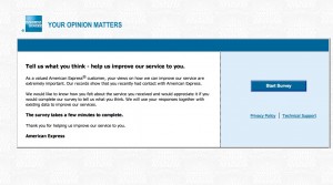
Landing page of the Amex survey
Landing page of my American Express survey

I got a survey invitation the other day from American Express that exhibited a number of worst practices. I’ll share highlights so we can hopefully learn from it.

1. The survey arrived too late. The email started, “Our records indicate you logged on to americanexpress.com on September 19, 2012, and we would like feedback about your on-line experience.” Problem: the email didn’t reach me till September 24. How am I supposed to remember something I did online 5 days ago?

2. The survey offered no incentive. It’s a sad but true fact that you have to give people a reward to participate in these days, simply because everybody else is doing it. It doesn’t have to be much … how about just a chance to win a $100 American Express Gift Card?

3. The survey is poorly written. The landing page starts, “As a valued American Express® customer, your views on how we can improve our service are extremely important. “ My views aren’t the customer, I am. That’s a dangling prepositional phrase and it’s distracting.

4. The survey doesn’t promise that it will be a quick and easy experience. The landing page simply states, in bold type, “The survey takes a few minutes to complete.” In context, that feels like a very long time.

5. The survey demands an explanation on each question of why I answered the way I did, written in free text. Eg, “What could have been done to make you more likely to recommend American Express to a friend or colleague?” (More bad or awkward writing.) Nothing really… I was just paying my bill! And it won’t let me leave the field blank. I have to type something, even if it’s nonsense, otherwise the page reloads.

6. The survey asks questions it already knows the answer to, in this case why I was on the website and what I did there. (It could have ben spun into a “do you recall what actions you performed while on the website” question which would have had more apparent validity since it appears to be testing the intensity of my recollection.)

7. The survey asks a question I can’t answer: “Please rate your satisfaction with the ease of navigating the American Express website, americanexpress.com.” Yo! The site I go to is called “Open Savings”. It does resolve (I just checked) to americanexpress.com but a consumer I shouldn’t be expected to know that. Why mention the URL at all?

8. The survey communication wasn’t sufficiently personalized. After I abandoned the survey for all the irritations described above I got an email “reminder” which was the same as the first email with this additional superscript: If you have already completed the survey, thank you and please accept our apology for the additional e-mail. But when I returned to the survey I was deposited where I left off.

What’s happening here is that they are automatically sending a follow up email to EVERYBODY who received the first email, and not removing or acknowledging the completions or people who started and then abandoned it. How irritating is that?

The “independent research company” that provides this survey is researchhq.com. Autofills on the search panel suggest they’ve also done surveys for Wells Fargo and Allstate. Good luck with that.

For all you long-copy haters out there…

Screen grab from Stansberry's 77 minute online ad
Screen grab from Stansberry’s 77 minute online ad

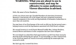
Direct marketing watchdog Denny Hatch had his knickers in a twist about the online ad shown here. And with good reason. It’s simply a long copy direct mail letter turned into a PowerPoint video and it runs 77 minutes (I am taking that part on faith since I lasted about 4 minutes) with no pause button and no call to action until the very end. The sell is for an investment newsletter which allegedly has 241,700 active subscribers, which I presume are the same as the 241,700 people currently viewing Otisregrets.

Stansberry's "don't leave" interrupter screen
Stansberry’s “don’t leave” interrupter screen

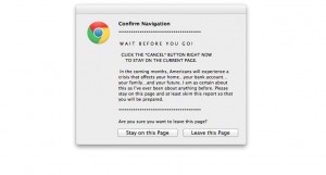
Hatch waited all the way to the end; I didn’t and clicked the close button, bringing up the frantic “WAIT!” alert usually reserved for adult content sites. I clicked the “stay on page” button … and was rewarded with the opportunity to read the same copy, but in its original mega-letter format. (And badly reproduced, too. Hope that Stansberry picks up a few subscribers so he can afford a new imaging drum for his scanner.) Even so there is no call to action until the very, very end of the letter where we find a single “subscribe” button.

Stansberry's letter
Stansberry’s letter

Of course this is NOT evidence that long copy is a bad idea. Rather, it’s a great way to experience good direct marketing by its absence. When asked how long a man’s legs should be, Lincoln allegedly replied “long enough to reach the ground.” It’s the same with sales letters. They can be one page, or 32 pages (my personal record), or hundreds of pages like the Stansberry effort… just as long as the copy is permeated with calls to action so the reader can stop reading and give you the order as soon as they are convinced.

Hatch’s article had a great quote from old school copywriter Claude Hopkins, which talks about “print” but applies equally well to electronic media:

“People are hurried. The average person worth cultivating has too much to read. They skip three-fourths of the reading matter, which they pay to get. They are not going to read your business talk unless you make it worth their while and let the headline show it.

People will not be bored in print. They may listen politely at a dinner table to boasts and personalities, life history etc. But in print they choose their own companions, their own subjects. They want to be amused or benefited. They want economy, beauty, labor savings, good things to eat and wear.”

Getting back to the format of Stansberry’s online ad, Hatch closes (as will I) with this zinger from “Visual Display of Quantitative Information” author Edward Tufte: “Power corrupts. PowerPoint corrupts absolutely.”


Applebee’s out-ironics The Onion with its new campaigns

Have you seen this? According to a media commentator, Applebee’s has a new campaign in which they are urging hipsters to dine at their restaurants “ironically” which makes sense since they are never going to get them there through conventional advertising. Take a look:

Funny thing is, Applebee’s actually is running a social media campaign that is far more bizarre as this, called “Girls’ Night Out. Life is better shared.” A Betty White character harangues ladies for spending too much time online, then tells them the solution is to get down to Applebee’s for some facetime. Take a look:

There’s also a tumblr page that anchors the campaign and has links to Pinterest and Twitter pages (no Facebook, maybe because it’s a regional campaign). All the elements of a well thought out and expensive social media campaign.

Speaking of social media, Applebee’s is also marketing a life size inflatable dummy you can leave at your desk while you sneak out for lunch. This one is on Facebook, where you can take the Desk Lunch Diagnosis Quiz (I am the “Break Room Hero… people are tired of cleaning up the microwave after you”).

Does this stuff work? The “goddess” video above has over 50,000 hits but how many of those are potential customers? There are only 400 plus followers on the Twitter page and the selection of inflatable dolls on Amazon was originally 7 but is now down to just 2. The bottom line is that Applebee’s is still Applebee’s (check the hashtag #applebee and you’ll get a far more realistic snapshot of Middle America’s view of the chain) and there’s only so much you can do to get hipsters to change their behavior… unless they do it ironically, perhaps.